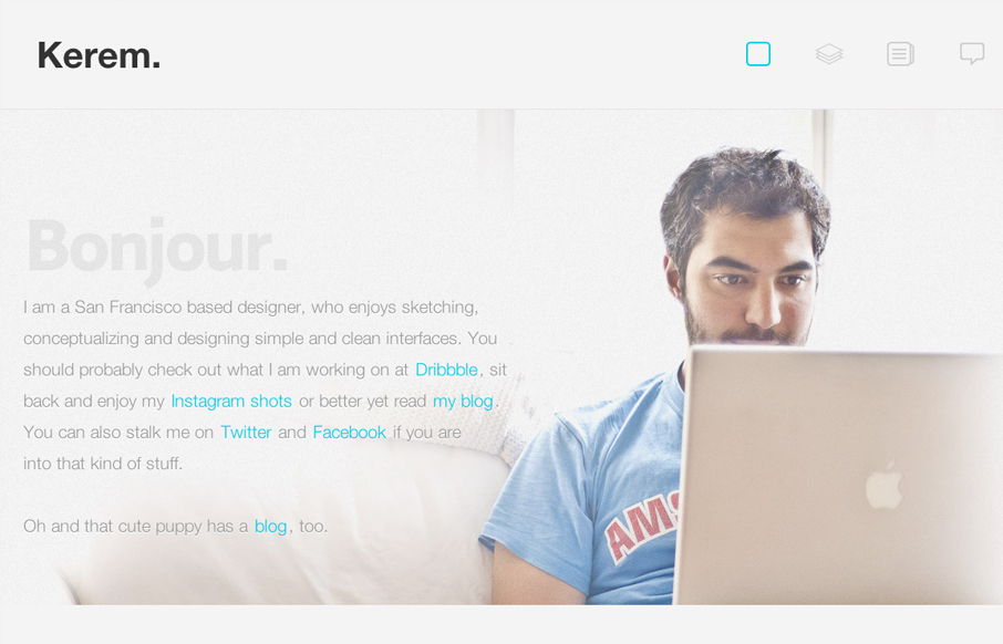
by Gene Crawford | Jul 25, 2012 | Gallery
Nice work on the photo and how the copy plays right up to it, even visually with the copy about the dog right above the dog. I just dig that. Love the fixed header and how it feels really well tailored into the site. Random numbers section in the footer area is...
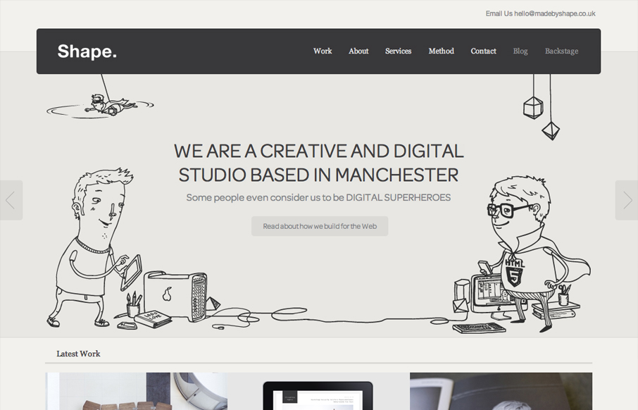
by Gene Crawford | Jul 23, 2012 | Gallery
God I love this website. It’s so full of sweet little details and then awesome features like ‘method’ page. The project planner form is a real piece of work too, I love interactions in the multiple choice section and the price range slider. Spend...
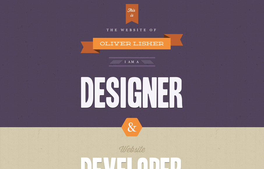
by Gene Crawford | Jul 20, 2012 | Gallery
First off, I want more. This single page is superbly designed visually and I want more pages to look at. There now that’s over. There’s such a nice tactile feel to the design of this website. It’s little detail work like this that pushes something...
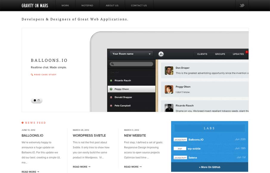
by Gene Crawford | Jul 18, 2012 | Gallery
Sharp looking minimal(ish) site design. I really like the cropping of the main image slideshow a lot. It gives a good sense of the apps and shows them in context on the iPad but it’s not overpoweringly large. The delicate lines and typography are matched up...

by Gene Crawford | Jul 17, 2012 | Conference, Gallery
Super simple yet clean and open looking conference website. I like the green & gray color palette too.