
by Gene Crawford | Aug 29, 2012 | Gallery
Beautiful site from @addison – well.io – love the subtle animations— Jason VanLue (@jasonvanlue) August 23, 2012 Beautifully simple and minimal website for the iPhone app Well. Using some simple animations as you scroll down the page to engage you...

by Gene Crawford | Aug 28, 2012 | Gallery
Another solid minimal(ish) design that’s great. I love the bold typography and black and white coloring. Keeps it all very clean feeling. Then those charts of skill-sets are very craftily done.
by Gene Crawford | Aug 28, 2012 | Gallery
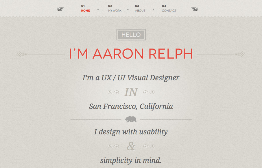
Submitted by: Aaron Relph @aaronrelph Role: Designer & Developer Wonderfully simple, yet chock full of detail work is this site for Aaron Relph. I give it two thumbs up for the domain name alone, love that sense of humor. Plus the silhouette of the T-rex is just...

by Giovanni DiFeterici | Aug 24, 2012 | Gallery
Submitted by: Samuli Nivala @buena_fi Role: Designer & Developer Nordcloud is a perfect example clean, sensible web design. It’s certainly not the flashiest site that I’ve reviewed, but it is tastefully simple and extremely usable. I would like to see...
by Gene Crawford | Aug 23, 2012 | Gallery
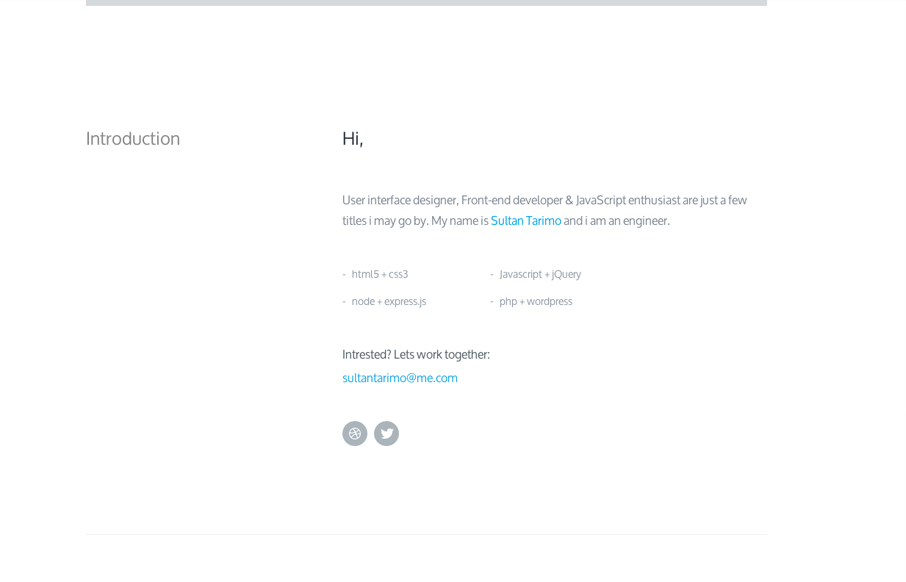
Submitted by: Sultan Tarimo @Tbakdesigns Role: Designer & Developer We don’t normally post something this minimal here in the gallery but this one is just so nice. It feels very architectural to me, in a truly minimal sense though. I love the slight...
