
by Gene Crawford | Nov 1, 2012 | Gallery
Lovely home page design. With the split/slide in animation of the creative tools as you slide down the page the site immediately feels activated. I think that’s the point given the subject matter and way the FieldTrip conference is supposed to play out. Just...

by Gene Crawford | Oct 30, 2012 | Blog, Gallery
The Squarespace product website is simply a thing of beauty. Richly designed and executed with system screenshots and great photography. It’s a long page that scrolls forever but it’s full of useful product info and tells the narrative of using Squarespace...
by Gene Crawford | Oct 26, 2012 | Gallery, Portfolio
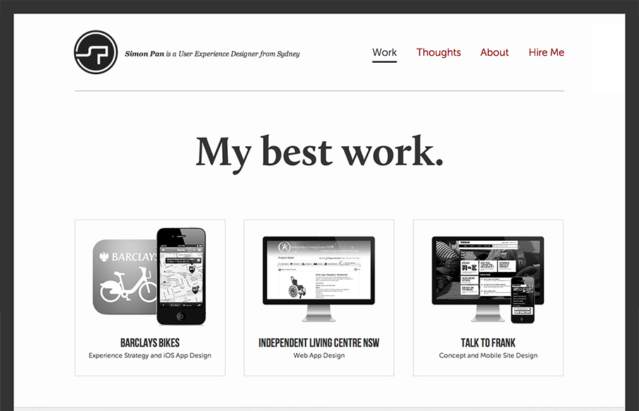
Submitted by: Simon Pan @span870 Role: Designer & Developer Creating a site about myself was a challenging task. I aimed to craft something that arouses trust from my users through a pure and sincere presentation. My aims were to strive for a timeless aesthetic,...

by Gene Crawford | Oct 23, 2012 | Gallery
Cool kinda asymmetrical design here. Very fluid design too for the responsive implementation for this site as well, check it out when you get a chance.

by Gene Crawford | Oct 19, 2012 | Gallery, Government
I absolutely love this design. I’ve tried to accomplish a design like this myself (a site that’s largely a big set of text links) and have fought opposition from management from the client and lost. Makes me very excited to see a solution like this for a...
