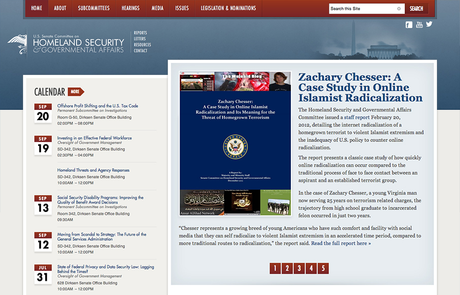
by Gene Crawford | Oct 17, 2012 | Gallery, Government
This responsive design for the Homeland Security site has some really nicely placed breakpoints. I really dig how the layout just really seems to flow so well in between the breakpoints too. Nice clean type and it seems really easy to use on a tablet and iPhone...

by Gene Crawford | Oct 16, 2012 | Design Firm, Gallery
Nice and clean and full of sharp corners but somehow it feels open and inviting to read. Super awesome photography in play makes this site really stand out, when you have photos like these you got to show them off, right? I also like the mouse over zoom effect on the...

by Gene Crawford | Oct 15, 2012 | Gallery
Submitted by: Matt Hamm @matthamm Role: Designer & Developer It’s our newly designed responsive website. It’s been 2 years in the pipeline. We hope you like it! Solid responsive design. I’d say two years work is worth it for such a clean and...
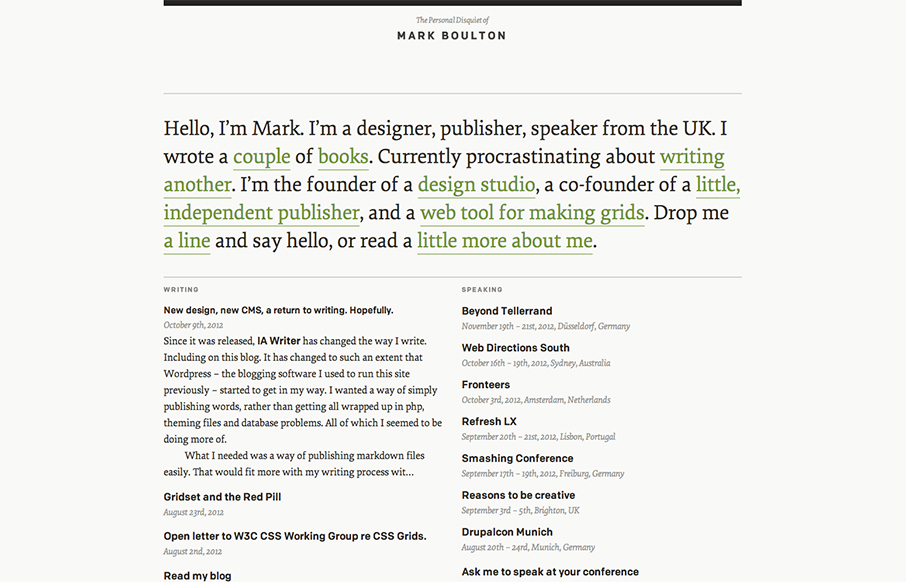
by Gene Crawford | Oct 15, 2012 | Blog, Gallery
I’ve watched Mark Boulton’s blog/site designs over the years make this really refreshing trip towards being completely minimal. I love it. He’s gotten down the just the bare essence of what he needs in a website, particularly with this latest design...
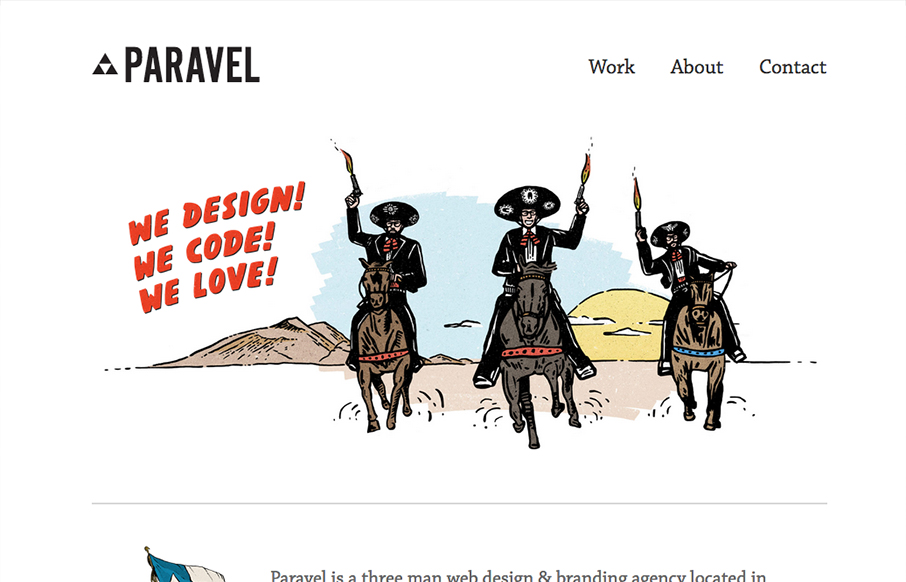
by Gene Crawford | Oct 10, 2012 | Gallery
New update for the Paravel team’s website. They’ve simplified what was there before and boiled it all down to just what’s needed to communicate what it is they do and have done. Telling their story quickly with a super badass illustration. The thing...