by Aaron Griswold | Mar 11, 2014 | Food and Beverage, Gallery
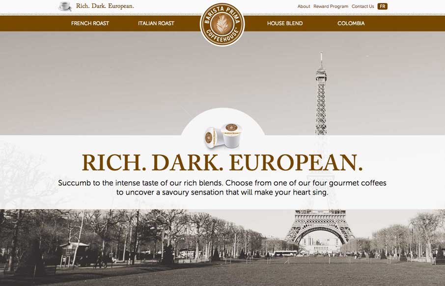
So… as soon as I saw this site, I fired up the Keurig. The black, white, gray and coffee brown immediately put me in a mood to enjoy coffee. The entire site is centered around the brand’s tagline: “Rich. Dark. European.” The background images,...

by Gene Crawford | Mar 10, 2014 | Design Firm, Gallery
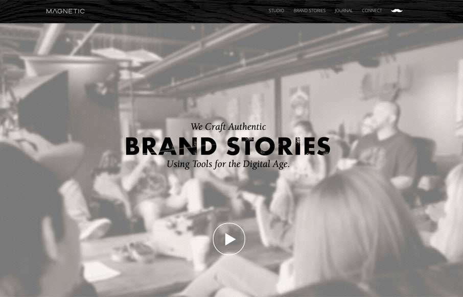
Really cool looking mix of tight straight edges and hand made type treatments, mixed with the sepia colored imagery. This site has a nice hand made feel but also very high end. The slight movement of the images behind the type overlays add that extra little dimension...

by Gene Crawford | Mar 10, 2014 | Gallery
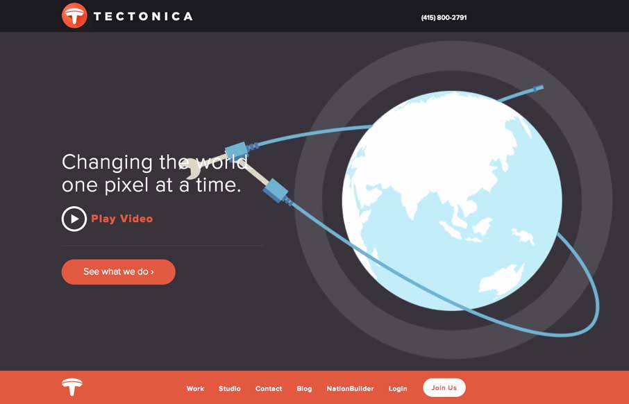
Engaging illustrative website. There’s also plenty of interaction stuff happening on the home page to keep you interested. The thing I like most is that it’s not intrusive at all. You can engage with it by continuing to scroll or not. The look and feel of...

by Gene Crawford | Mar 10, 2014 | Gallery
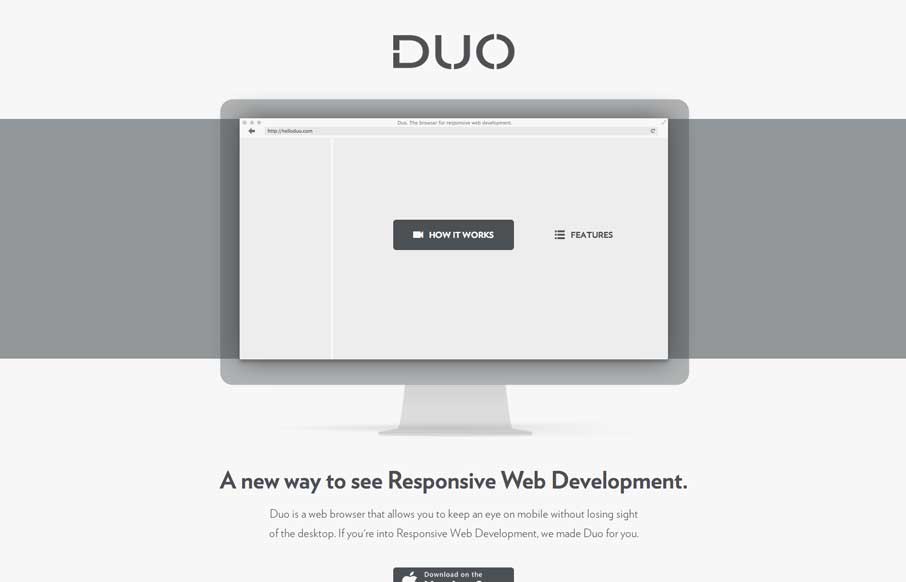
Really super simple page. Normally something this scaled back wouldn’t make it into the gallery, but wait – click the “features” link. That’s why it’s in here. Very smart effect.

by Gene Crawford | Mar 10, 2014 | Gallery, Portfolio
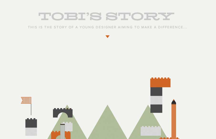
The Toby’s Story site is just fun. There’s really no functional aspect to it, like a call to action or newsletter signup but you know what I don’t care. It’s cute and exists solely just to be a fun little experiment. I always love seeing that...
