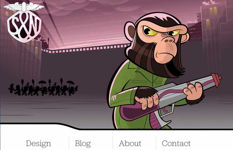
by Gene Crawford | Mar 21, 2014 | Gallery
It isn’t that “new” of a re-launch now but the new Stuff & Nonsense website is as always wonderful. I love the responsive header illustrations. Both informing and entertaining – which is how Mr. Clarke always is.

by Giovanni DiFeterici | Mar 20, 2014 | Gallery
Parkeriain.com is a portfolio site with a simple, but well conceived structure. I like how the footer has been strategically used to create a call to action on every page. It’s a small detail, but effective when flipping through the portfolio detail pages. Solid...
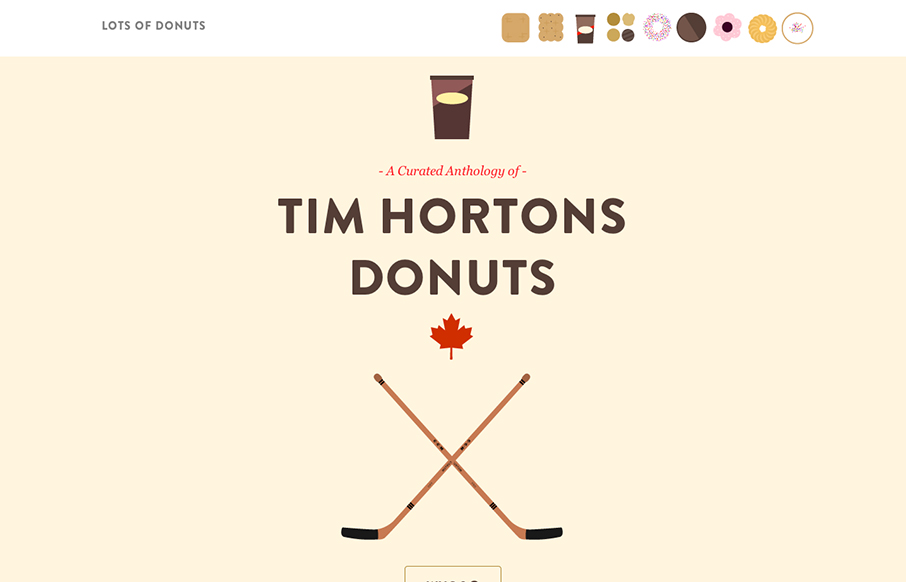
by Giovanni DiFeterici | Mar 20, 2014 | Food and Beverage, Gallery
Lots of Donuts is fun as hell. It’s beautiful and simple, which I love. The parallax effect has gotten a lot of play in the last few years, but it’s cool and fits the tone of the site. The art is great, too. Now, I just want donuts…
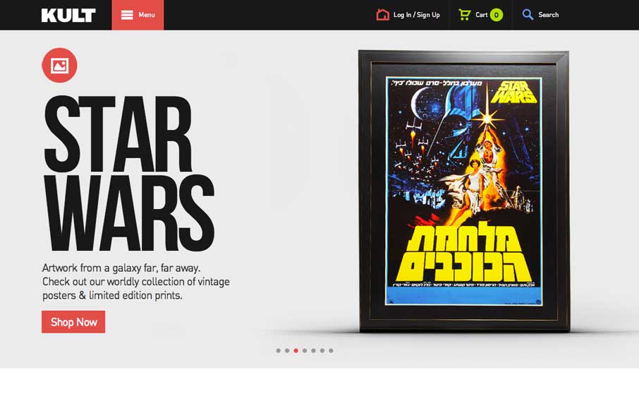
by Gene Crawford | Mar 17, 2014 | Gallery
Good simple layout, just kind of a blocky and bold presentation of stuff. What’s interesting to me is how when you interact with the menu it grays out the content, keeping you focused on the menu navigation itself. What do you guys think of that?
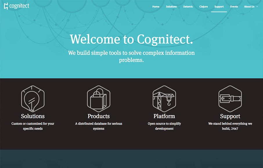
by Gene Crawford | Mar 17, 2014 | Gallery
Pretty slick looking design. I love the colors and illustration work a lot. I also really dig the interactions/animations on the main marquee blocks – those are just great. Overall a really great and simple experience picked up by some clever illustration and...