
by Gene Crawford | Mar 31, 2014 | Gallery
I love the visual changes that happen around the page as you scroll down. The way the logo and main nav get smaller. The way the laptop image stays put and other graphics interchange with it is smartly done too.

by Gene Crawford | Mar 28, 2014 | Education, Gallery
Nice, Harvard has a responsive site design now. Not sure how long it’s been relaunched but I like it. It’s one of the better collegiate designs as far as i’m concerned. I really dig the featured marquee area and how they change for focus based on the...
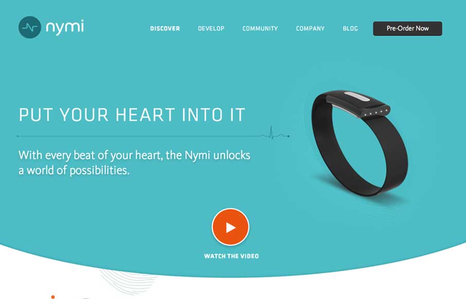
by Gene Crawford | Mar 28, 2014 | Gallery
Nice product site design here with nymi. I really like the main featured area and the focus put into designing for different screen widths for it. The little radiating lines animation is a nice subtle touch too.

by Gene Crawford | Mar 28, 2014 | Gallery
My favorite part of this design is the hero image area. I love how it slides down and fades as you scroll down the page. Then check it out when you resize it for the mobile screen widths. Very clever design.
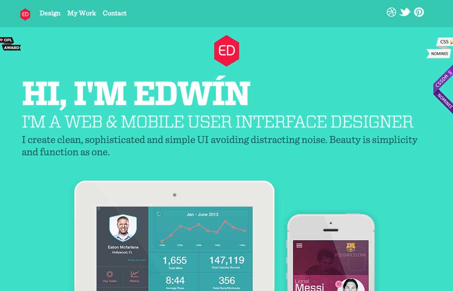
by Gene Crawford | Mar 27, 2014 | Gallery, Portfolio
Nice clean look to this portfolio site. I like the about text on this site, typically on portfolio websites it’s largely useless but on Eddie Diaz’s it’s actually informative. Bravo!