
by Aaron Griswold | Apr 30, 2014 | Gallery
As one-page websites become more prevalent, you start looking at them a little differently than when they first started popping up onto the interwebs. I like how clean and minimal the site is which makes it quicker to get to the information they think is important to...
by Gene Crawford | Apr 29, 2014 | Gallery, Portfolio
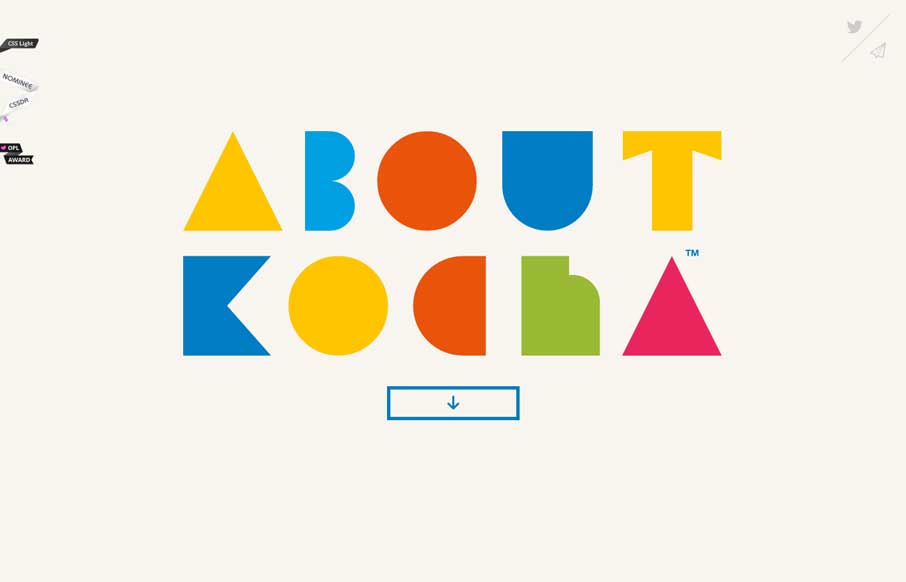
Damn I love this website. Just beautiful illustrations supported by a clean design base.
by Aaron Griswold | Apr 29, 2014 | Gallery
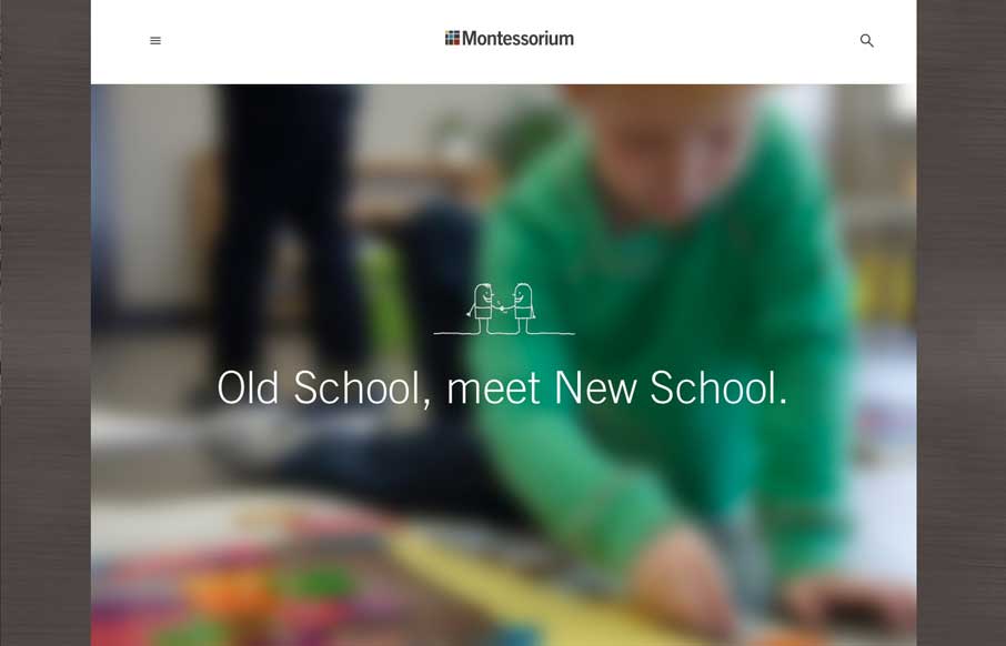
Montessorium is gaining ground in the iTunes store, and their site reflects why. As a parent of three kids who have gone to Montessori schools, we were always looking for ways to bridge the gap between school and home with toys and tools that you would have in the...

by Gene Crawford | Apr 28, 2014 | Gallery
Gotta love it when someone pushes the limits on what we do. I love the animation in the background and all the other little details here.

by Gene Crawford | Apr 28, 2014 | Gallery, Portfolio
Nice simple approach to a portfolio website. With some nice little details like forward and back arrows when you’re viewing a detail page.