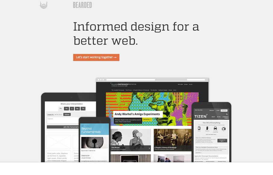
by Gene Crawford | Aug 26, 2014 | Gallery
New Bearded. ’nuff said. But really, it’s super slick and simplified beauty. It’s this type of thing that makes me really love hate these guys. They even had the gaul to give us a pretty good write up about the redesign too: I’m constantly reminded...
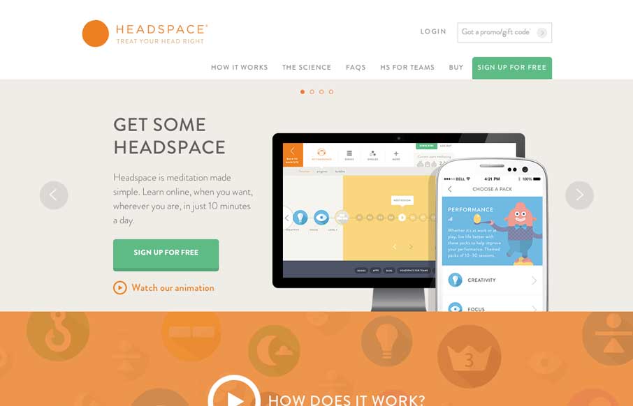
by Gene Crawford | Aug 25, 2014 | Gallery
I love the look of this site. It has hard edges and a rigid typeface but it still keeps a soft feel to it all at the same time. It’s party color and imagery and rhythm that keeps it feeling open and inviting. Great work all around visually on this.
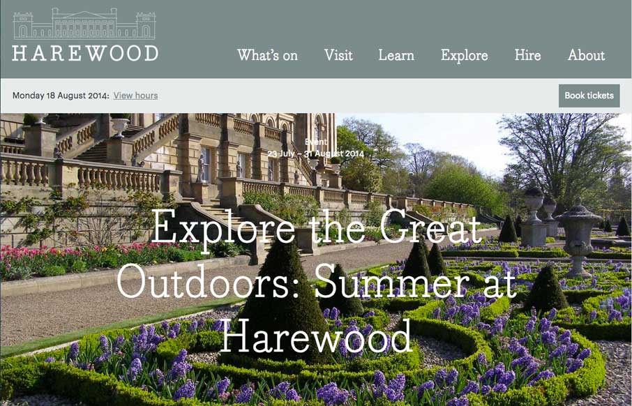
by Gene Crawford | Aug 25, 2014 | Gallery, Travel
The Harewood site is a great example of how to deliver something that’s responsive and still have that “RWD look” but also elegant at the same time. I like a lot of this design and at the same time sniff several tried and true visual RWD patterns at...
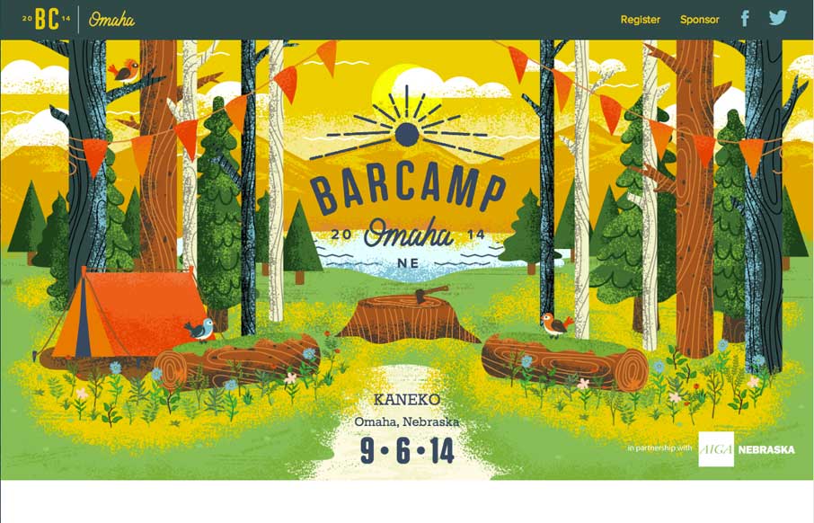
by Gene Crawford | Aug 22, 2014 | Gallery
The Barcamp Omaha website is just beautiful. I love just about every aspect to it, but the thing that I dig most is the illustration work that sets the tone. It promises a pretty well organized Barcamp; quality is driven home via the visual branding. I only wish I...
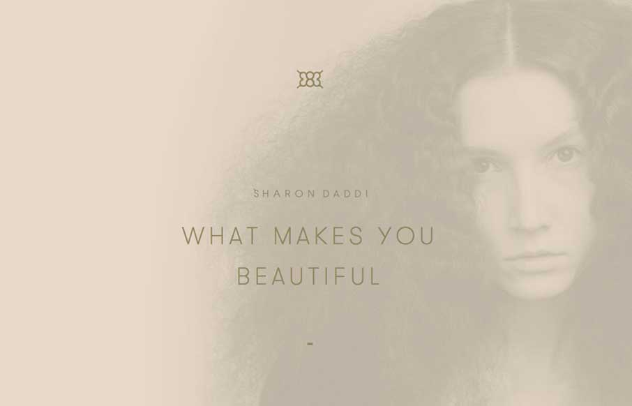
by Gene Crawford | Aug 20, 2014 | Gallery
What a unique design for this salon. I feel like it’s really something different for what most people experience with their salon’s website. It’s subtle and very smooth feeling as you go through it to me.