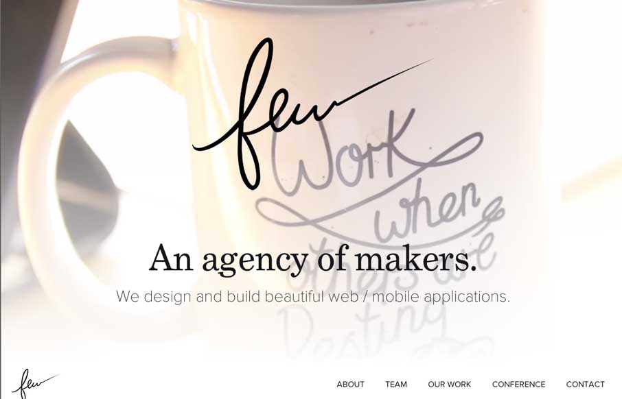
by Gene Crawford | Aug 19, 2014 | Gallery
Really beautiful and wispy design for the few.io site. I really dig the open vibe to the design and just about everything else that goes with it. Also, that is some epic beardage across the team there.
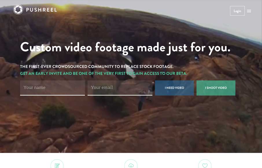
by Gene Crawford | Aug 19, 2014 | Gallery, Marketing
Looks like a pretty useful project, backed up by a nice simple and well designed page. I really dig the signup form elements and the way the nav works with the site overall. Smart stuff. Submitted by: Michael Moran @mike_moran_ Role: Designer & Developer Beautiful...
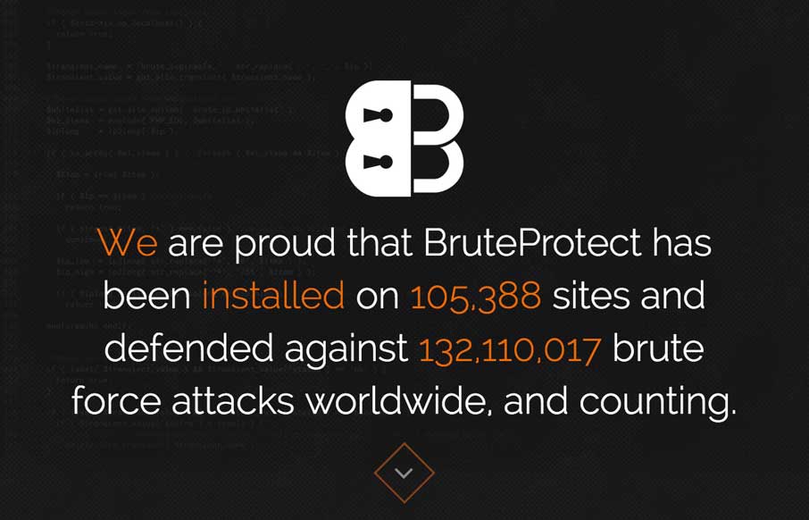
by Gene Crawford | Aug 18, 2014 | Gallery
There’s a lot of well tread design patterns in play on the BruteProtect site, but they’re done pretty well and that goes a long way. The sections are also broken up in interesting ways, like the use of the visual timeline for example. The best part is the...

by Gene Crawford | Aug 15, 2014 | Gallery
The team from Lullabot have released an app called Shoot. Pretty neat concept for an app. The website for it is top notch. Shows off the app, takes mobile into consideration heavily (you’d be surprised…) and is just plain neat to check out on it’s...
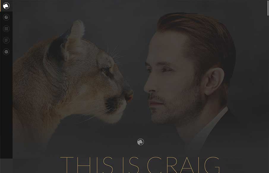
by Aaron Griswold | Aug 15, 2014 | Gallery
Thank the gods of the interwebs that there is finally a designer portfolio page that has everything you want in a significant other – smart, beautiful, and funny. We joke around here sometimes that we would like to change the message of our client services...