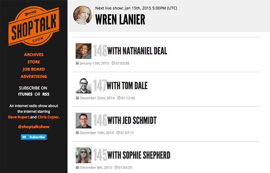
by Gene Crawford | Jan 13, 2015 | Gallery
The new Shop Talk Show website is up. Retaining the same branding and colors but very much looks like it just goes straight for mobile users. Likely a very smart move. The content is in the audio and getting people to that fast not in showing off a super slick site...
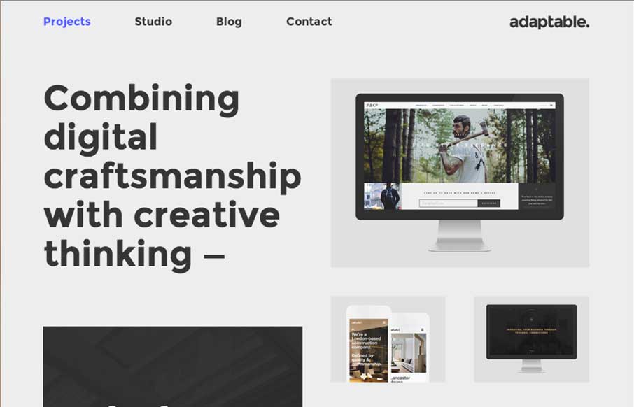
by Gene Crawford | Jan 12, 2015 | Design Firm, Gallery
I love this layout. It’s simple and to the point as well as a nice example of responsive design. The scaling of the main images is nicely done and in contrast the larger bolder type in the layout works our really well.
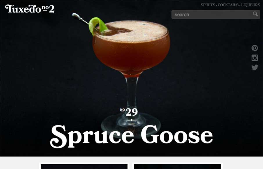
by Aaron Griswold | Jan 12, 2015 | Food and Beverage, Gallery
It’s 5 o’clock somewhere right? Who needs the Bartender’s Pocket Guide anymore – you can head to Tuxedo No.2 for great responsive, Instagram photo, easy to navigate (the drinks are the navigation), drink recipe / instructional guide. As an SEO...
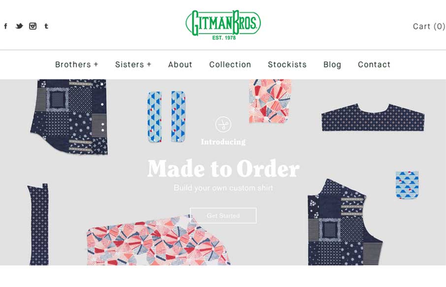
by Aaron Griswold | Jan 12, 2015 | Gallery, Shopping
Good Monday Morning to you! I’m responding to Gitman Bros’s Instagram message this morning. Offering cool vintage style shirts through their Shopify site, Gitman’s site is clean and easy to navigate (not always the case for shopping sites). Really...
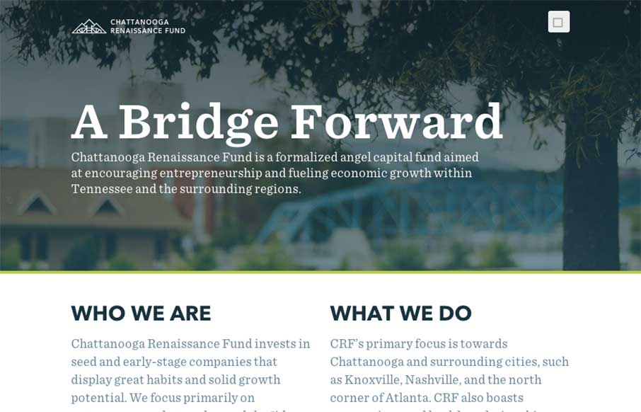
by Aaron Griswold | Jan 9, 2015 | Gallery, Nonprofit
Good way to end the week. The Chattanooga Renaissance Fund’s site has great sweeping full-width shots and video backgrounds of Chattanooga that is fun just to look at from a design perspective. Especially like the footer image. Also like the vertical type on the...