by Gene Crawford | Feb 16, 2015 | Gallery
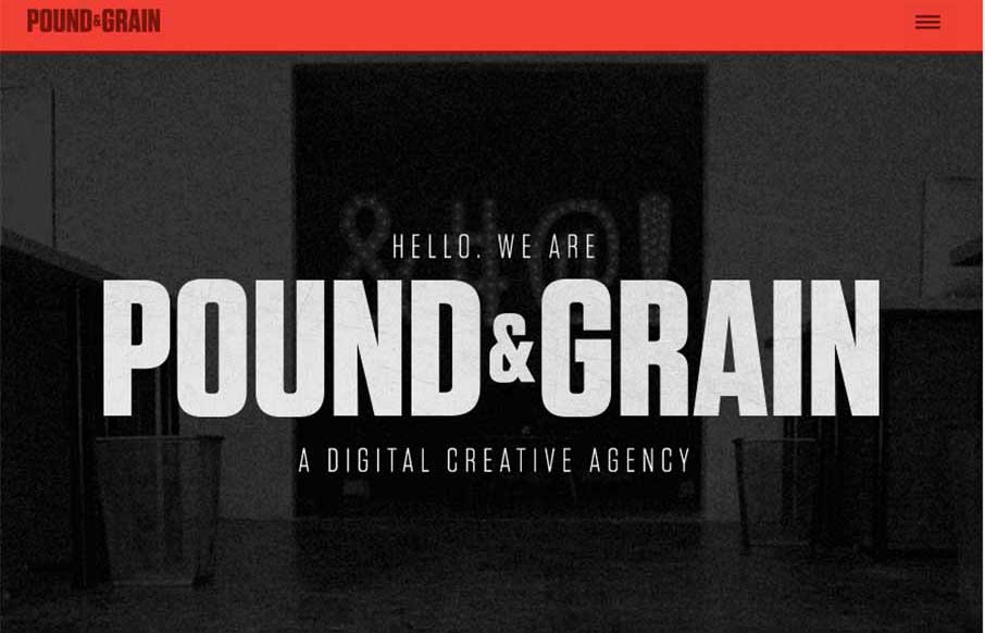
I really like the movement of the Pound & Grain site, out of Toronto. The subtle use of parallax with background shapes and colors, coupled with the images and copy make for a great experience. Also like the little vibrance of the animated gifs hero images, that...
by Aaron Griswold | Feb 16, 2015 | Design Firm, Gallery
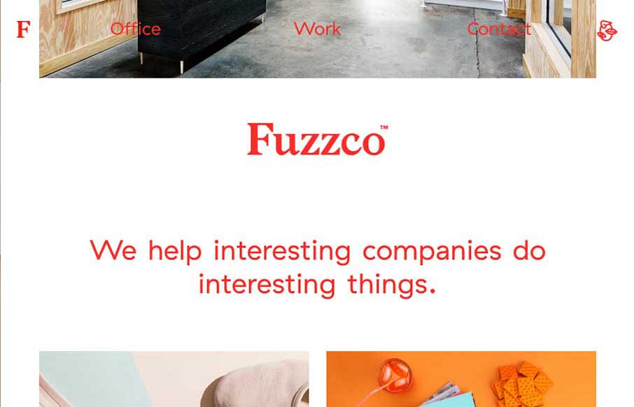
If you don’t like Fuzzco, then you’re probably just jealous you didn’t come up with that first. I’ve read some reviews of their new site – both good and bad – and hey, we all have opinions (insert colloquialism here). And why am I...
by Aaron Griswold | Feb 16, 2015 | Design Firm, Gallery
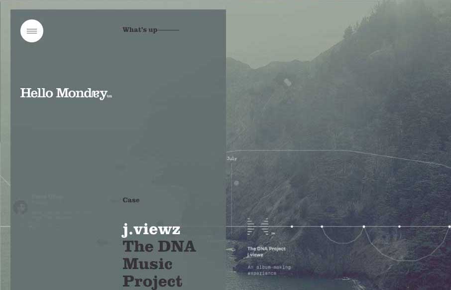
Excellent way to start Monday – with the agency site from Hello Monday, out of New York and Copenhagen. They do some really cool work, and their site is definitely different than most web design firms. From the parallax slider that rotates vertically, to the...
by Aaron Griswold | Feb 13, 2015 | Gallery, Sports/Recreation
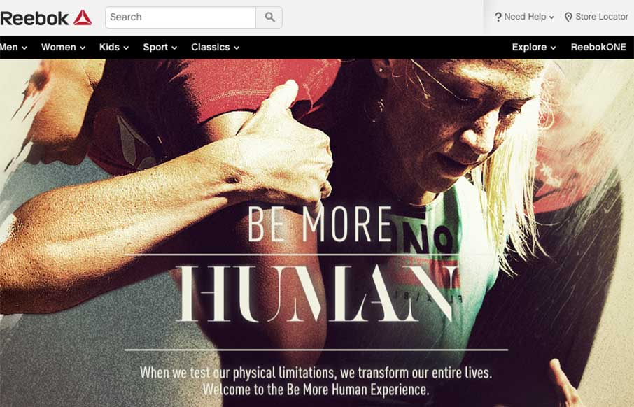
Some of us here at Unmatchedstyle are fan-boys of Reebok (planning our Spartan Race Tri-fecta for this year). And when Reebok released this one page / video, it makes us glad that we have a 12k trail run tomorrow – like watching football (both kinds), and then...

by Aaron Griswold | Feb 12, 2015 | Conference, Gallery
The countdown is on, registration for Google I/O 2015 is open in 33 days. The site (right now) seems a little scaled down from last year – but cleaner in approach, but not traditional. Either way, looking at the photos from Google I/O 2014, it’s something...