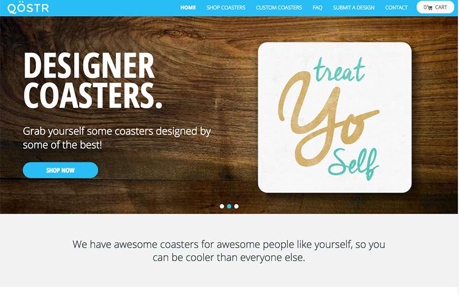
by Aaron Griswold | Aug 26, 2015 | Gallery, Product, Shopping
Qostr out of Arkansas, was built by Matchstick Studio (well Qostr was, not Arkansas…sorry) – thought this was a pretty cool concept – and can see the applications for the product and platform for photographers / artists / weddings / etc. It’s...
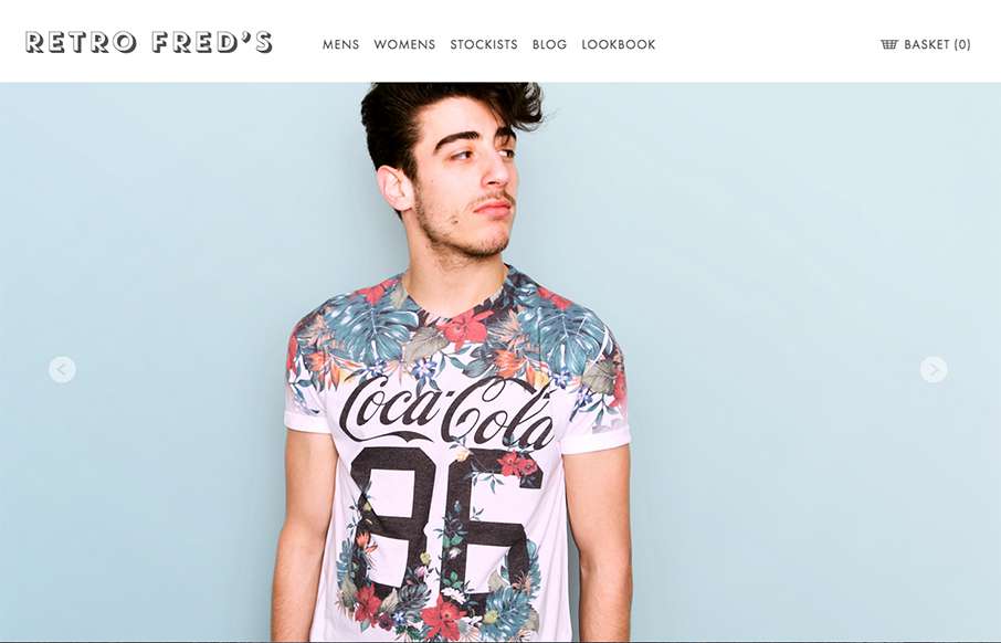
by Gene Crawford | Aug 25, 2015 | Fashion, Gallery, Shopping
I like the simplicity in the grid for this ecommerce site. It’s clean and simple and driven by the photography. I really like the way the main navigation is displayed open when you load it up on the mobile site width like that too. Smart stuff.
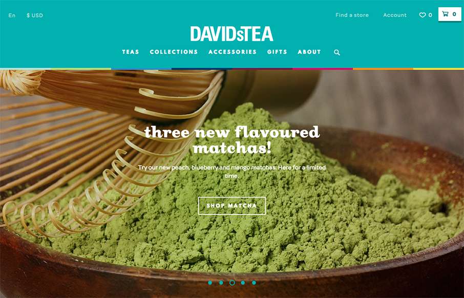
by John David Hunt | Aug 25, 2015 | Food and Beverage, Gallery, Shopping
This is a bright and lively site from David’s Tea out of Quebec. It’s incredibly detailed throughout the shopping part of the site – it looks like hundreds of items on the site – and all are beautifully done. My wife is a huge fan of Rooibos...
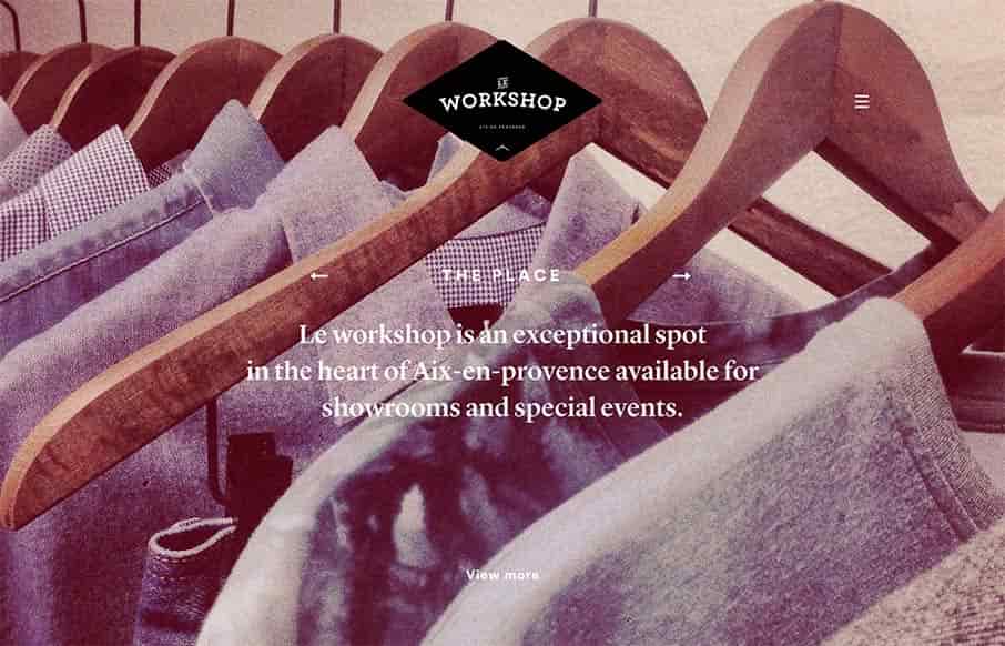
by Gene Crawford | Aug 24, 2015 | Gallery
It’s not often you see a website that really matches the physical location that it’s representing quite like this site does. Based on the pictures I really feel like the vibe of the space and the vibe of the website design and layout matches fairly...
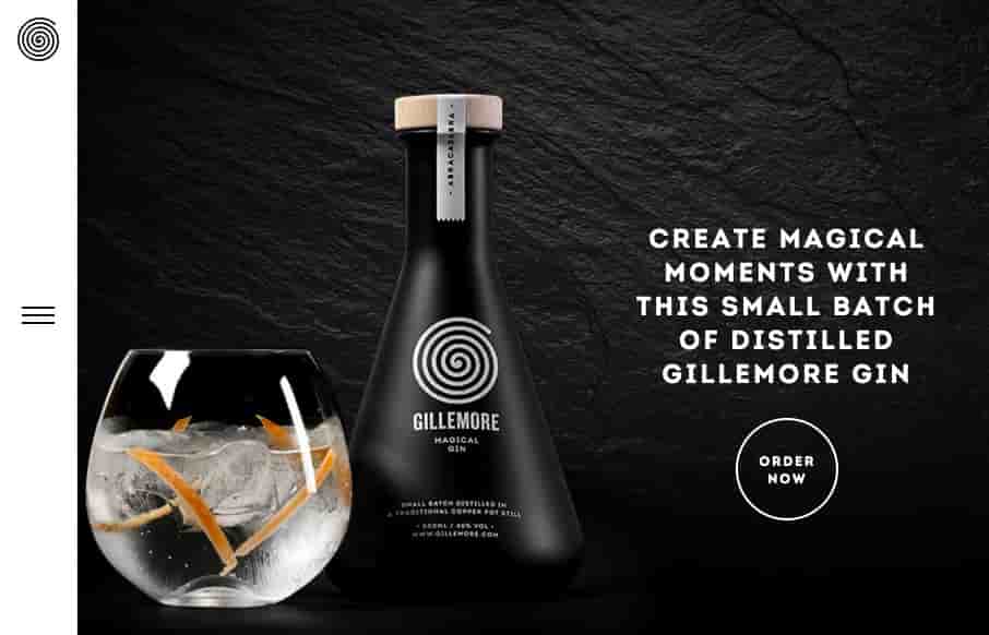
by Gene Crawford | Aug 21, 2015 | Food and Beverage, Gallery
Nice upscale look for the Gillemore Gin’s website. I like the black/dark vibe, it really aides to the uniqueness of what the product looks like. Along side the slightly non-traditional feeling nav in the left hand side tray pattern the approach matches the look...