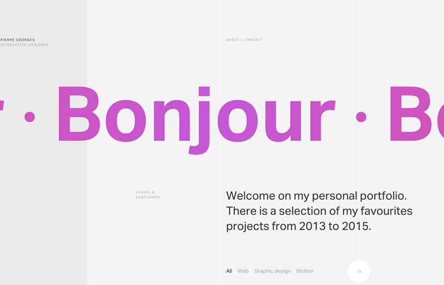
by Gene Crawford | Aug 27, 2015 | Gallery, Portfolio
Super sleek grid based layout. I love that he’s using the grid visually and structurally. I also love the way it plays with the typography and then the interactions feel perfectly placed. The layout of the work samples get kind of tedious as you scroll down the...
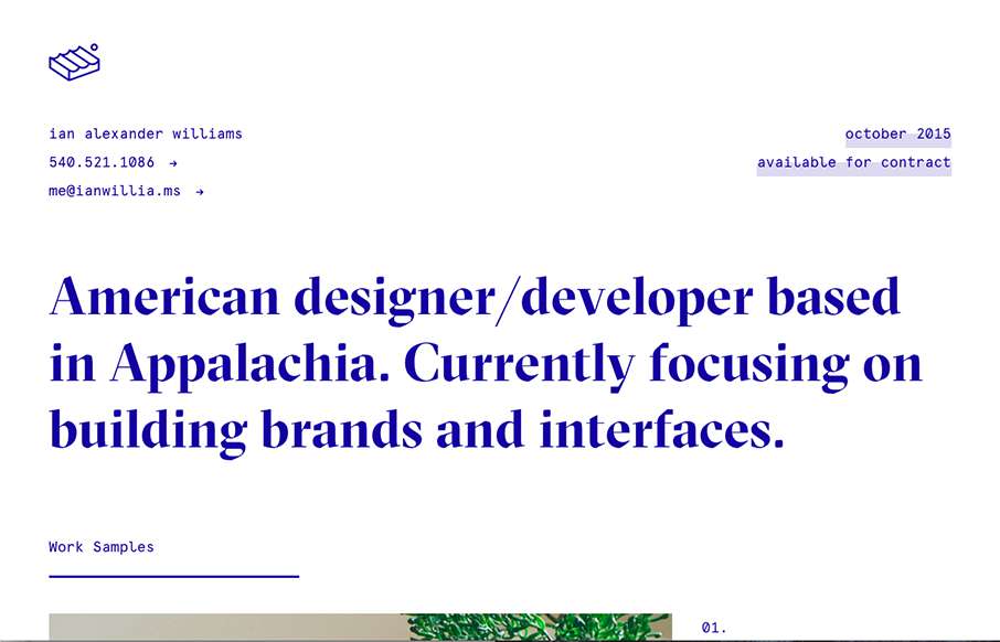
by Aaron Griswold | Aug 27, 2015 | Gallery, Portfolio
Ian Williams out of Virginia – love it. I’ve seen other sites like this- “looks” liked stripped out design – but they’ve been pretty, well not good. Ian’s is an excellent example of how to. It’s different without being...

by Aaron Griswold | Aug 27, 2015 | Design Firm, Gallery
Good quick design from LHV Studios out of Germany – looks to be an iOS app company. Detail is in the product pages – good stuff. Comedy in the copy the Beer “game” – I think this game is probably only legal in Germany… funny though....
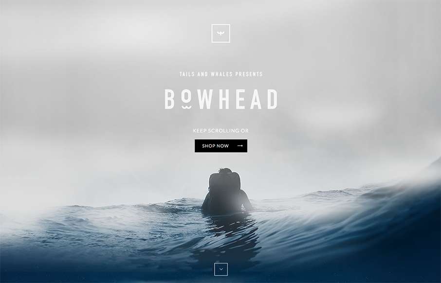
by Aaron Griswold | Aug 26, 2015 | Gallery, Shopping, Sports/Recreation
Well – we’re back to a product that as we say around here “me want.” Sweet looking backpack for active types / surfers especially – from Tails & Whales out of Portugal. Like the look and feel as you scroll down – good water...
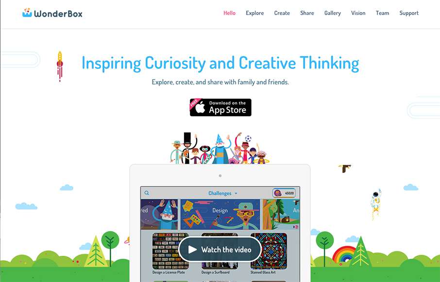
by Aaron Griswold | Aug 26, 2015 | Gallery
Well – I guess I found something cool, and non-cracked-out-candy-crushed to let my kids look at on my phone: WonderBox, an educational app made by Duck Duck Moose out of San Francisco. Looking forward to the app – but the site is pretty good too....