by Gene Crawford | Sep 24, 2015 | Gallery
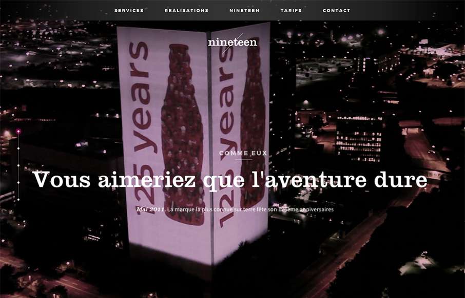
I like the overall vibe of this site design. The black and white setup is nice and gives it a sense of class. The photos are pretty rad too. Smooth experience as well as you make your way down the page(s). Submitted by: Swann Mayor Twitter: @swann_nineteen Role:...
by Gene Crawford | Sep 24, 2015 | Gallery
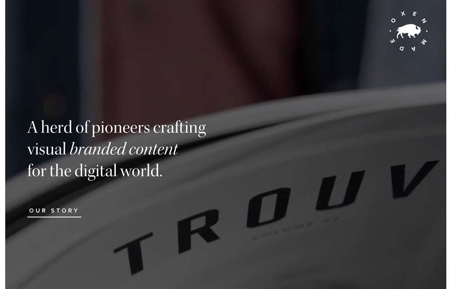
Cool, image heavy site. I really like the hero image style video and then how the navigation comes up under that as you scroll and then sticks as the header. The remainder of the page is nicely organized and continues with the great imagery. From the Designer: Oxen is...
by Gene Crawford | Sep 23, 2015 | Gallery
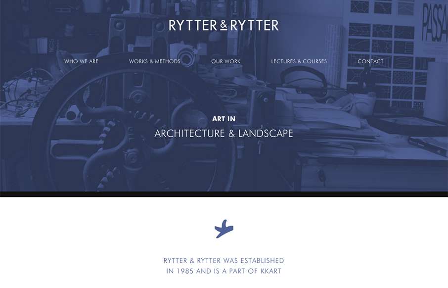
Pretty clever single page layout for Rytter & Rytter. I like the way the sections are laid out as you scroll down, the flow feels nice. My favorite section is the pictures of their work, the way they’re cataloged and displayed is just clever.

by Gene Crawford | Sep 23, 2015 | Gallery, Marketing
Nice work with this heavy grid layout, lots of sections of content to get on the page. Sometimes, boy do I know, it’s hard to work with all sorts of content that a client might give you and this design just screams this to me. I really like how it’s all...

by Gene Crawford | Sep 23, 2015 | Gallery
What a beautiful yet simple layout for Think with Google. I love this, material design in play as well here. Well balanced sections and plenty of space between elements make this easy to scan, read and remember.