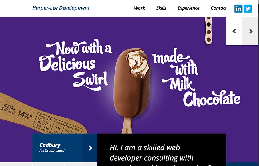
by Aaron Griswold | Feb 9, 2015 | Gallery, Portfolio
No – not that Harper Lee (who is releasing the sequel of To Kill a Mockingbird this year) – but Martin Harper-Lee is doing some pretty decent work too. Like how the home page has no scrolling, and instead of a traditional slideshow, he has used canvas to...
by Gene Crawford | Feb 5, 2015 | Gallery
I really dig the main hero area, the ‘masonry’ type layout and animation for the imagery. Solid design and overall organization too. Working with marketing, operations, sales, and of course the design team – we designed a website that is 100% focused...
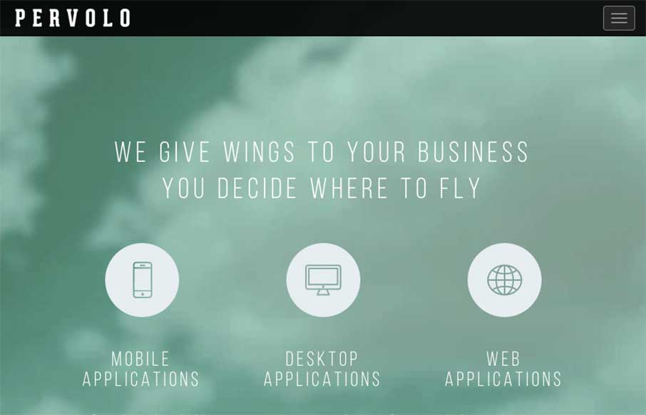
by Gene Crawford | Feb 3, 2015 | Gallery
I like the monochromatic approach to the color and the simple line art icons give it a good vibe. I also like the way the header is treated visually as you scroll down a bit.
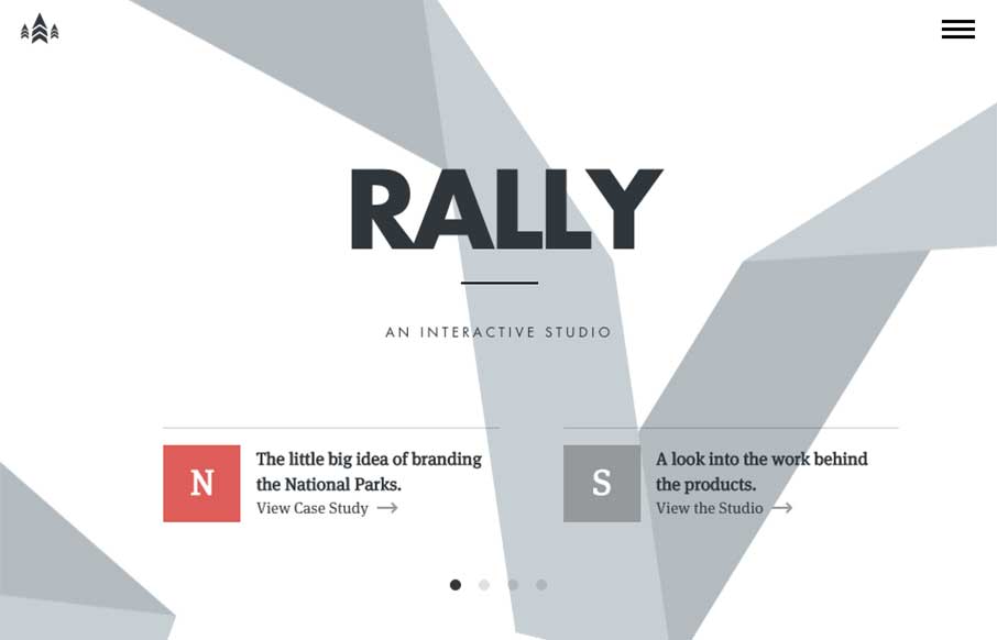
by Gene Crawford | Feb 3, 2015 | Gallery
I love just about everything there is about the Rally website. The main “hero” area, not sure what to call this area anymore really, is super dope. The “ribbon” graphic is very nicely executed, even when you scale the screen down the ribbon...
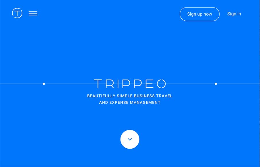
by Aaron Griswold | Jan 29, 2015 | Gallery, Travel
We reviewed the Trippeo site last year, pre-launch, and remembered it was pretty cool. So we’re looking at it again today – even better. The SVG animation that’s integrated with the video backgrounds and content areas give you a good idea of what the...