
by Gene Crawford | Mar 23, 2016 | Gallery
Yep, scroll jacking, but get over it. 🙂 some beautiful screens to look at here and it works pretty well. Especially the main nav once you open it up, simple and to the point.
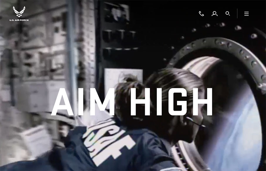
by Gene Crawford | Mar 21, 2016 | Gallery, Government
New(ish) website for the US Airforce here. There is some serious inspiration to gain from this site. It’s executed quite well and has a ton of detail work. Like the main navigation design, I love how it becomes another part of the website almost, not just a big...
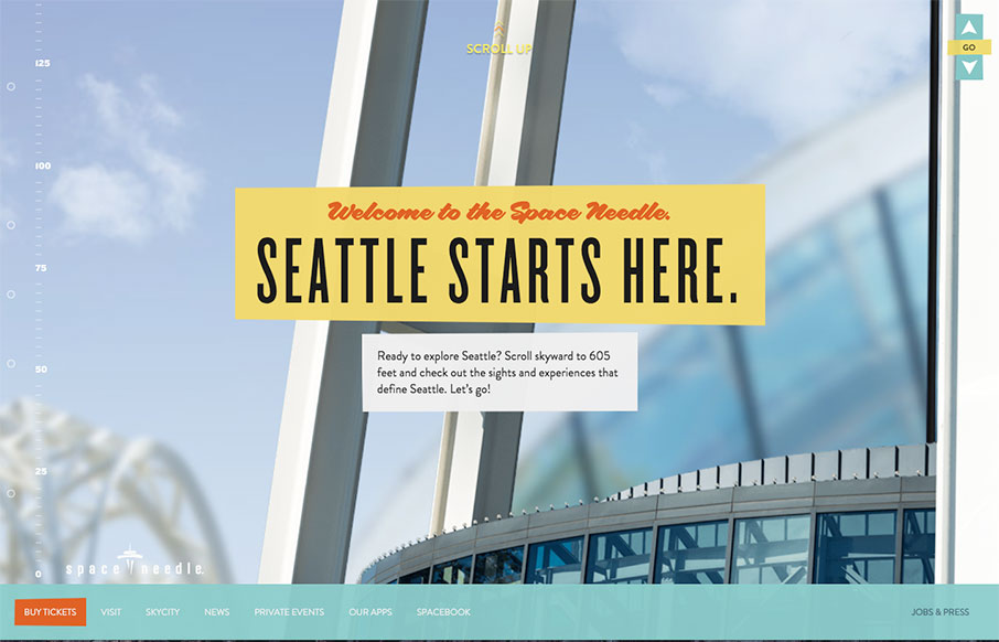
by Aaron Griswold | Mar 17, 2016 | Gallery, Travel
Get ready to scroll up – the Seattle Space Needle site is simple, and to the point – just a cool way to do something different, thate really makes sense for the location / building – upward and onward!

by Gene Crawford | Mar 17, 2016 | Design Firm, Gallery
Yeah it’s a parody agency site, but it’s actually not that bad of a design. Fun stuff, but it works pretty well.
by Gene Crawford | Mar 16, 2016 | Food and Beverage, Gallery
Pretty cool aesthetic to this site. I feels like it perfectly matches what they do in it’s visual vibe. It’s also kind of interesting with the scrolling and the main links in the top right and left like that. Simple and effective. Love it.