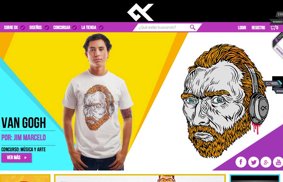
Great design and vibe throughout this site design. I like the transitions between screen widths too. Loud coloring to help push the products as well as bold previews of the artwork itself.
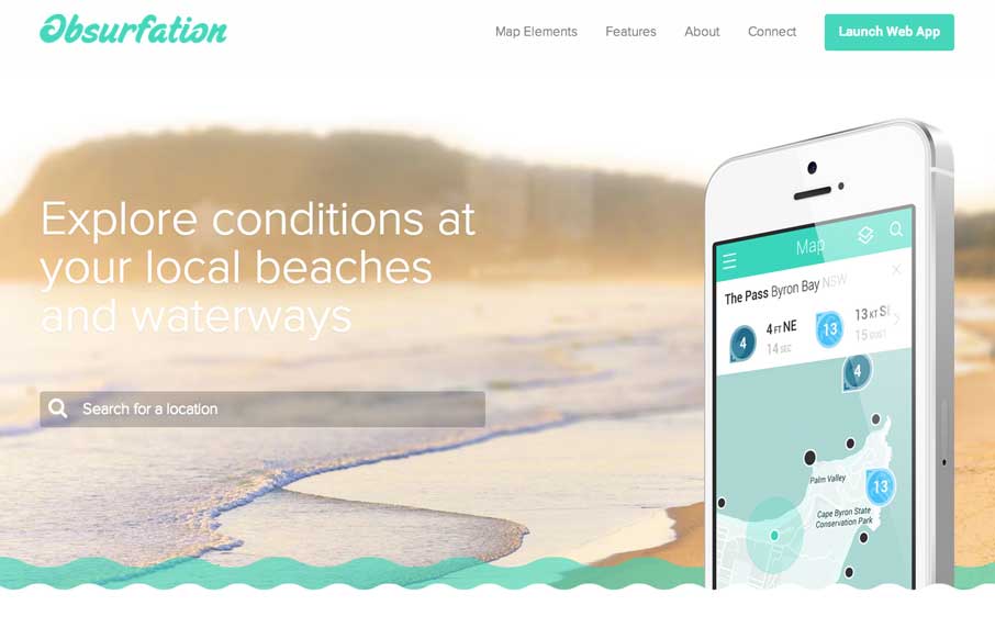
Obsurfation
I'm not a surfer, nor live near an ocean, but if I did i'd use this app just because of the website. I love the slight animation of the waves and the little mouse interactions here and there.
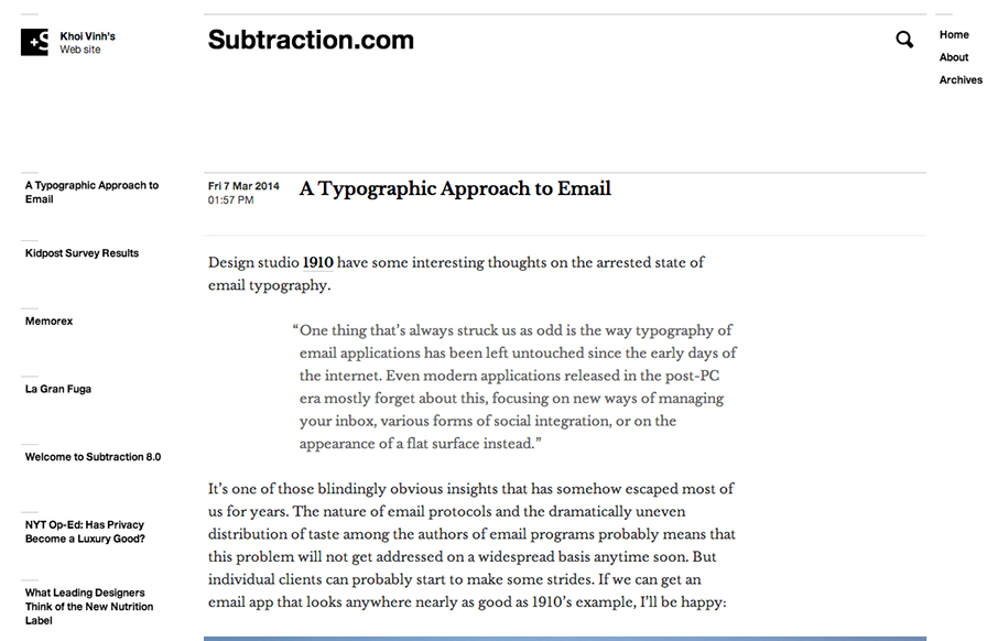
Subtraction
New site design for Subtraction, which is Khoi Vinh's personal website. Know to be pretty prolific in writing posts i've been a visitor to his blog for years. The new site follows the same basic form that the old one did with the black and white treatment and lines....
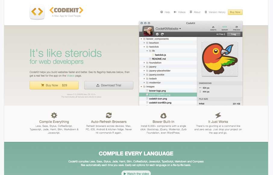
CodeKit
The CodeKit page/site is one of the better product pages i've seen. Plenty of good design down the page, animation, funny little sections and a superb overview of the guts of the app itself.
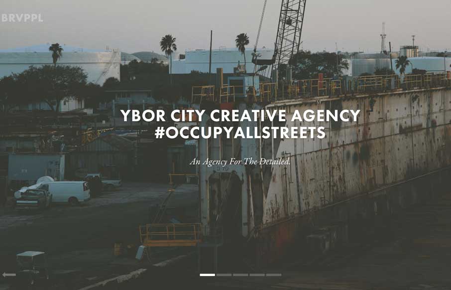
Brave People
Nice slick feel to the design. I like the soft almost washed out colors, almost black and white feel to the design. Things move well and the rhythm is good as you make your way down the page. I also really dig the plan a project form.
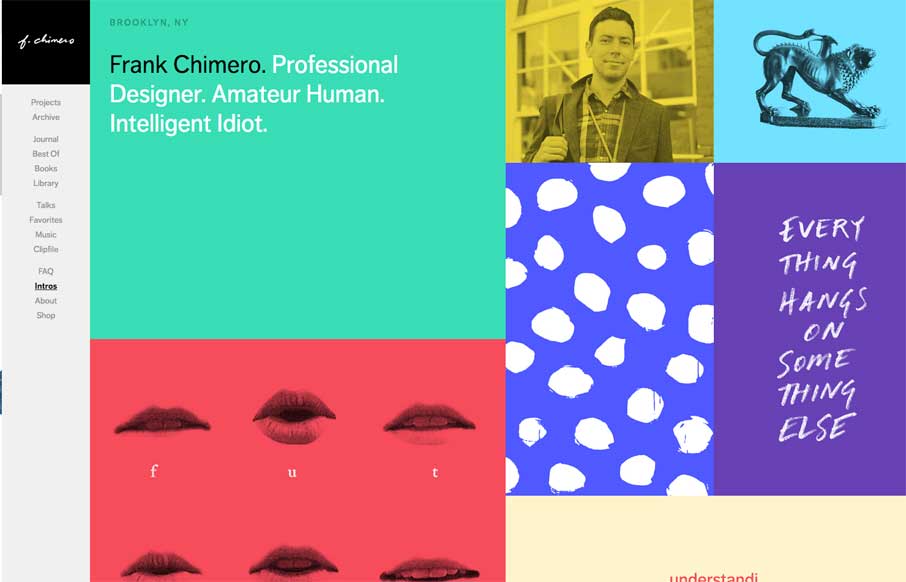
Frank Chimero
The latest version of Frank Chimero's personal website is just great. I love that it's largely traditional in that the nav is just there on the left, in text form, for anyone to see and click. It's this kind of understated beauty that reminds me why I love what I do....
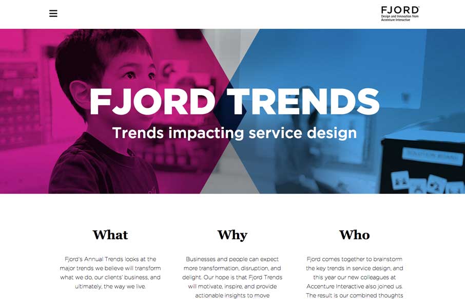
Fjord Trends
What a great reading experience the Fjord Trends site turns out to be. Both on the desktop and your mobile device. I love how the stories flow with nice bold blocks of imagery then "fold" out so you can read them right there. The tracking nav on the right side (when...
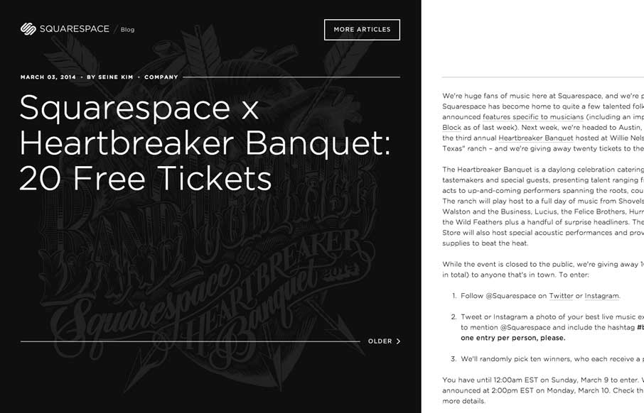
Squarespace Blog
The Squarespace Blog is very simple at first glance. Keeping all the relevant content for the post (or most recent post) front and center. You can slide open a list of past posts, that have nice little hover effects of the images. On the right is the now standard...
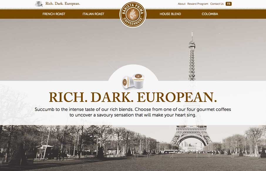
Barista Prima
So... as soon as I saw this site, I fired up the Keurig. The black, white, gray and coffee brown immediately put me in a mood to enjoy coffee. The entire site is centered around the brand's tagline: "Rich. Dark. European." The background images, the parallax effects,...
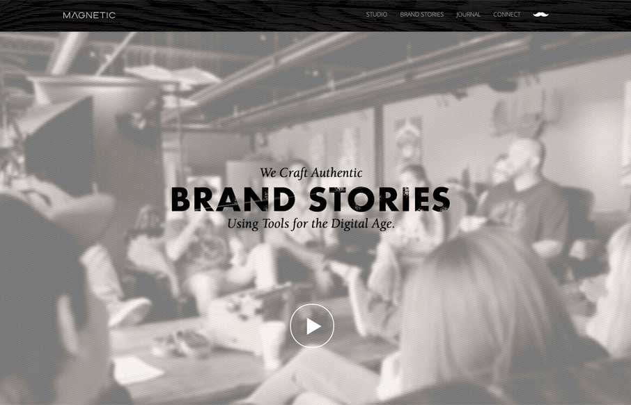
Magnetic
Really cool looking mix of tight straight edges and hand made type treatments, mixed with the sepia colored imagery. This site has a nice hand made feel but also very high end. The slight movement of the images behind the type overlays add that extra little dimension...
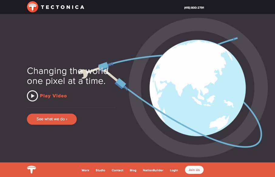
Tectonica
Engaging illustrative website. There's also plenty of interaction stuff happening on the home page to keep you interested. The thing I like most is that it's not intrusive at all. You can engage with it by continuing to scroll or not. The look and feel of the site is...
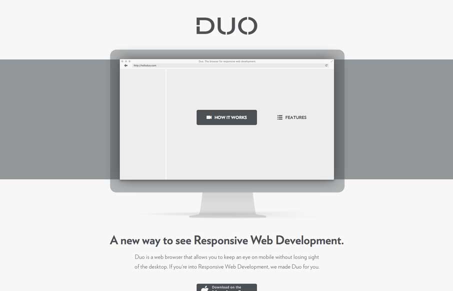
helloduo.com
Really super simple page. Normally something this scaled back wouldn't make it into the gallery, but wait - click the "features" link. That's why it's in here. Very smart effect.
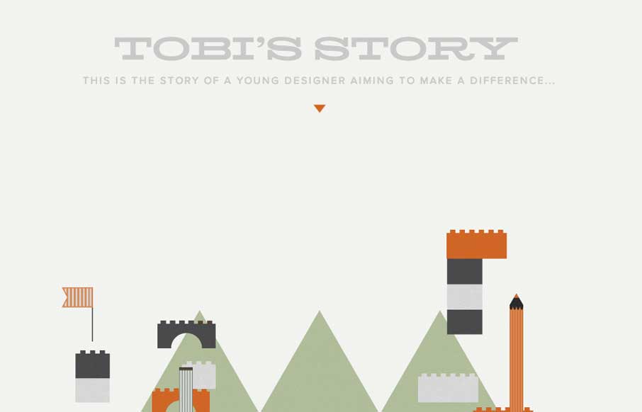
Toby’s Story
The Toby's Story site is just fun. There's really no functional aspect to it, like a call to action or newsletter signup but you know what I don't care. It's cute and exists solely just to be a fun little experiment. I always love seeing that there's someone out there...
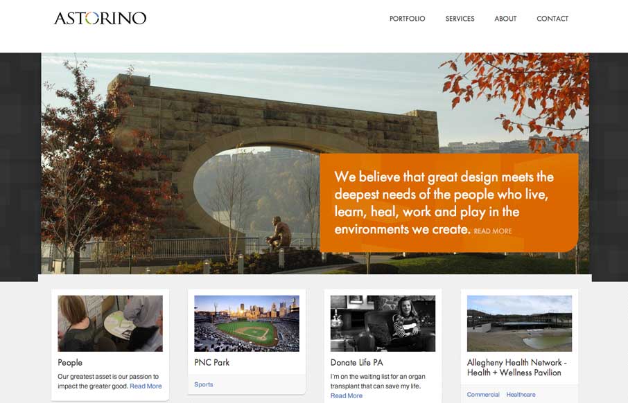
Astorino Architects
Great new site launched for Astorino Architects from the mighty Bearded Studio team. I love the clean layout and responsive design decisions made between the different screen widths. There's a good bit to study and apply from this sit to all of our projects....
Realtii
Realtii does a great job of using animation to focus the user's attention on key details. The colors are soft and friendly. A pleasant site with simple detailing.
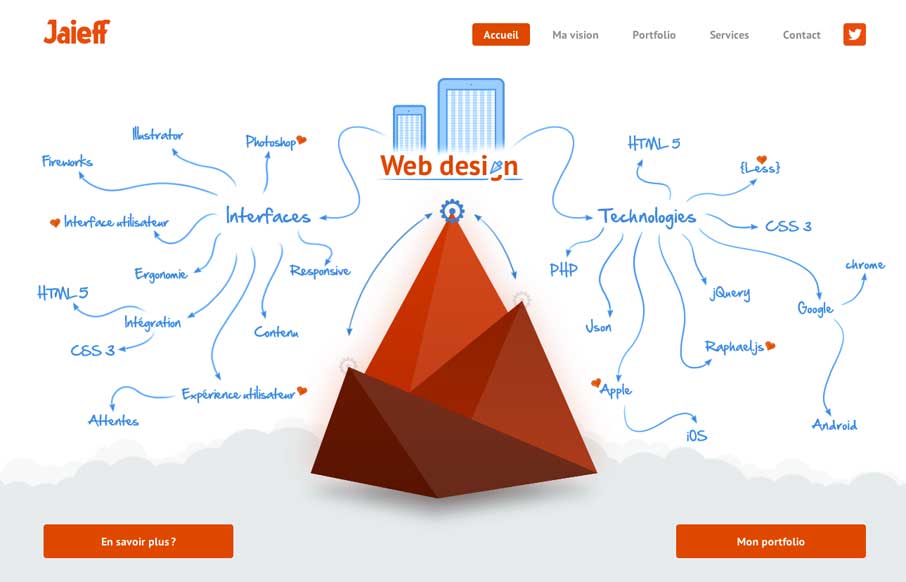
Jaieff
There's a lot to like about this website. But the best part is the interactive illustration on the home page. It's pretty fun to mouse over that little gear and get all the arrows and stuff to show up. Also check it out on smaller screen widths, the stuff that get's...
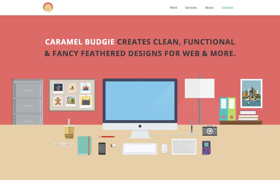
Caramel Budgie
Man I love these illustrations! Super slick and both clean and illustrative at the same time. I like that it's a single page layout - that works pretty well for this instance. Enough eye candy and simplicity to get the site to work for them.
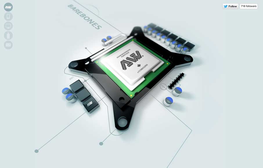
Adam Woodhouse
The Adam Woodhouse website is clearly a design intended to impress with lush, complex animations and a strong graphical sensibility. Not responsive, but beautiful nonetheless. Plus, Bender.
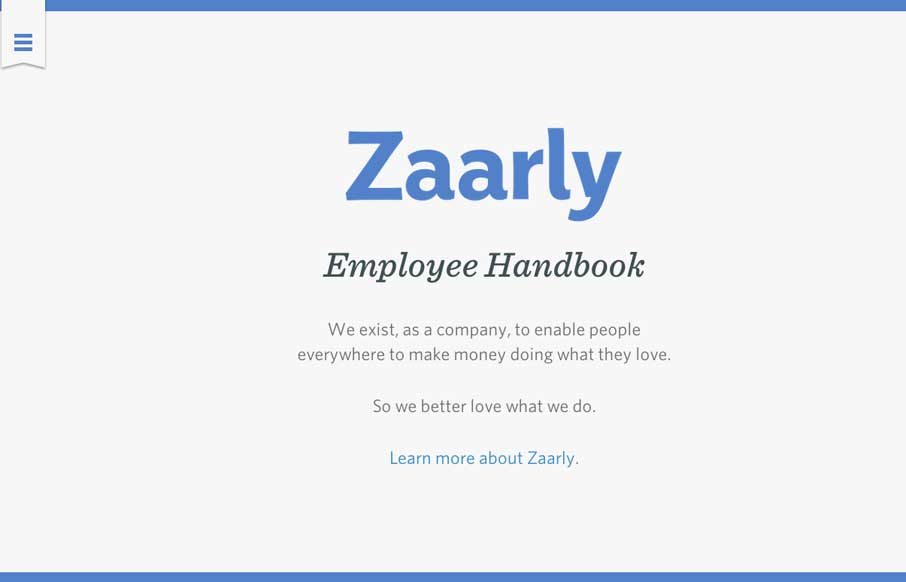
Zaarly Employee Handbook
Nothing super rule breaking about this but it's become commonplace for companies to put things like their employee handbook or benefits info on a website or resource like that. The Zaarly Employee Handbook is just sexy. Nothing more needed to say about it other than...
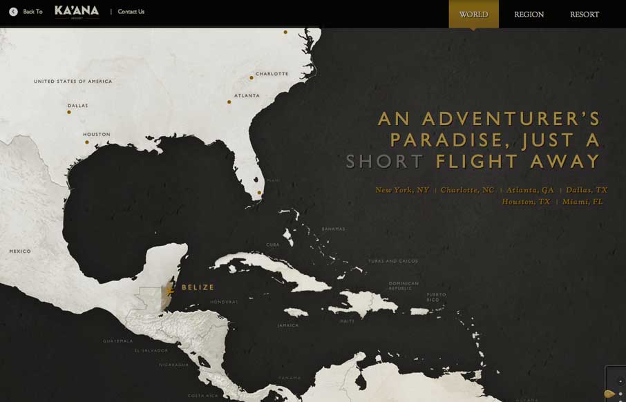
Ka’ana Resort
I can't recall where I saw this description for the map design from first (if it's you please let us know in the comments below) but I it sums it up perfectly: Awesome interactive travel map for Belize. Featuring three levels of zoom with css animations, jQuery photo...
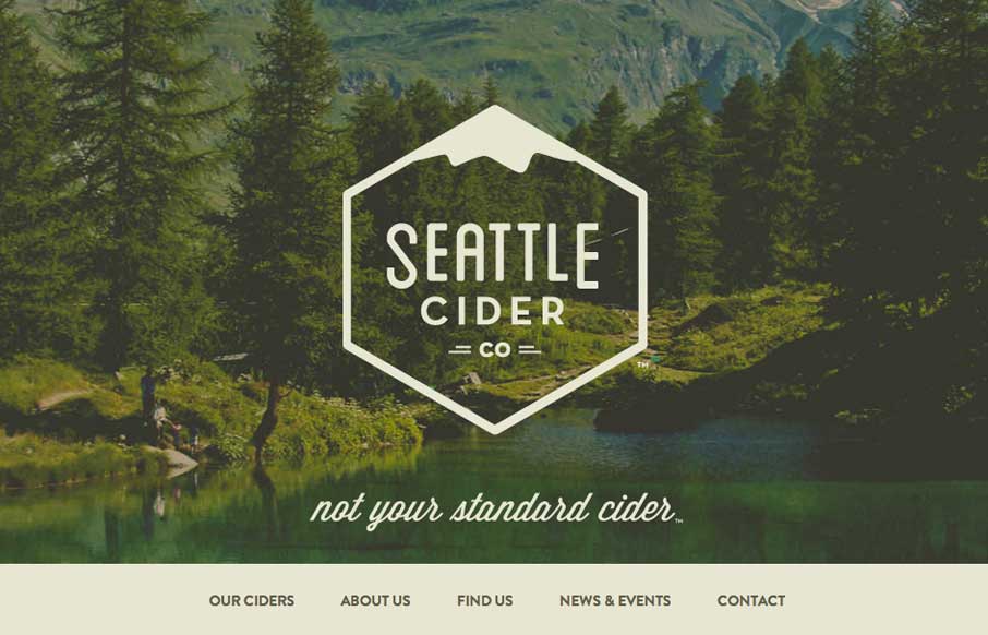
Seattle Cider Company
The Seattle Cider Company website uses flat illustrations and simple interactions to control the narrative of the cider making process. The design style is hip and minimal with a few nifty tricks (like the slide-in fixed nav) and a lot of character. The narrative...
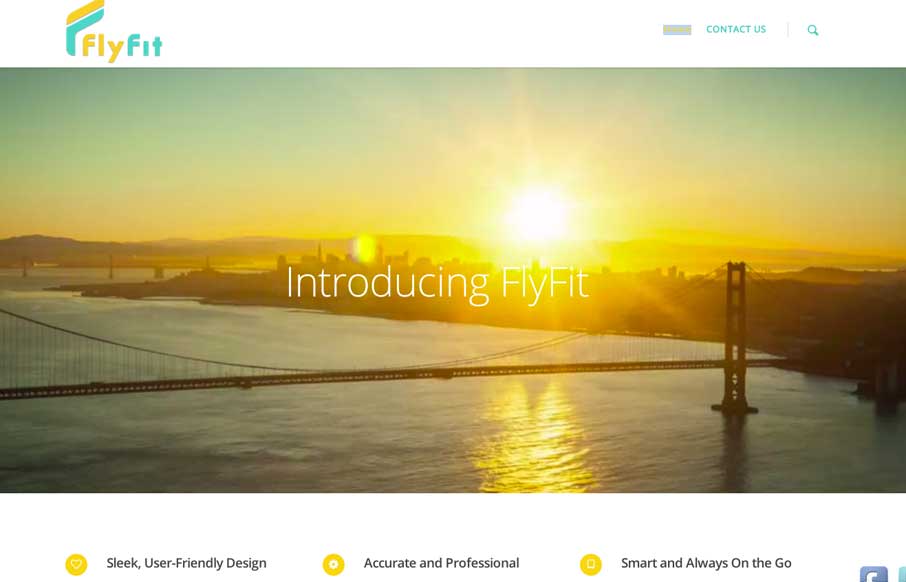
My Fly Fit
This is a fast loading video based site that was made for a large screen. It has subtle parallax elements that don't detract from the main video feature of the site. They could probably go with a cleaner social media linking system, but since it's a new product site,...
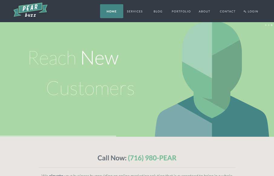
Pearbuzz
Love the colors and icon/illustration work on this site. The layout is pretty formulaic by design trend standards but sometimes that's okay and with well designed elements you can really make things sing.
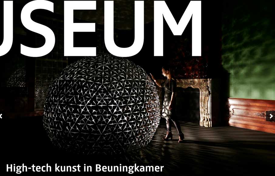
Rijks Museum
There is some really neat design stuff going on with this site. I love how the "Rijks Museum" overlays and play with the slider. Then the top nav is just fun to mess with. Nice responsive work here too.
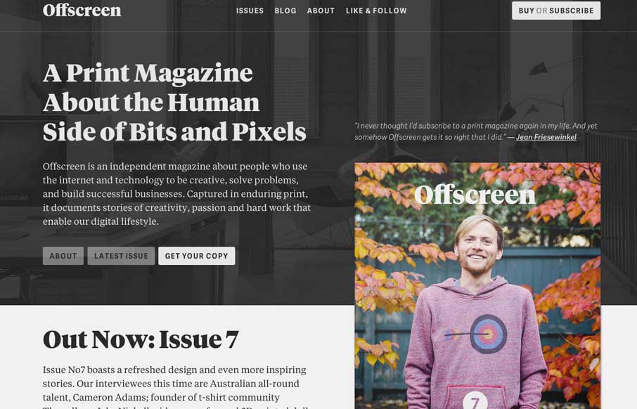
Offscreen Magazine
Offscreenmag.com looks great at all screen sizes. I really enjoy the balance of the typography and soft grays. The site does a great job of balancing a lot of information with a minimal design language. Simple and elegant. We get the mag and that's nifty too. 🙂
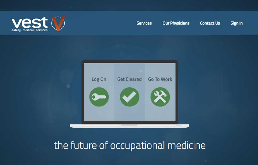
Vest
Vest provides a really nice loading experience, considering it is a site that transfers 1.4MB when loaded. The main view loads a simple graphic and then loads in the heavier images whenever they are a available. The effect is something like a load screen that doesn't...
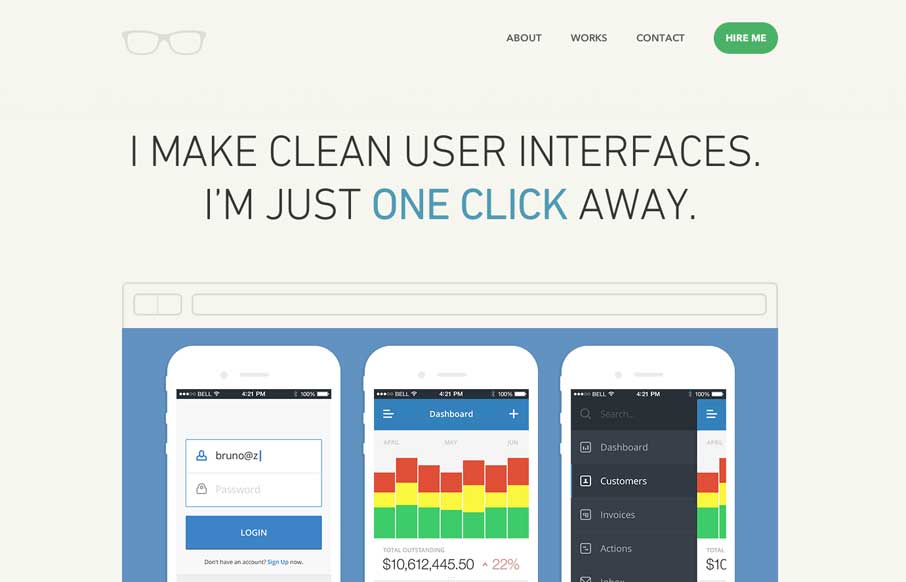
Bruno Felicio
Really simple minimal approach done well. I like the logo, then to see it used again on top of the guy's self-portrait illustration. Nice simple layout that let's me see the work really fast while looking engaging at the same time.
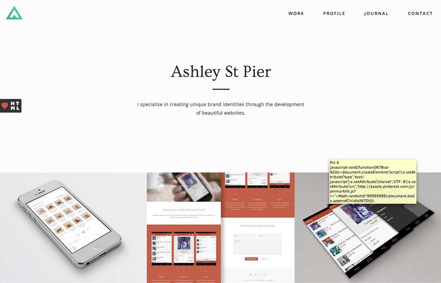
Ashley St Pier
Ashleystpier.com is big and beautiful. This kid is drinking the minimal Kool-Aid and it is working. Very nice portfolio site with minimal detailing and superb balance.
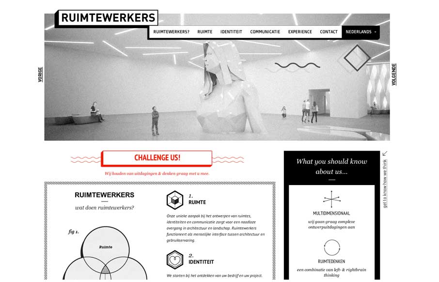
Ruimtewerkers
I like the stark black and white box design of this website. Very simple and clean yet it almost feels gritty due to the way the boxes are used. That fixed nav section is pretty slick. I like how it just folds down to "nav" for mobile screen widths too.
FAAL
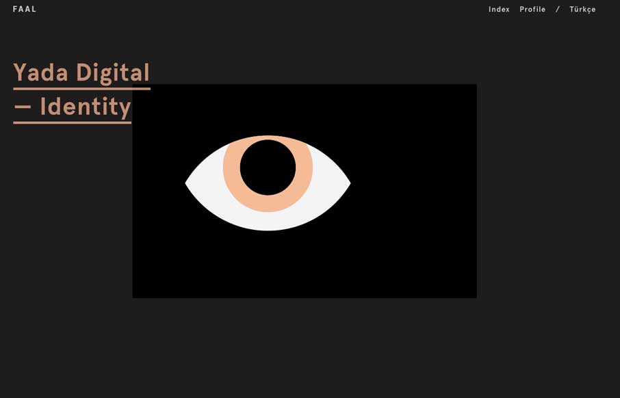
Very nice portfolio site. I really dig the dark design and the simple way the title of the work is presented overly large like that. Very cool.

