Web Design Inspiration Curated
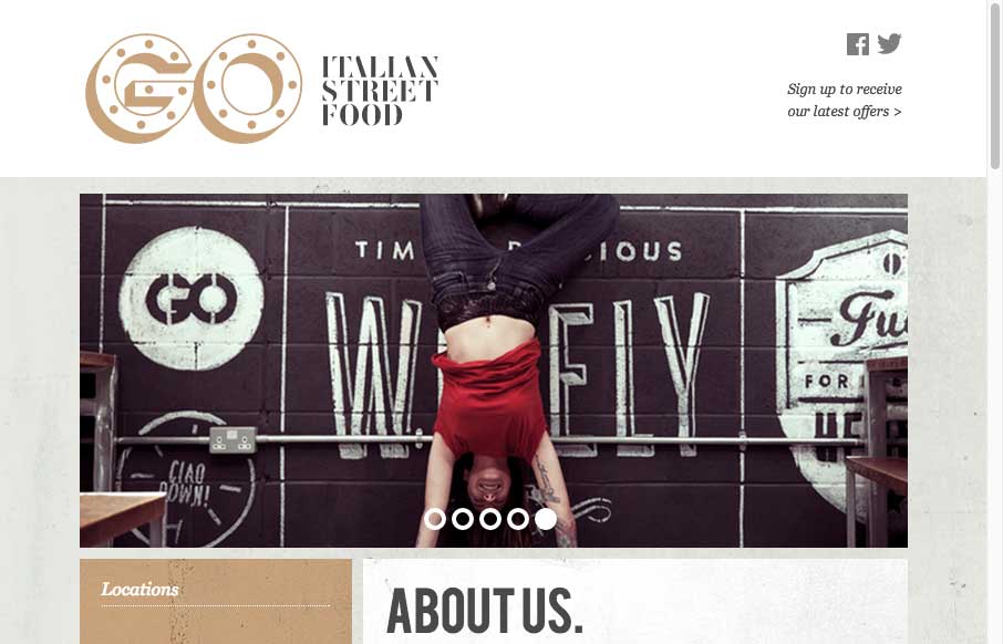
GO Food
Cool adaptive site design for GO Food. I dig all the illustration work and how it's been worked into the layout to feel really hand made like it does.
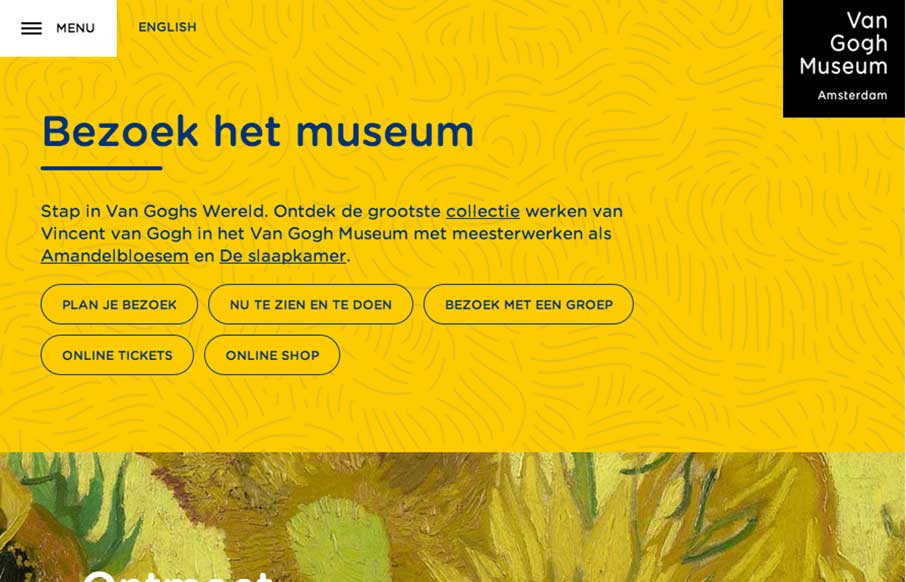
Van Gogh Museum
There is really a lot going on here with the Van Gogh Museum website. From the different design decisions made across the different screen widths to the navigation details. You really need to go spend some time clicking through this one guys.
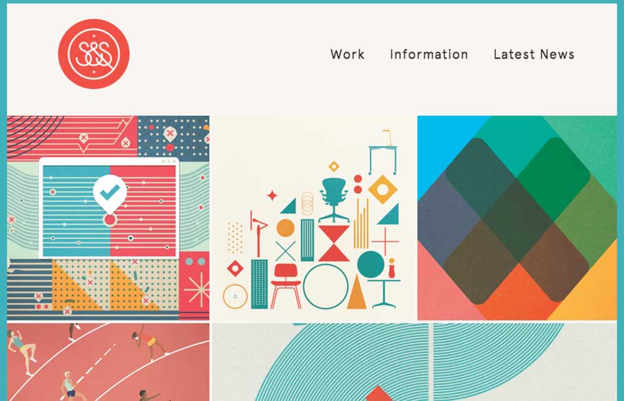
Script & Seal
Nice Masonry/Isotope type responsive effect here. Actually, digging into the code looks like it is Isotope... I like the usage of it here because it just feels a little different. Especially with the way the logo overlays on top of the images like that too as you...
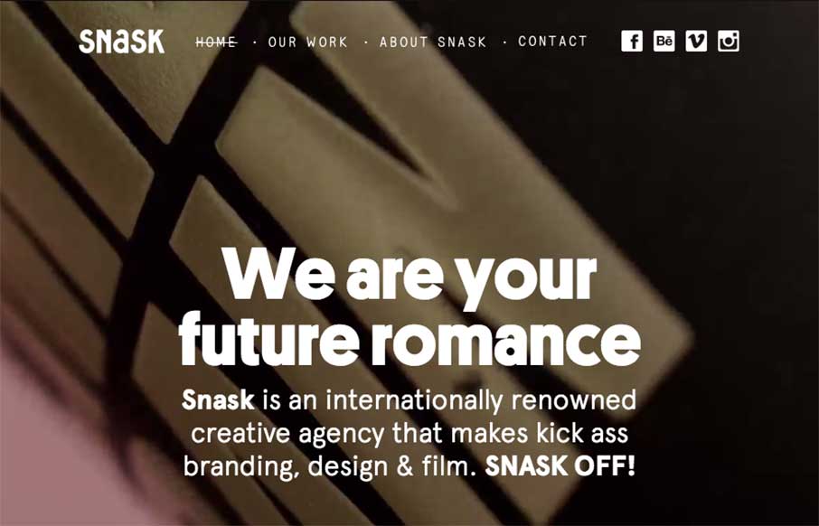
Snask
Some fairly straightforward design queues here on the Snask site. But I really really love the way the images are placed on the page. They just feel like they're embedded in the page somehow to me. Kinda like a nice offset printed page feels. Know what I mean? Maybe...
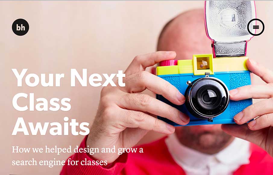
Brian Hoff Design
There are so many details that make up Brian Hoff's new site I don't know where to start. First off it's minimal at first glance which is what drew me in, then as you click around you start to discover there's some really rich content there about Brian's Design Studio...
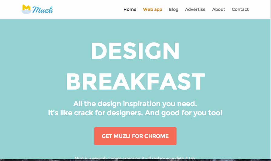
muz.li
Looks like a great resource, also looks like a nice site design for a product. I love the colors and fun little illustrations too. Good stuff here. Aaron Edit: Sorry... forgot the image... feel like Jonny from Airplane pulling the plug on the runway lights...
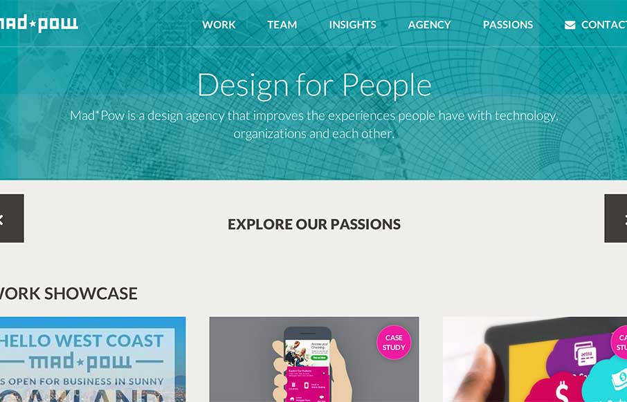
Mad*Pow
I like how Mad*Pow out of Portsmouth, NH has used their slider in a different fashion - less big image, more information. Also like how most of the coloring for the site comes from their examples of work - build a canvas, fill it up!
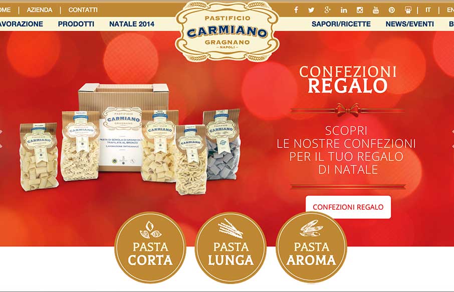
Pastificio Carmiano
I keep telling myself not to write reviews of food sites before lunch... did it again. The Pasta Factory Carmarthen Gragnano (or Il Pastificio Carmiano di Gragnano)'s site out of Italy takes a grand tour of pasta - I didn't know there were so many types. The site has...
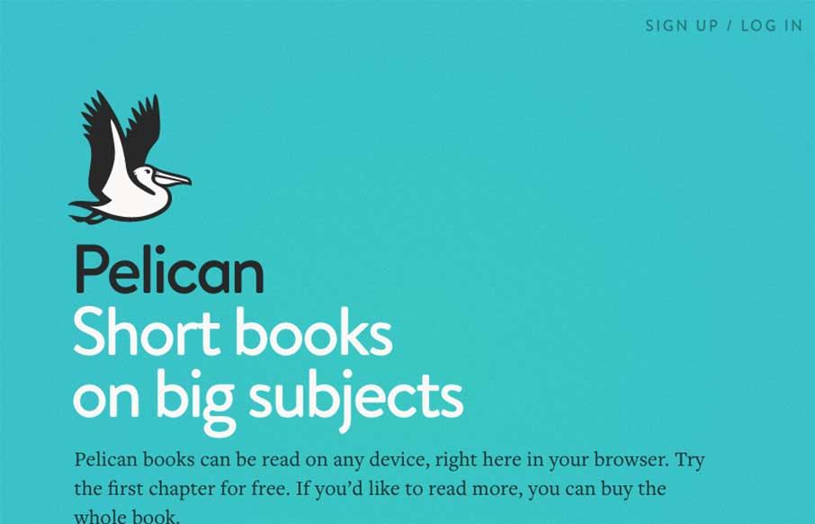
Pelican Books
Pelican's site, "an imprint of Penguin Books," has a very clear path of what they want you to discover and do. It's clean and classic in how it presents info, and makes me feel like the Pelican "app" will allow for an easier reader experience. Check out the About page...
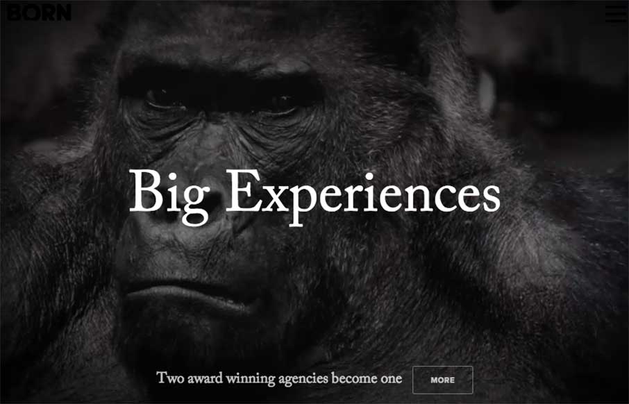
Born Group
OK - let's get the New Year started right! Here's a great site from the Born Group out of New York and London. Great contrast throughout the site that's exemplified with the video background of the 800 pound gorilla to start you out. Good off-screen navigation and...
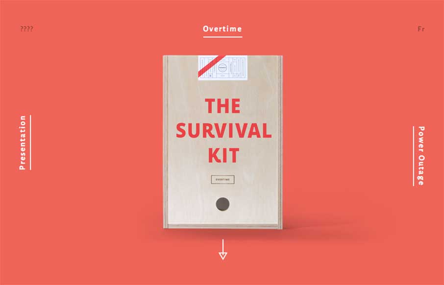
Agency Survival Kits
Fun and maybe appropriate way to end the year with Montreal's Phoenix Creative Studio's Agency Survival Kits. Basically - our normal MO during the last two weeks of the year for our client services part of our business, Period Three, we go minimal, and work on...
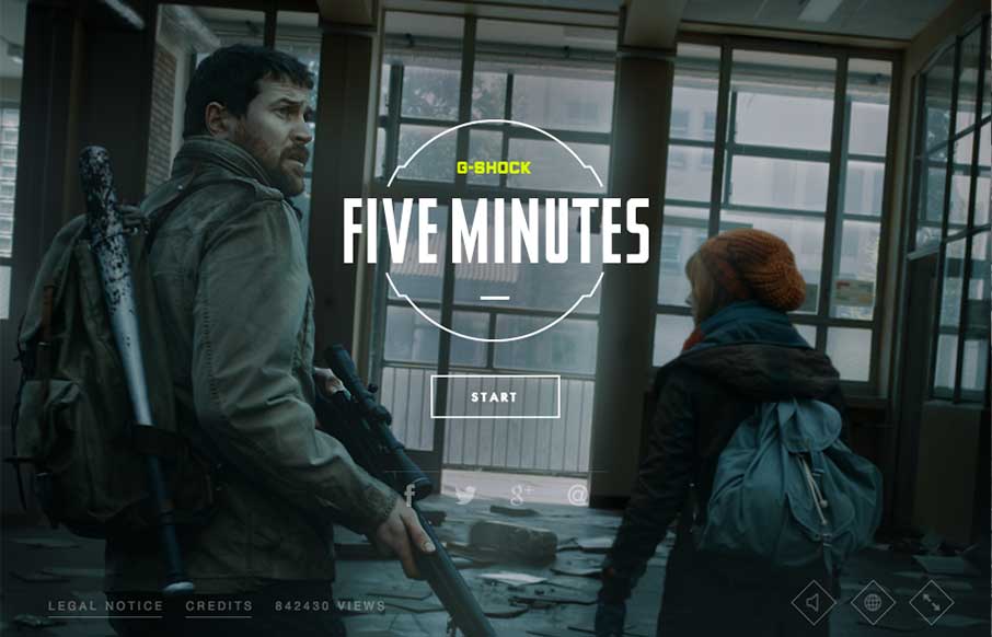
Five Minutes – G-Shock
New Years is a time of new beginnings. Each year at this time, billions of people try to re-ground themselves, decide what they'll focus on for the upcoming year (or couple of weeks...you know what I mean), and grow into that new person they want to be. So it's...
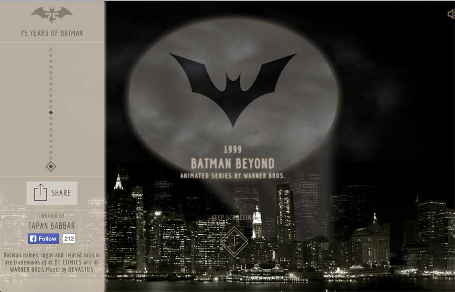
75 Years of Batman
I was working on some Top 10 posts for the end of the year, and stumbled onto Tapan Babbar's site: 75 Years of Batman. @tapanbabbar He made all of the Batman logos using CSS, with a little parallax thrown into Gotham itself. Pretty cool! And... if this and his other...
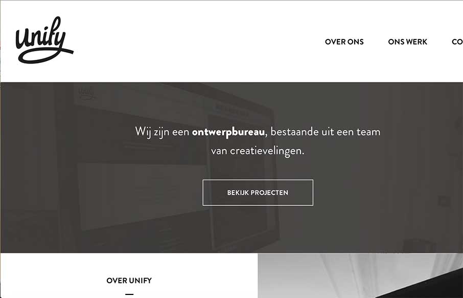
Unify Media
Very simple, clean, minimal site from Unify out of the Netherlands. What I really like is on their portfolio detail pages - they've posted they color palette and font's they used. Would be cool if they named the fonts too - but this way you can see how the parts come...
Google & NORAD Santa Tracker
No matter what you celebrate, or where you live, we here at UnmatchedStyle wish you the safest and warmest of holidays, and are looking forward to a great 2015 with all of you! In the website world - two of the most popular websites today, December 24th are the Google...
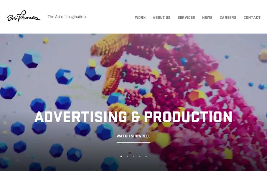
Ars Thanea
Crash, bang, wow! Ars Thanea's agency site is a visual assault on your senses - that's a good thing. The video background / slideshow on the home page actually makes you stay on the page / and watch a slideshow. Cool how when you mouse to the left or right of the...
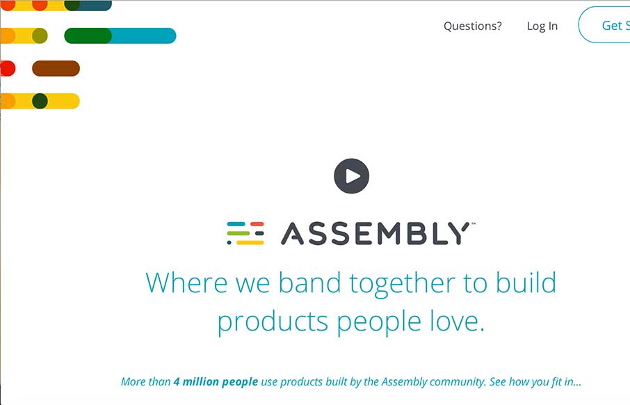
Assembly
Really cool concept here with Assembly - looks like a crowdsourcing site directed toward different design / development products, with shared revenue for participants. Love the white space with color accents. Interesting how the sticky header comes out when you scroll...
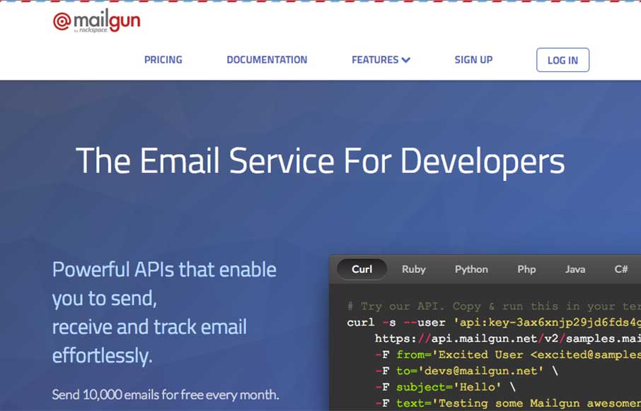
MailGun
Good interactive site from Rackspace with their new email service MailGun, that's more developer based. Lot's-o SVG work, some subtle animation on the logo, some on-scroll work - but the cool thing is how they present their API in the interactive area in different...
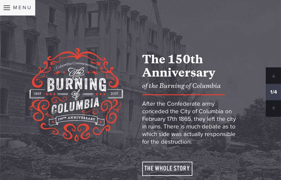
Burning of Columbia
This February marks the 150th anniversary of General Sherman's burning of Columbia, South Carolina. The City of Columbia is commemorating the rebirth and reconstruction of the Capital City through a series of events designed to appeal to history buffs from all over....
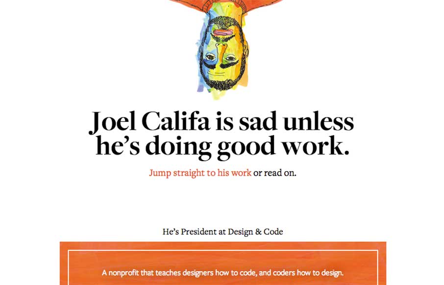
Joel Califa
Theme of the day is clean and simple. Joel Califa's portfolio site out of Brooklyn is exactly that. Love two main things: 1 - The "text-heavy portfolio" are really more than just "I did that" - there's a ton of detail on HOW he did everything, completely referenced....
EMAIL NEWSLETTER
News & Articles
Setting Up CodeKit for Sass
 How to use progressive tools like Sass without touching the command line.
jQuery Picture
 A review of jQuery Picture. A jQuery plugin to help ease the transition to responsive images.
Template Giveaway: Responsive HTML5/CSS3 Website
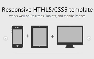 Special thanks to the Web Code Builder team for putting this Resonsive website template together for us all to download for free.

HARD WORK. CLEAN FUEL. NO EXCUSES
Use “WARRIOR2023″ for 10% off.