Web Design Inspiration Curated
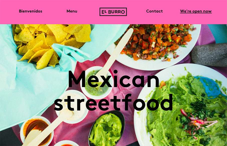
El Burro Oslo
Tacos in Oslo.. yep. When I lived in Australia, getting Mexican food was always hit or miss - so hope El Burro's food is as good as their website. BTW - this is a great one-pager for a restaurant (which we've said before... restaurant websites usually stink). I'm not...
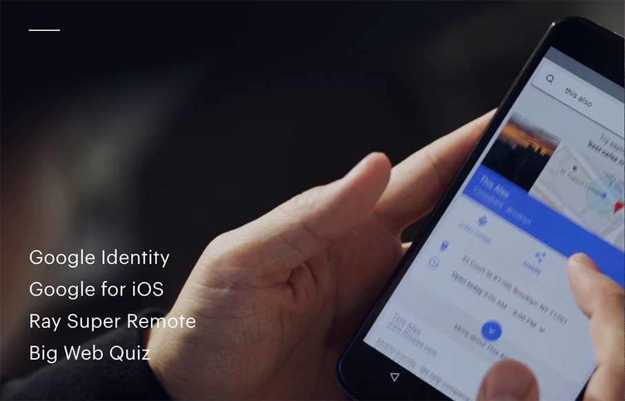
This Also
Awesome site from This Also out of Brooklyn. Great home page with video background - great use of navigation that is hamburger, but it's not - and great way of each page always leading back to the home page, but it's also the footer, that's the home page... cool.
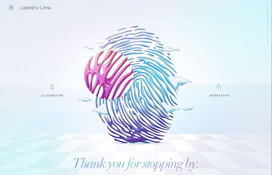
Leandro Lima
Leandro Lima, out of Barcelona has some great work highlighted here - especially the illustration side of the site. I also like the look and motion of the hamburger drawer on the left.
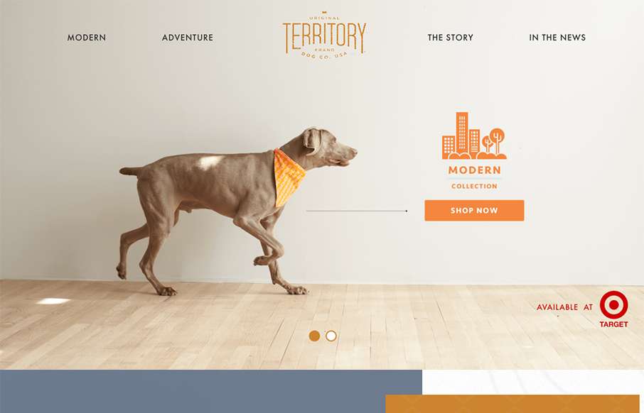
Original Territory
Love the texture that's woven into this site - both fore- and background, for Original Territory Brand Dog Co out of White Plains, NY. Cool little icon work on the nav too.
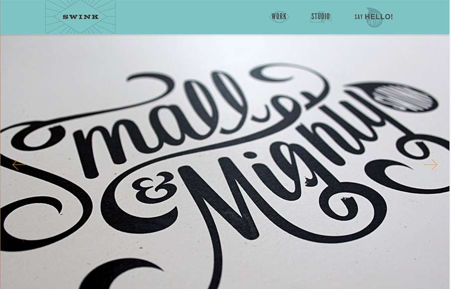
Swink
This studio / agency site for Swink out of Wisconsin is pretty sweet. We're rebuilding our client services site - and this is great inspiration (we won't steal, we promise). Love the font work and letterpress style of the site.
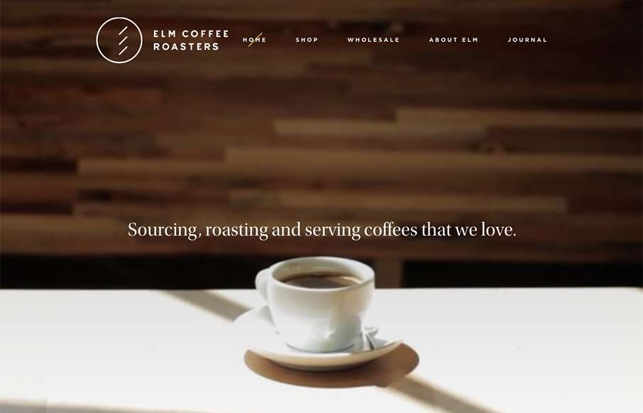
Elm Coffee Roasters
As I was setting up the review for Elm Coffee Roasters out of Seattle - I found myself stopping, and going to get coffee at least twice... I guess the marketing is working. Great design - clean and simple, with video background on top - excellent!
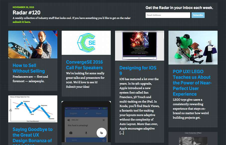
Radar #120
Each week, we do a round up of curated "stuff from the interwebs" that we call Radar. In this week's 120th Radar: How to Sell Without Selling Freelancers are — first and foremost — salespeople. ConvergeSE 2016 Call For Speakers We’re looking for some really great...
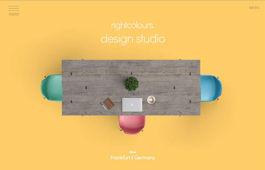
Right Colours
Quick, clean agency site from rightcolours out of Frankfurt, Germany. I wish it was responsive, but I like the big images on each page.
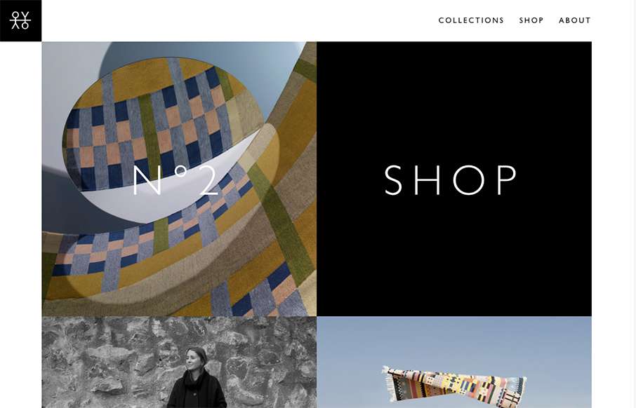
Oyyo
I love the speed of the Oyyo website out of Stockholm. The transitions are quick, and the site is neat and simple.
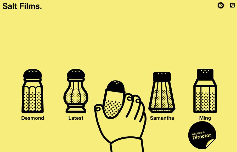
Salt Films
Very unique way to interact with the website, i'm 50/50 on liking it or what. I do think it's very memorable and probably converts clients very well.
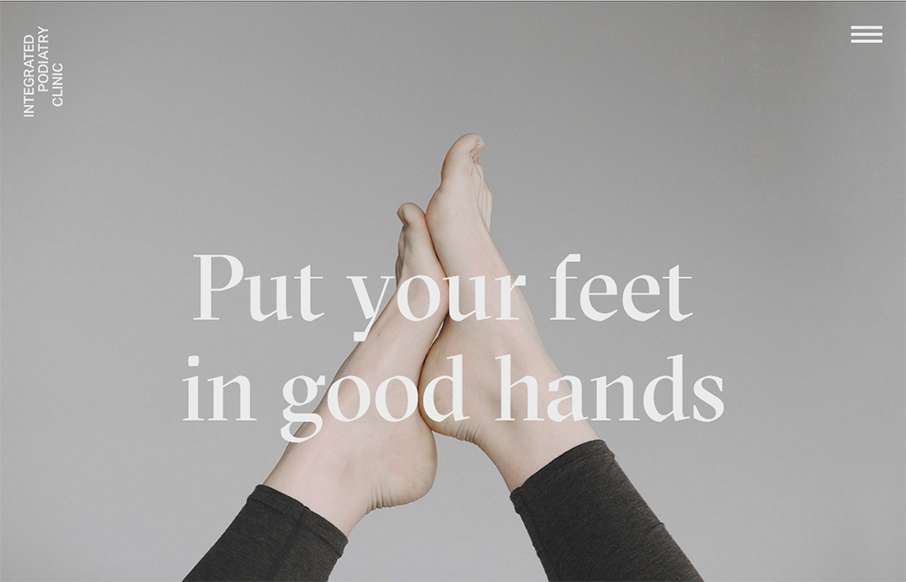
Integrated Podiatry
Super rad website for a Podiatry clinic. You just don't see this type of design being brought to client's like these. Superb work on making something mundane feel really hip and new.
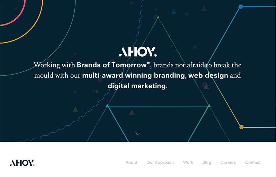
Ahoy
I love the dark field with the geometric shapes art. Pretty snazzy stuff. I really dig the way the content is blocked out on the home page too. I've never seen something like they're doing with the "call our account director" content block before either, that seems...
Digital Kitchen
If you like lavish visuals and solid yet simple typography then the DK site is for you. It's chock full of custom videography and really is a clinic for us all to see how to use it within a web page. Solid work and really solid website for this digital firm. (This is...
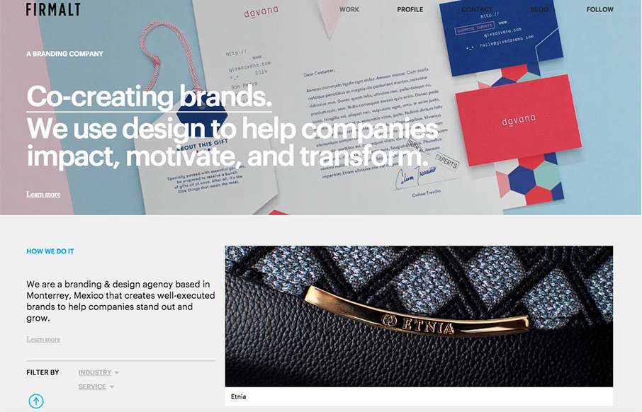
Firmalt
Nice grid based layout for Firmalt. I like the Masonry like treatment of the main image blocks as you scroll down the page and shift screen sizes. Nice solid simple layout always wins!
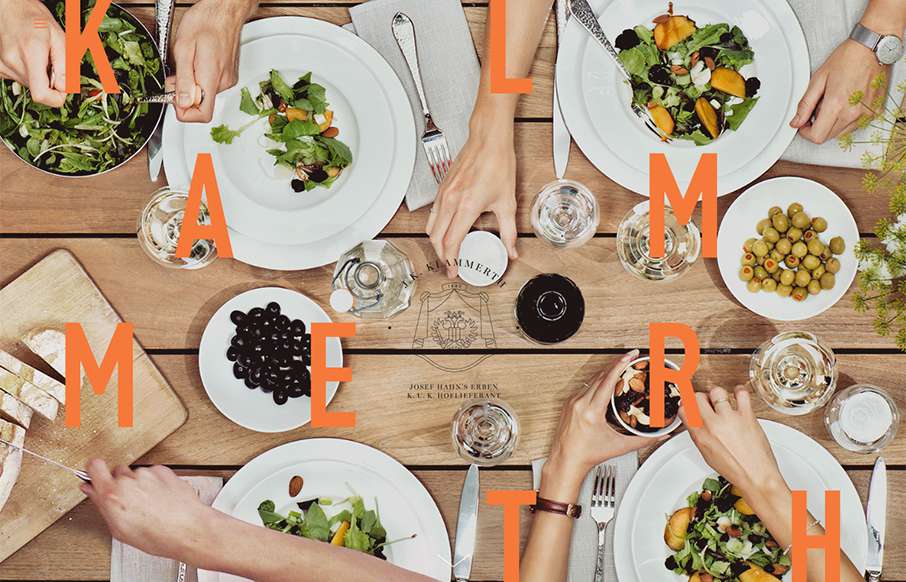
Klammerth
Holy hell I love this site design. The way the main hero area/image merges into the main site is brilliantly done. Then the rest of the layout is invigorating. Do me a favor, just spend some time on this site and tell me what you think!
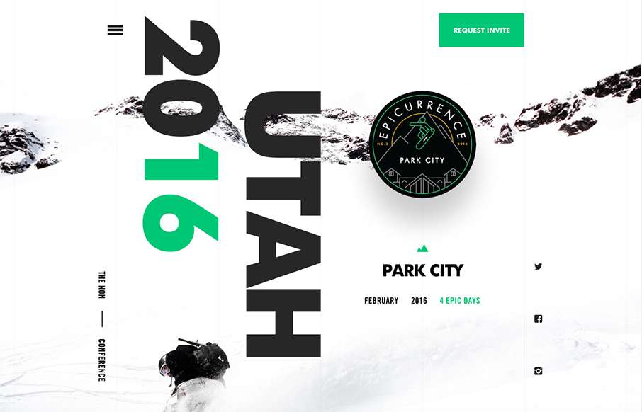
Epicurrence
Holy cow I love this. I love the interactions and the pieces that move around as you scroll. It feels quick to respond and looks pretty dang unique too. Definitely a memorable site design. Also, I want to go. 🙂
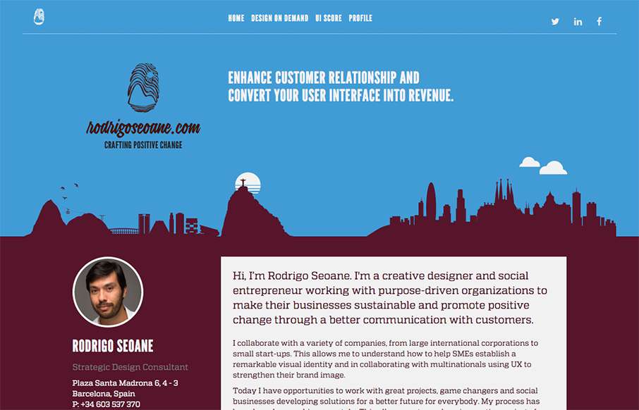
Crafting Positive Change
At first this site design looks fairly classic in its layout. I dig the smaller changes to it in that respect. Some good looking graphic devices to help communicate what he does is smart. I also dig the colors. From the Designer: Hi, I’m Rodrigo Seoane. I'm a creative...
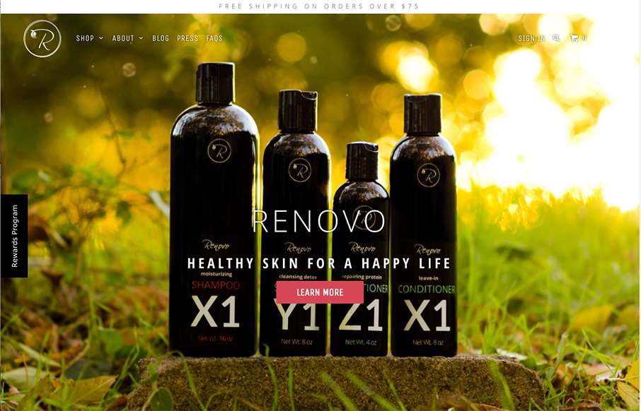
Renovo
Some great photography set fixed in the background like this can go a long way for engagement. I also dig the first run animated fade in images down the page. Pretty strong layout. From the Designer: This beautiful site came to be after months of trial and error. We...
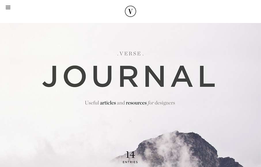
Verse
Really nice type based design to get you excited. I love the simplicity and the centered text layout too. Beautiful typography FTW!
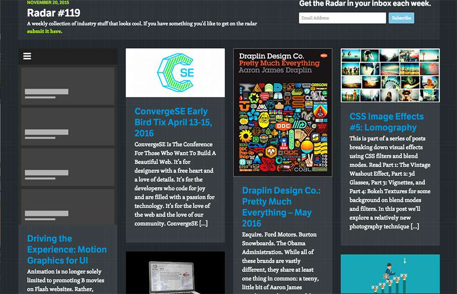
Radar #119
In this week's 119th Radar: Driving the Experience: Motion Graphics for UI Animation is no longer solely limited to promoting B movies on Flash websites. Rather, animation is quickly assuming a useful and important role in user experiences. Now, users can rely on...
EMAIL NEWSLETTER
News & Articles
BizCraft Episode 36: With Jenn Lukas & Val Head
 In this episode of BizCraft we do a cross-over show with the Ladies in Tech hosts Jenn Lukas & Val Head. We talk about public speaking, conference stuff and more.
100 Free Vector Icons From Streamline Icons
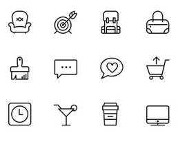 Download a free set of vector icons from Streamline Icons. Also leave a comment to be entered to win one of 3 full Streamline Icon packs.
Height-Based Media Queries
 Height-based media queries are a powerful and underutilized tool. Take a look at why and how you can roll some of your own into your next project.

HARD WORK. CLEAN FUEL. NO EXCUSES
Use “WARRIOR2023″ for 10% off.