Web Design Inspiration Curated
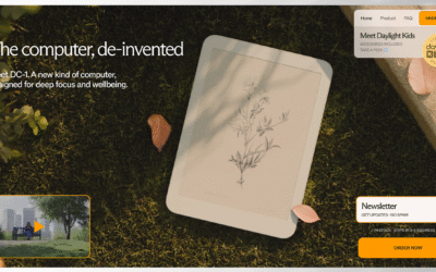
Daylight
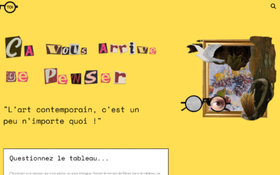
Art-Toi
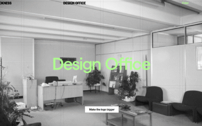
Design Office
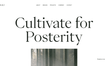
ANAI
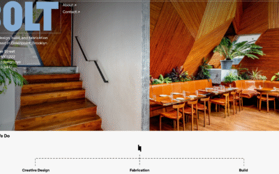
Bolt Design
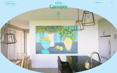
Villa Canopée
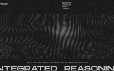
Integrated Reasoning
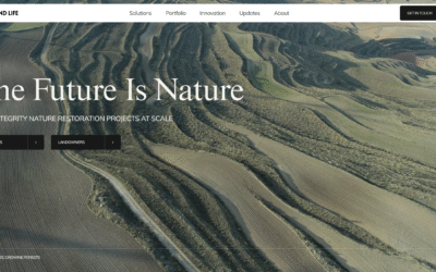
LAND LIFE
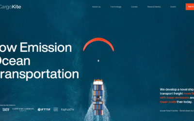
CargoKite
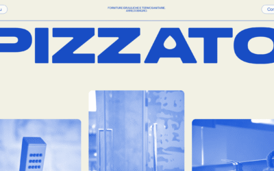
Pizzato
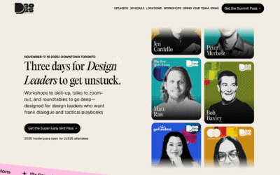
Design Leadership Summit
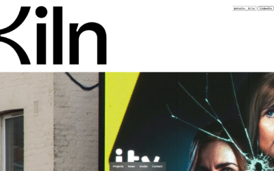
Studio Kiln
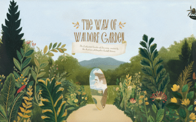
The Way of Waldorf Garden
A magical story about Rudolf Steiner
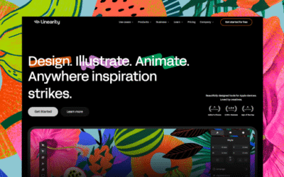
Linearity
A redesign for Linearity’s website, shifting away from a marketing-led B2B approach to speak directly to illustrators, designers, and motion creators using Curve and Move.
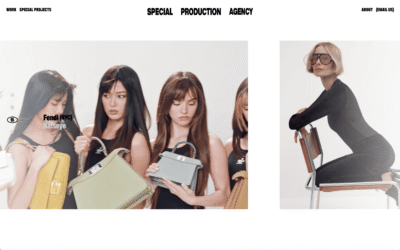
SPA
We designed and developed the website for production agency SPA, giving the fast growing agency a strong digital home to present their work to potential clients and partners. Pages layer on top of one another like posters on a wall, creating a continuous flow that reflects the pace and energy of production. The result is a dynamic yet efficient platform that makes SPA’s projects easy to explore and positions the studio with impact.
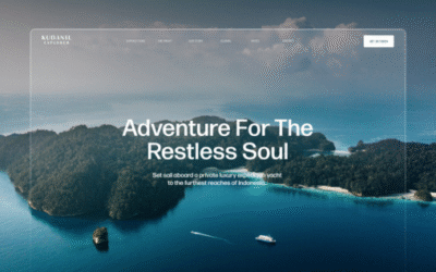
Kuanil Explorer
A digital home for Kudanil Explorer, Indonesia’s leading private expedition yacht. Designed to showcase the country’s raw beauty and the refined adventure that defines Kudanil’s journeys.
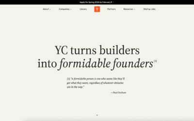
Y Combinator

OneMohrTime Design Studio
A responsive, performance-driven, and accessible website that was designed & developed by Derek Mohr, to showcase web design and branding projects.
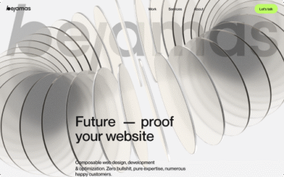
Bejamas
Bejamas is a modern web agency specializing in high-performance, design-driven websites. Their work combines technical excellence, minimalist aesthetics, and storytelling – creating fast, scalable digital experiences that balance clarity, creativity, and cutting-edge development.
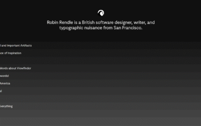
Robin Rendle
EMAIL NEWSLETTER
News & Articles

How CX (Customer Experience) Can Combat Customer Churn
A seamless customer experience (CX) can reduce churn and boost retention. Discover essential design strategies that transform frustrating user journeys into engaging, personalized experiences that build loyalty and trust.

Is Graphic Design Dead?
Graphic design isn’t dead, it’s evolving. Inspired by a Threads post, this piece dives into the art vs. design debate, AI’s impact, and why selling your value matters.
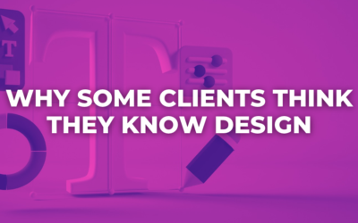
Why Some Clients Think They Know Design (And How to Keep the Project on Track)
Ever wonder why some clients over-explain or dodge your questions? Learn how to navigate unclear client communication and keep your design projects on track with practical, experience-based strategies.

HARD WORK. CLEAN FUEL. NO EXCUSES
Use “WARRIOR2023″ for 10% off.