Web Design Inspiration Curated
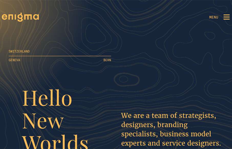
enigma
This enigma website is gorgeous. I love the header and the way it moves and contracts as you scroll down. Brilliant visuals, yet simple, as you make your way down the page. The light line work is so clean and lovely.
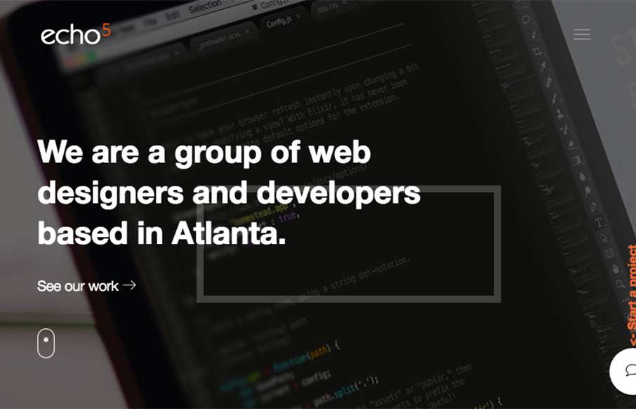
Echo 5
Nice looking website, that takes a lot of well worn design patterns and uses them in a classic and good looking way. I dig the overall presentation that you get when you give this site a once over. Good work. From the Designer: It's modern and clean, more intuitive...
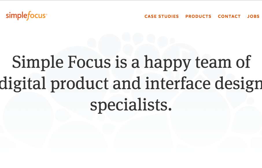
Simplefocus
Pretty cool, minimal vibe, to the Simplefocus website. I've been a fan of their work for a good while - even back before they were called Simplefocus. So to see the evolution they've gone through over the years has been awesome.
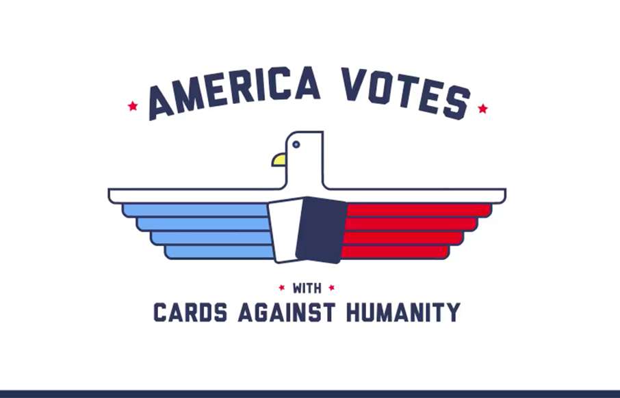
America Votes with CAH
Hands down, one of the funniest things i've seen on the internet in a while. It is also a pretty well designed and put together website. Bravo.
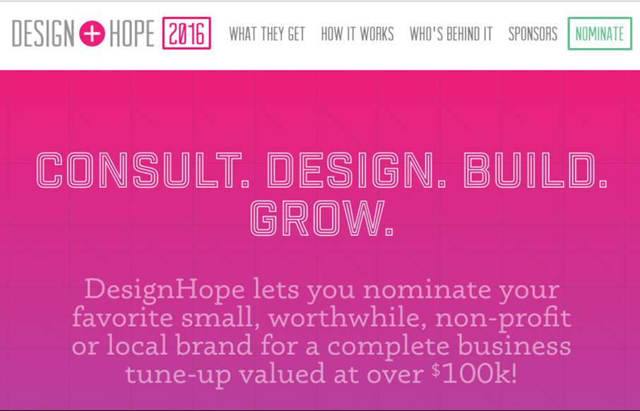
Design Hope
Nice effort on the Design Hope website. I dig this simple, easy to read, website design. Good photography and easy copy make it super simple to get the point and get going. I wish these guys well.
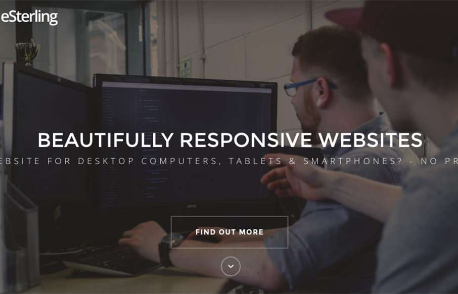
eSterling
Super straight forward layout on the home page, but chock full of all you need to see. I like that, not relying on a potential client to click around, just scroll and read. These guys aren't scared to give you some content either. Show's they are serious in their...
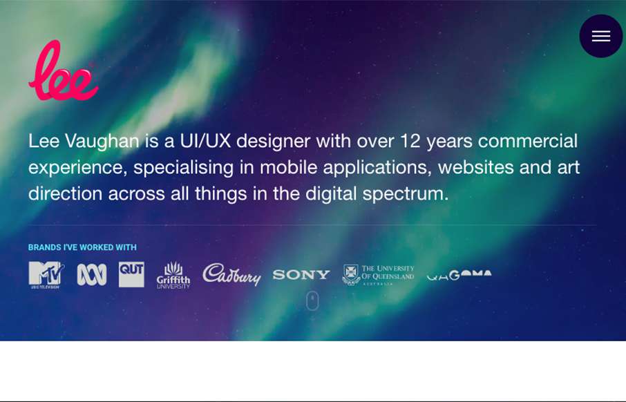
Lee Vaughan
Very cool. I like the fade-in loading of the section images. I also really like the skills graphing breakdown. Pretty clever. Role: Designer & Developer Country: Australia
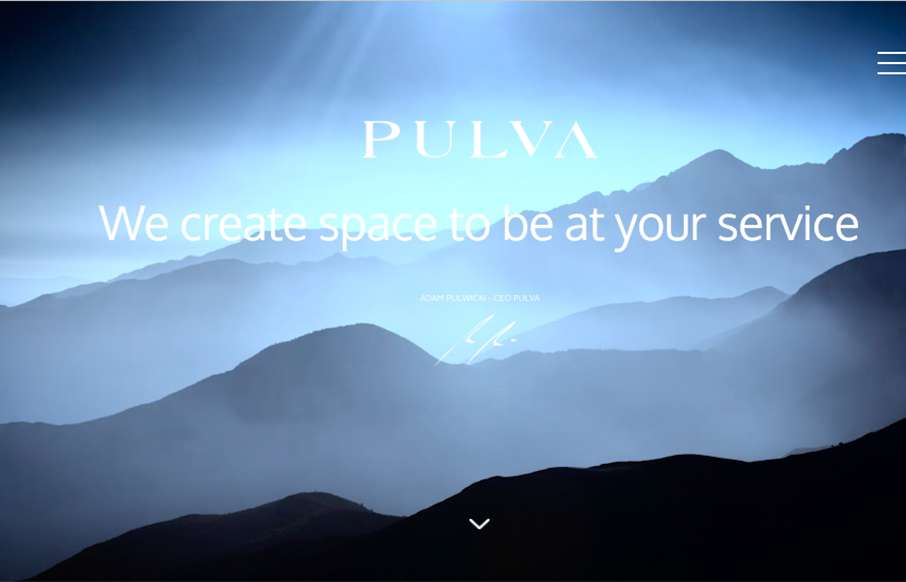
PULVA
Can't tell if this is a theme or not, but regardless it's nice. I like the groupings and layout of the picture sections. That's really nice and gives us a nice asymmetrical look that really makes you take note. Submitted by: Lucyna Eich Role: PR Manager Country:...
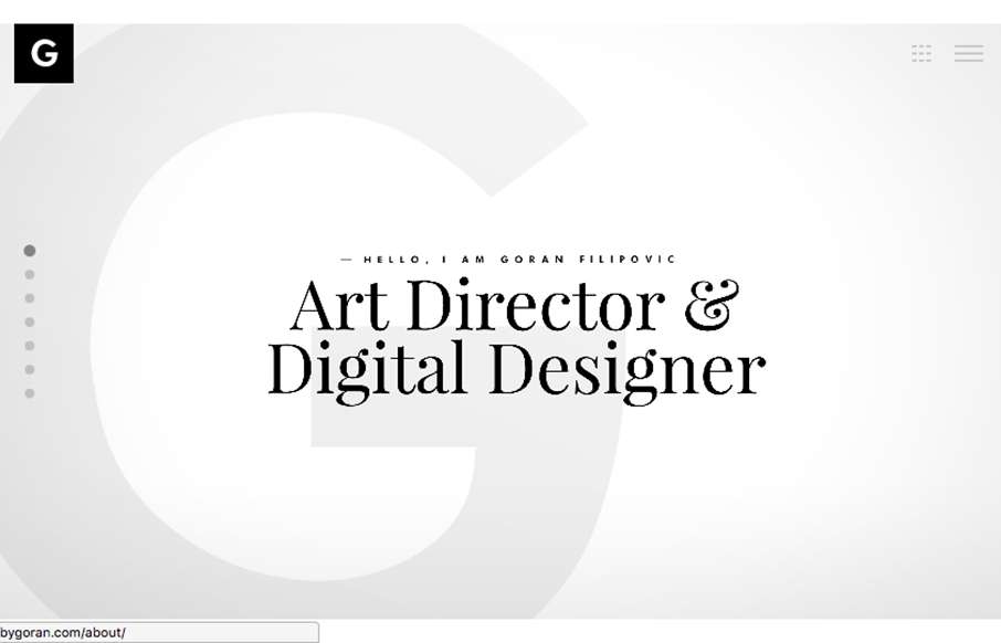
MadeByGoran
Pretty nifty approach. The site largely exists as a slideshow. You could pretty much use it as a slide deck when you're talking with a client. I like that. Clever sectioning of the case study project displays as well. Submitted by: G Filipovic Role: Designer &...
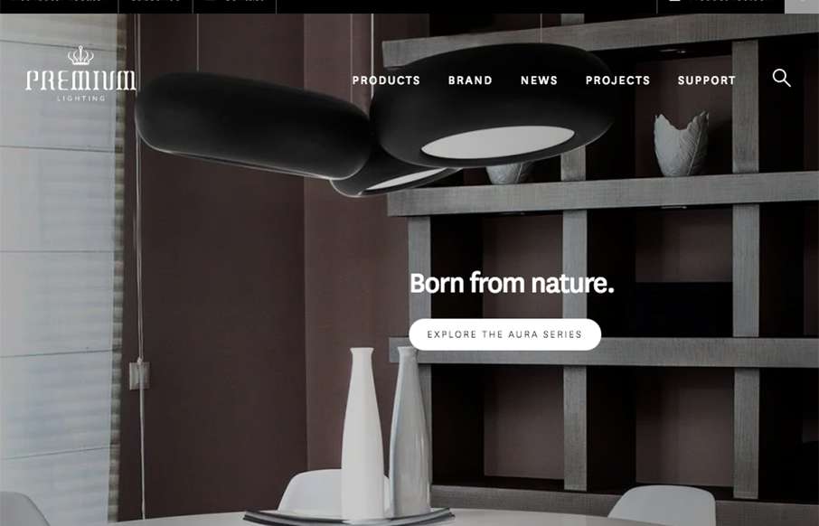
Premium Lighting
Likely a theme but nonetheless it's a nice site design. I really dig the photo placement and grid approach. I like the sectioning of the home page, content is grouped nicely and the sections are all well thought out. From the Designer: Premium Lighting specialise in...
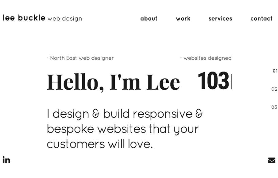
Lee Buckle
Such a smart site design for Lee Buckle's portfolio. I dig the way the navigation works, simple links and then as you scroll you get the "more" hamburger thing. Simply smart. I also really like the overall break down of info into the 3 main sections that's done on the...
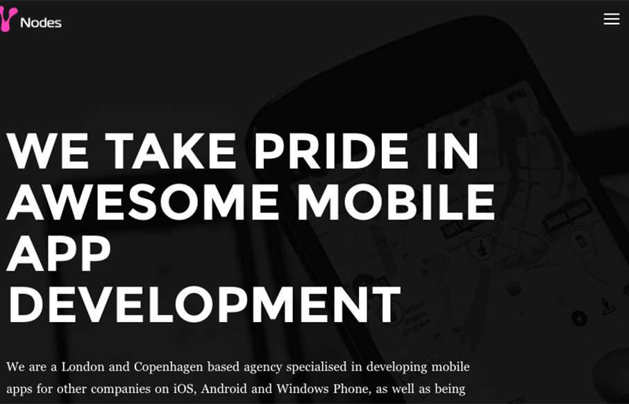
Nodes Agency
Pretty cool "straight up" looking design for Nodes Agency. I like the rigid blockiness to it with the dark vibe and professional looking work images. Strong look. From the Designer: We've developed this one-page inspired website with WordPress, Varnish and a bunch of...
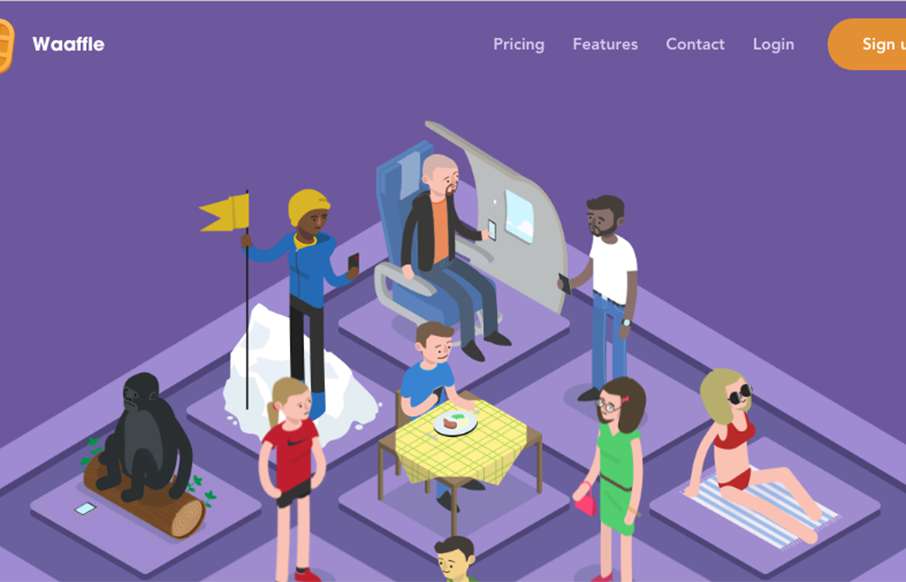
Waaffle
Really fun looking website for Waaffle. It takes it's name not at all too seriously which is great and delivers fun illustrations that help tell the story of what the thing does. I like the timed scrolling imagery and the overall brand/vibe a great deal on Waaffle....
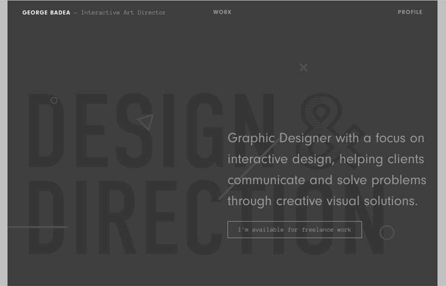
George Badea
"Graphic Designer with a focus on interactive design, helping clients communicate and solve problems through creative visual solutions." It's not often I see a website design for a designer/portfolio that truly does/believes in their own tagline. This site does just...
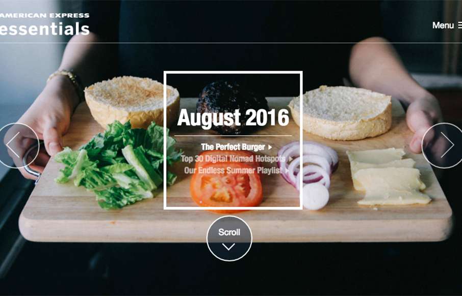
Amex Essentials
Pretty nifty, big commercial, project. I dig the details worked into the design/interactions and the overall way it's presented visually. Cool looking project. American Express Essentials is the definitive digital compendium of the best and brightest new ideas....
Luc Van Loon
Pretty rad idea to put the work first! Seriously, i'm surprised every day by how that's not the first priority on most designer's websites. Sell your work first, right?
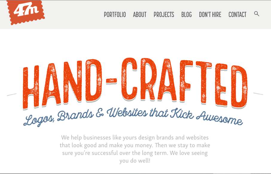
47 Media
Pretty stellar work on the 47media website. I love the brand's tone and the way the visuals really support that first and foremost. The site's content is really well done and thought through, all the way down to the customized photography. Bravo!
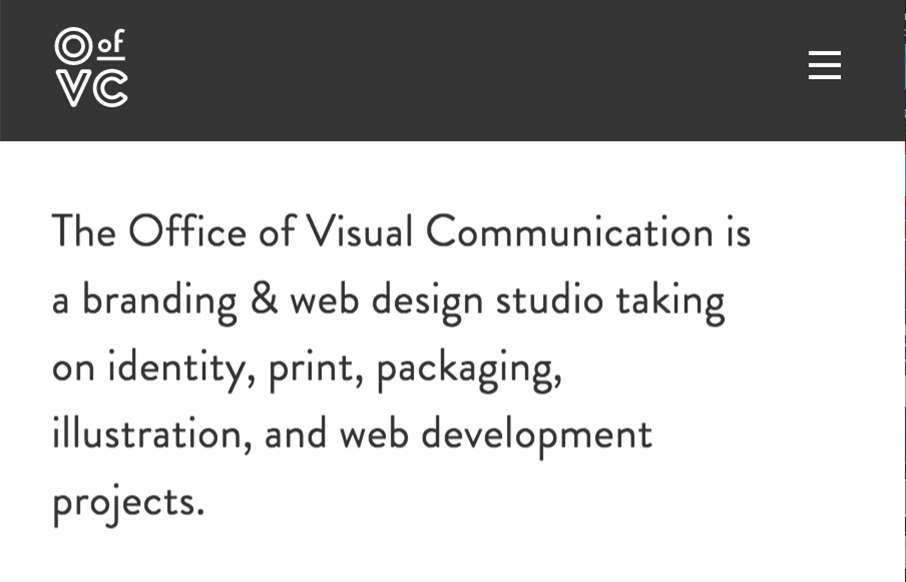
O.V.C.
Man, I love the name of this company. The graphic design is so on point too. I love this in every way. Submitted by: Brandon Vaughn Role: Designer & Developer Country: United States
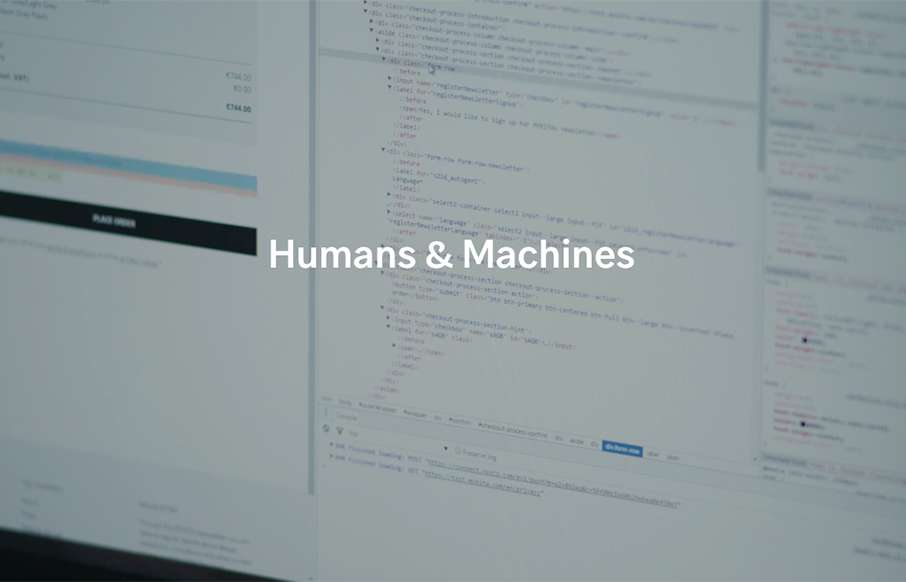
Humans & Machines
I like the minimal approach to the Humans & Machines website design. I also really dig the timed scrolling interactions, it doesn't feel at all like it's taking over my scrolling experience and is really smooth. Humans & Machines is an independent design and...
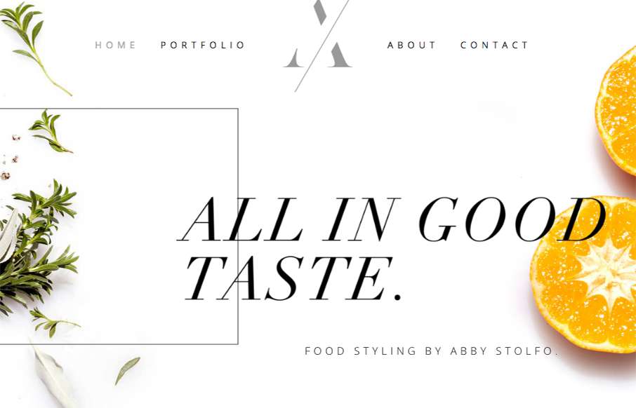
Abby Stolfo
Good design matched up with some good photography and nice flourishy details make this site really sing. I dig the overall vibe and tone. Good looking site design.
EMAIL NEWSLETTER
News & Articles
Grunt While You Work
 Giovanni DiFeterici runs you through the why, and how to set up Grunt.js, a JavaScript Task Runner – a bit of javascript code that runs other bits of javascript code.
What is the Value of Content in Today’s Web Industry?
 Listen to Sara Wachter-Boettcher talk about how to create meaningful content that connects with audiences on a broad range of devices, now and into the future.
Web Design Trends 2015
 We share a few of the UMS’ staff predictions for 2015 design trends, give you links and summaries to other designer / sites predictions and ask you to participate by answering a quick survey.

HARD WORK. CLEAN FUEL. NO EXCUSES
Use “WARRIOR2023″ for 10% off.