Web Design Inspiration Curated
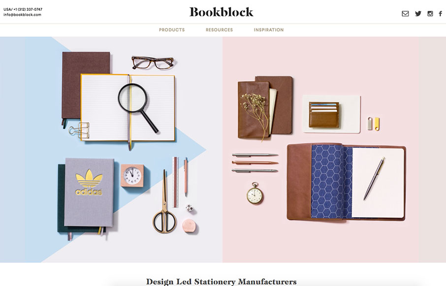
Bookblock
Well done, highly detailed product website. The Bookblock site is a fine example of imagery and illustrative elements together to meld very nicely. I love the details and simple animations. It draws you in and makes you want to find out more about the product. Bravo....
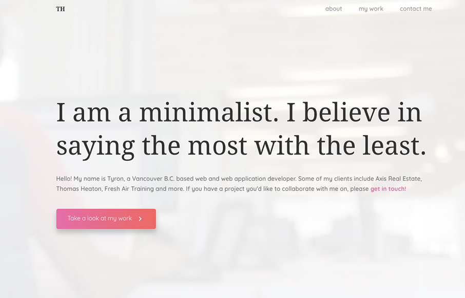
Tyron Hayman
I love minimal design when it's done right. The hard part with it, is just that, to get it right. Tyron Hayman does here and in a beautifully elegant way. Love this. I designed and developed this website to shocase my portfolio. The design focuses on clean use of...
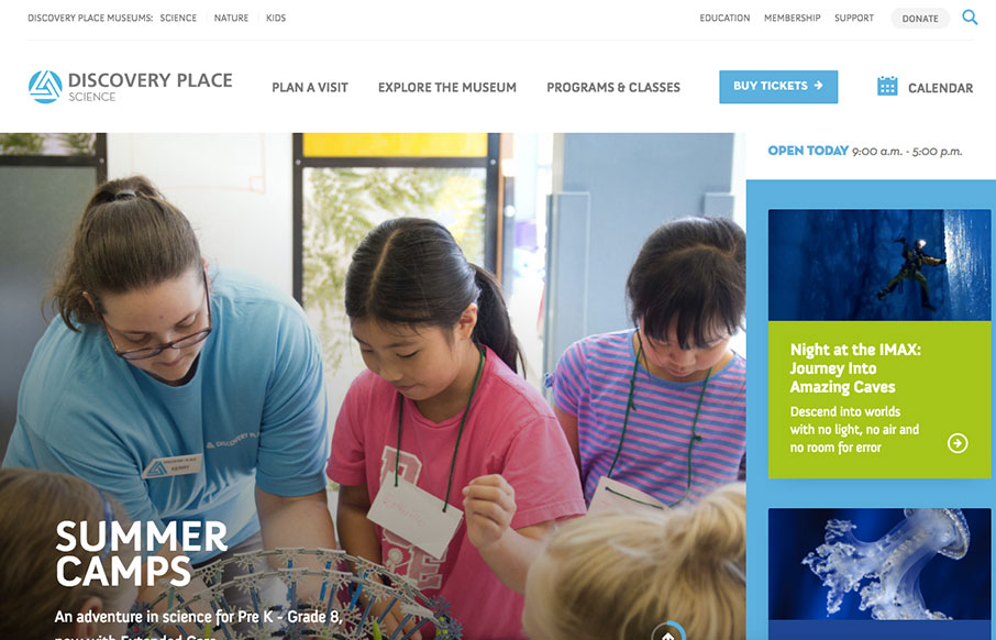
Discovery Place Science
Man, I love this website. Solid work top to bottom here. It's not often you see something so well put together that isn't the actual agency's site itself. Spend some time here folks, pick it apart to learn. For curious thinkers of all ages, Discovery Place helps you...
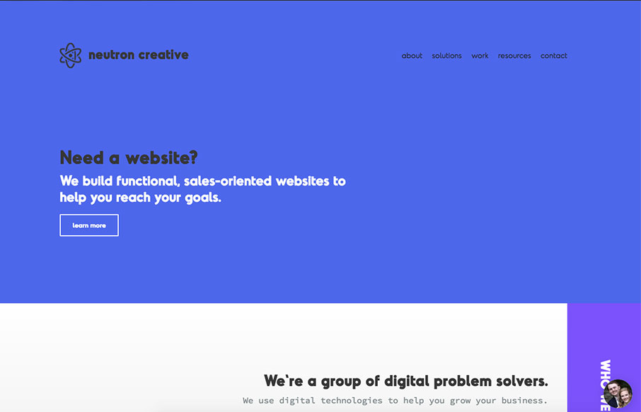
Neutron Creative
I like showing off the code snippets as you would normally show off visual work. Pretty nifty idea. I also like the off center vibe of the sections. Solid layout. I wanted to build a site that really showcased all of the new aspects of our rebranding, including our...
Type and Pixel
Pretty rad rhythm to this layout. I love the vertical spacing and imagery used to kick off points of interest as you make your way down the page. Good looking work here. We design brands and digital experiences that engage audiences and deliver return on investment...
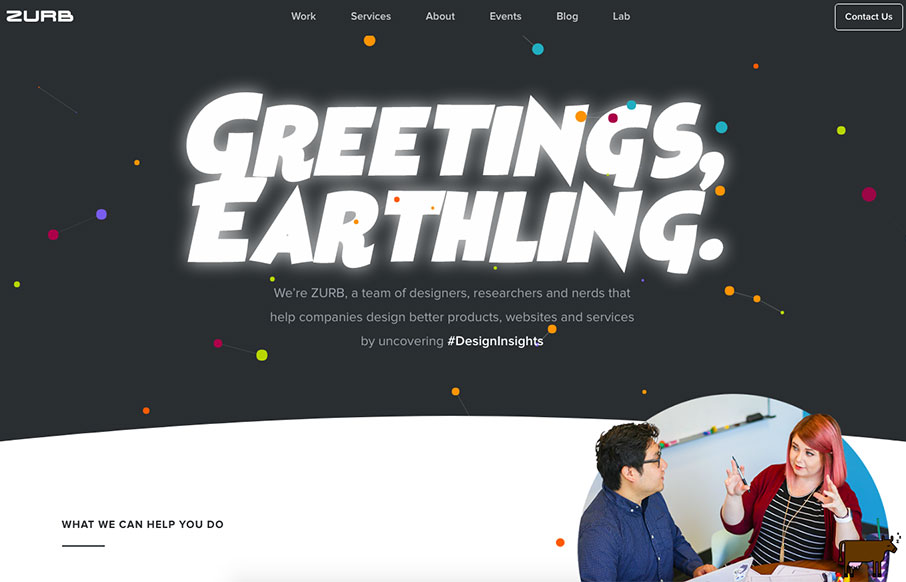
ZURB
Via Zurb: We’ve rebuilt ZURB.com. I know, I know... we’re living in the year 2017, and it’s customary for companies to redesign their website every few years. That’s about exciting as letting you know we paid our electric bill this month. But this is different. We’ve...
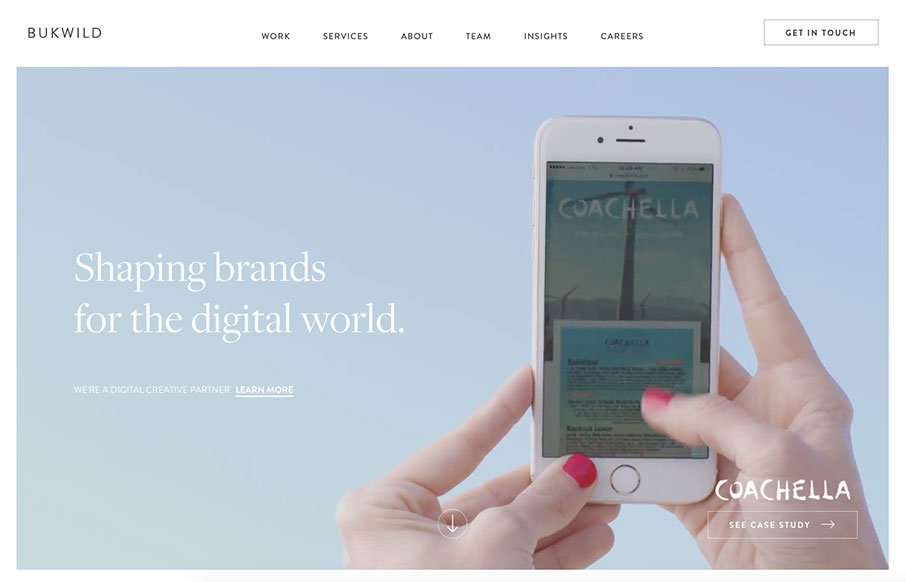
Bukwild
Pretty slick visual design. I love the light vibe to the colors/contrast and typography work. I have to say the interstitials kind of get annoying after a while, but I get why they're there. All in all this is a beautifully designed website.
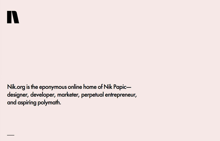
Nik.org
Lovely and simplified single page resume/portfolio website. I love the background color and the black/white palette. Nice grid work and layout too.

Clement SIMON
Very cool, beautiful and simple approach to Clement SIMON's portfolio. I love the way you scroll this and the imagery is timed visually just right. Beautiful little visual details too. From the Designer: Hi, I'm Clement SIMON, a 23 year old graphic designer and...

Viget
Love the new(ish) Viget site design. The simple grid and the beautiful typography and photography really bring the focus to the content. These guys are top-notch in the industry, go check the website out in detail and learn what you can.

Jack Morgan
Portfolio for Jack Morgan designer at Google. Pretty good, minimal site design with some subtle interactions that really work. I love the stark design a good deal for this one.
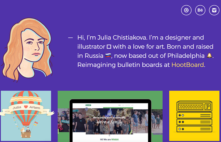
Julia Chistiakova
Love the clean approach to Julia Chistiakova's website/portfolio. The purple is unique and paired with the cool illustration makes it really approachable. Love the work too.
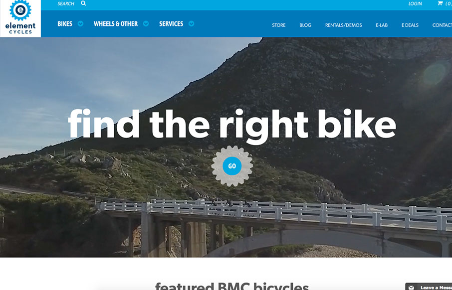
Element Cycles
Super strong layout for the Element Cycles website. I really dig the stark contrast but soft vibe. The nav is well done and simplified to make it quick to get to what you need. Strong video and product images too. From the Designer: We were really excited to work with...
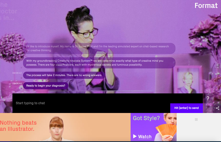
Get Your Creative Diagnosis
Pretty nifty chatbot type interface. The way they've mixed it with the funny video in the background and the super solid layout that surrounds it makes it really sing. I dig this. From the Designer: Are you an Electric Witch, a Trucker, a Crazy Ex or a Fire Starter?...

Kennard Lilly Design
I love the crazy colors and clear layout. It really makes this website explode with excitement. Solid work here. Submitted by: Kennard Lilly Twitter: @kennardlilly Role: Designer & Developer Country: United States

Tom Treadway
Love this type-heavy layout for Tom Treadway's portfolio site design. Clean and simple, focuses the visitor on reading and only shows the images that are needed. Bold stuff and well done. From the Designer: Portfolio for Tom Treadway – freelance designer in San...
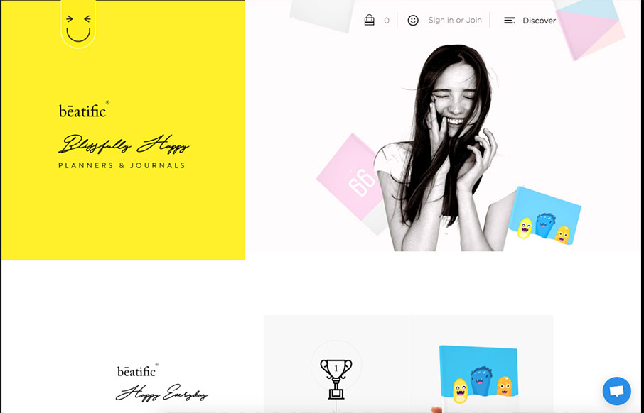
Beatific
Pretty unique looking/feeling e-commerce site. I love that it's for planners and they fully embrace the vibe of the product itself with the look & feel of the website. Bold yet happy colors and imagery. Makes me want to buy one honestly.
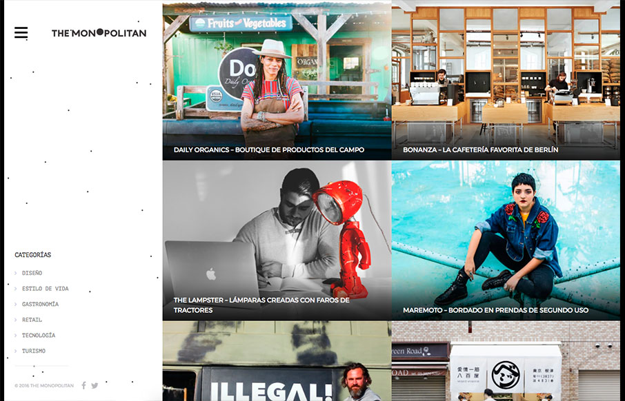
The Monopolitan
Pretty cool blog/news site layout. I like the basic grid and imagery. The hamburger nav with the nav items that only show once you click it seems a little unwarranted. Just my humble opinion, I don't like to hide things the user needs unless there's a reason. There...
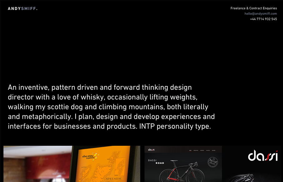
Andy Smiff
I love it when there's a good dark background website and it just works. Like with Andy Smiff's, I love how it really kicks in that classic way. Simple, straight forward, clean grid and clean type. Good stuff. Submitted by: Andy Smiff Twitter: @Andy_Smiff Role:...
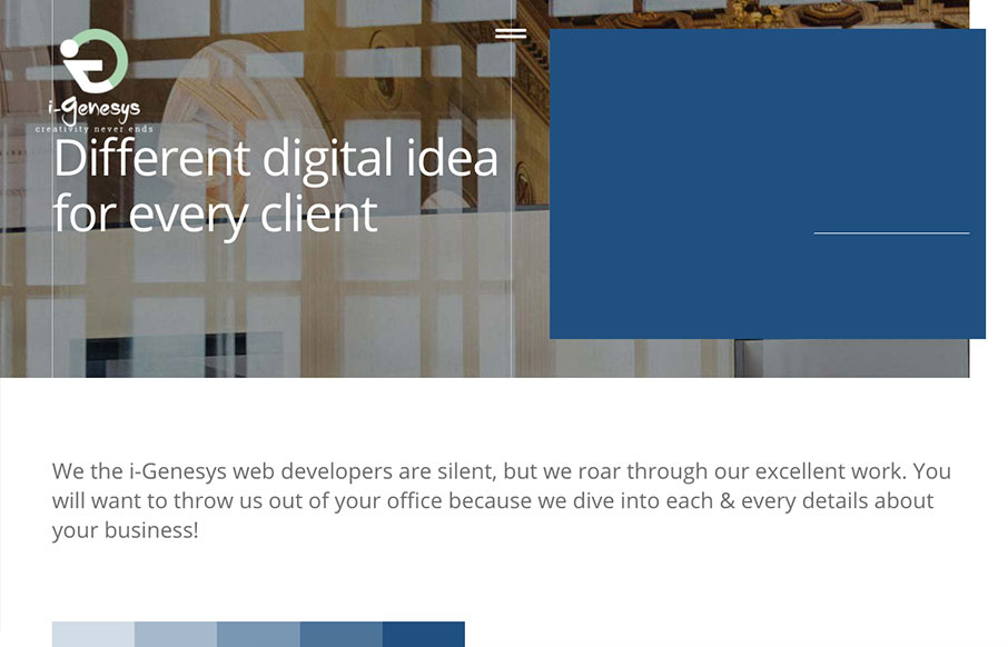
i-Genesys
Pretty nifty scroll triggered interactions and movement. I dig how the elements shift around as you downscale the browser window too. Showing off what they can do. Some clever layout and illustrations really seal the deal on this design. i-Genesys is a creative agency...
EMAIL NEWSLETTER
News & Articles

Rob Harr – The Business of Talent – Part 1
 Giovanni talks with Rob Harr of Sparkbox about how he runs his company, how they’ve grown their team in a sustainable way, and how companies might head off the slings and arrows of a volatile client services business.

Online Forms: Post-Submission Etiquette
 Take a look at how you manage your the intake of contacts with your website’s forms. Let’s take a look at how to follow up to get new business in smart and planned ways.

What a 5-Year-Old Entrepreneur Taught Carl Smith About Business
 nGen Works founder and BizCraft host Carl Smith thought he knew how to run a business until a cold winter’s morning and a persistent five-year-old proved him otherwise. TechnologyAdvice’s Clark Buckner interviewed Smith about “Lessons From the Lemonade Stand”.

HARD WORK. CLEAN FUEL. NO EXCUSES
Use “WARRIOR2023″ for 10% off.