
Web Design Inspiration Curated
Comic Scout
I love the simplistic/minimal nature of this design. The subject-matter is pretty fun too. The colors play well together and covers vs. comments section are nice to look at they way they are positioned. The logo could stand our more, or on it's own, as it is...
We Create Logos
I really like the use of the black background in the top half of this site. The illustration is clever and helps to showcase their talents. Overall well organized visually and gives the visitor just the right amount of information they need.
alphareturns
There's something to be said about a liqui-layout that works. This site design does just about everything well. From colors to type choices to grid technique. This design is surprisingly minimal yet there seems to be enough little details to keep in interesting.
Alterform
This is an interesting design, I like the way the navigation is done and it all works well on the black background. It's not often you can work in pink into your design and pull it off.
Scott Jehl
Very good use of the space, it all fits above the fold. I like the brown colors mixed with the green. Overall this design is unique and well executed.
Intrinsic Studio
From the visual organization to the modular layout this website design is one of the better studio websites out there. The colors are tried and true but somehow they look fresh to me.
BD4D
This is a wonderful design. Somehow it incorporates the "web 2.0" design cliche and the aesthetics from the Swiss School of Design. I've never seen that before, but it's a refeshing and intriguing take.
Cottyn
From the makers of Virb comes this great site. I'm not sure we need another hipster tshirt website, but this one is filled with Cooper-y goodness, clean style and good photography. But honestly, they had me at Cooper.
Green Earth Coffee
From the earthy tones to the execution of the logo design this website holds together very well. There is plenty of content to organize with this website and the designer has done that very well and played up the brand to it's fullest.
Iron Feathers
There's something about this blog that I really like, its design feels complete, from the "recent posts" on the right hand side to the footer to the colors and logo it's just complete.
Cabedge
This site has a great feel, very organic with muted, but somehow bold, colors. They do great work and get the point across with a simple site.
K&L Wine Merchants
At first glance this site seems rather plain, but it's really deep and does a good job of offering up a lot of information in a pleasing, non-cluttered way. Oh, and check out the $13,000 bottle of wine!
SiteGuys
Ok, so there could probably be a site devoted to nothing but coding services, but this one has a bit of a different take on it. They take a more full-featured approach into site management, which I think is actually a better sell than simply coding designs. As such,...
WP Coders
Another in the entry of the slice and dice your design services, this one focuses just on WordPress installations, which honestly, given the mess (and that's being charitable) that WordPress under the hood is, I would probably recommend to anybody let somebody else do...
Kyan
This is a really distinctive portfolio site from Kyan. The colors and background add a lot of detail and interest. The focus is rightly on their rather large body of work. The only quibble I have is that opening line "We build really good websites and web...
University of Notre Dame
Here's another site that's riffing (in this case, I'll say riffing instead of 'ripping') on Coverflow. I think this site works well, but like Giant's website, it suffers from being a bit heavy on the initial load. And while you might expect that from an ad agency's...
Future Fabric
At first glance, this site doesn't seem to have much going on, but it's got some nice details. The gradient/noise background is subtle and gives a nice warm feel to contrast with the simplicity of the layout.
number41media
I really like the clean look of this website, the blue and gray colors really go well together, very minimalist.
Janic Design
This is another one of those long page designs, but truly done well. The way each portfolio item is displayed with it's "meta" info out to the left is smart. The colors mesh well and work to highlight the work that's being shown instead of overpower it.
Jeremy Cowart
Holy crap is all I can really say about this guy's photography. The site is really slick and well done, but the photography is just amazing.
EMAIL NEWSLETTER
News & Articles
No Results Found
The page you requested could not be found. Try refining your search, or use the navigation above to locate the post.
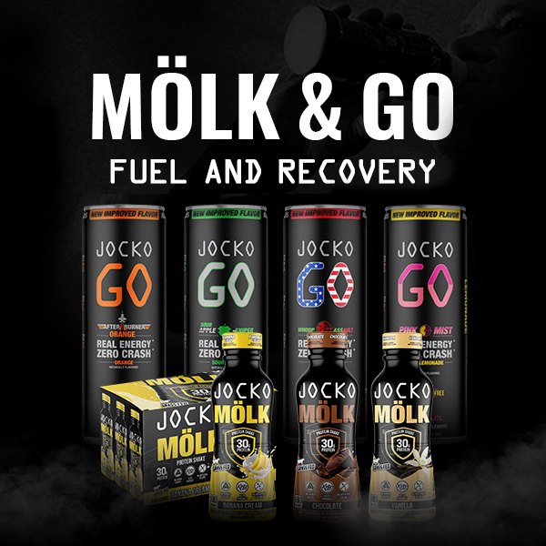
HARD WORK. CLEAN FUEL. NO EXCUSES
Use “WARRIOR2023″ for 10% off.