Web Design Inspiration Curated
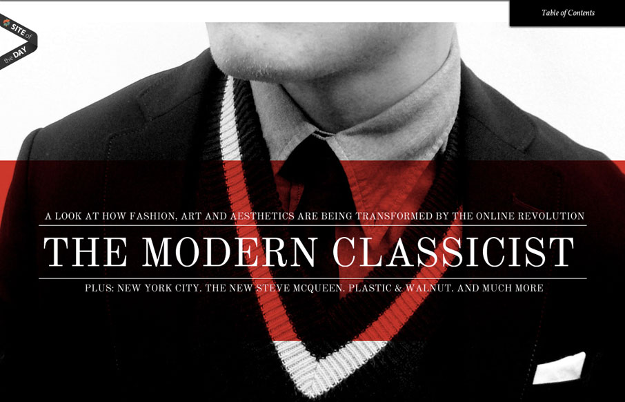
suitupordie.com
Wow. What a visual feast. The lush layouts are highly reminiscent of upscale magazine design. I find designs like this, ones that emphasize visual design over interaction, are often the most dynamic. Each page is unique and varied. Some pages are massive splash images...
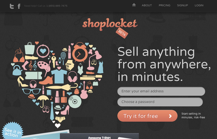
shoplocket.com
The ShopLocket site is a visual feast of illustration work and crisp graphics. I love the color usage and the overall vibe of the site. There are some cool little interaction pieces to get into on the home page too that make for nice surprises. Though I want the big...
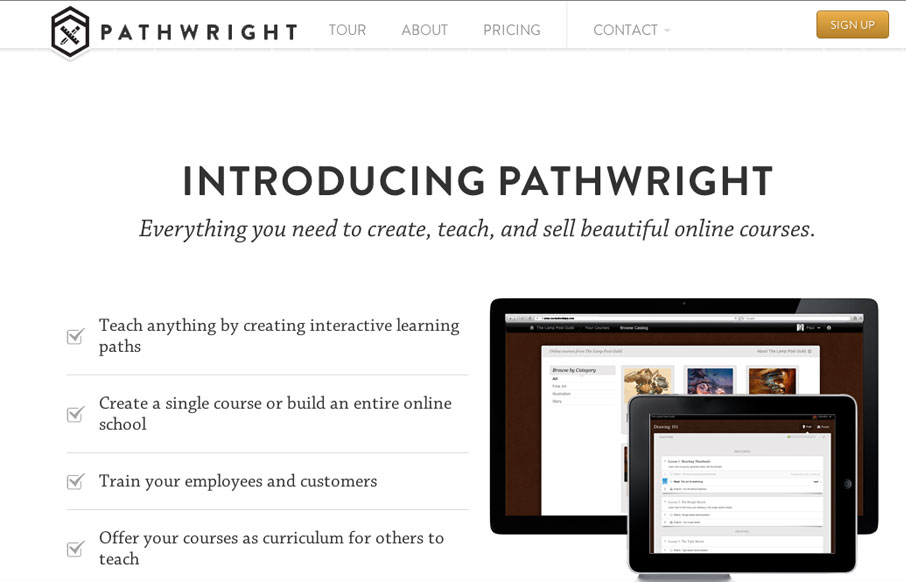
pathwright.com
Awesome concept and beautiful execution of this website. The responsive design details are nice and worth a study. I particularly like the fixed header and the "contact" link interaction. The signup page is also very nicely done. A super clean and minimal page around...
pixelivery.com
Really nice announcement website design for pixelivery.com. It has just enough info to entice you and the interactions with the scrolling links and responsive design are cool - which is what this needs to get you interested. Me. want. Shirts. Too!
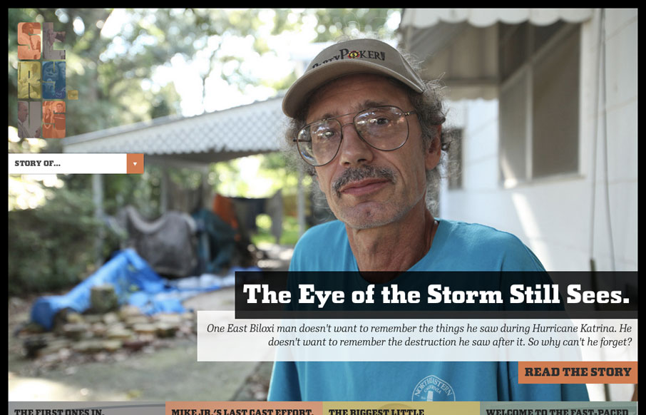
stry.us
This beautiful site takes full advantage of responsive design to deliver a compelling visual experience at every resolution. The massive imagery is nicely offset by asymmetrical text and bold, hard-lined shapes. In my humble opinion, stry.us seems to look best at...
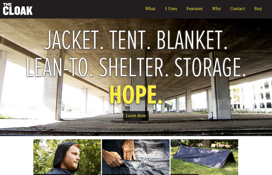
givecloaks.com
A lovely responsive site for a non-profit that looks equally lovely: givecloaks.com /via @hotmeteor— Responsive Design (@RWD) April 23, 2012 A great idea and an interesting solution to a real problem. The website quickly tells the story of what this is about and...
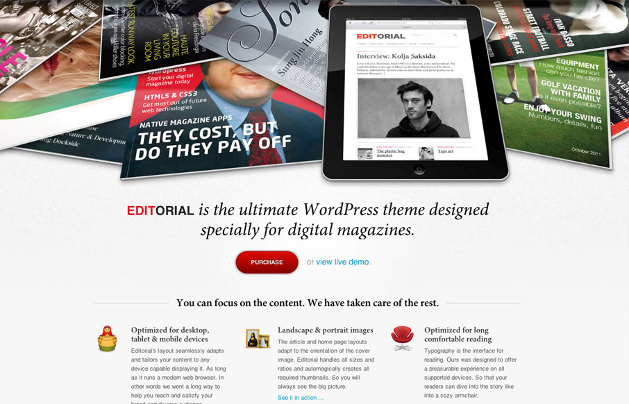
editorialtemplate.com
The Editorial Wordpress template sales page is very effective. The main header image is really the only image on the page and it's used as sort of a collage to show off the template at work and further sell the idea that's it's designed for magazines. The content...
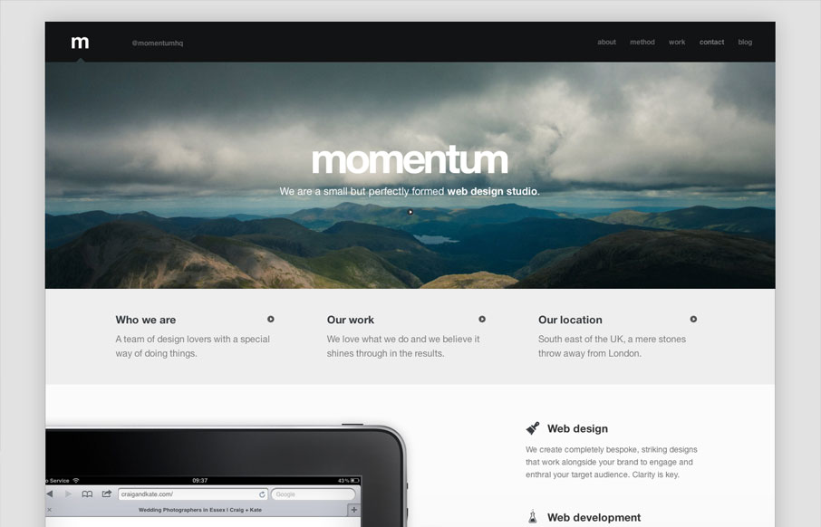
builtwithmomentum.com
Beautifully designed responsive website. I love the simplicity of this design it's fairly minimal in it's approach but just skirts to the line. Plenty of content to get to know the team behind the company including a nice little video on their studio space. I also...
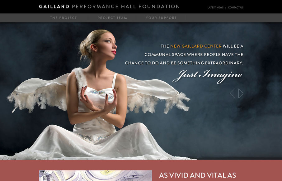
gaillardfoundation.org
This is a visually expansive site. The imagery is stunning throughout and I like the added interest the typography lends. There are some CSS transitions in use that might be pushed a little more, but their existence at all helps to add some elegance to the experience....
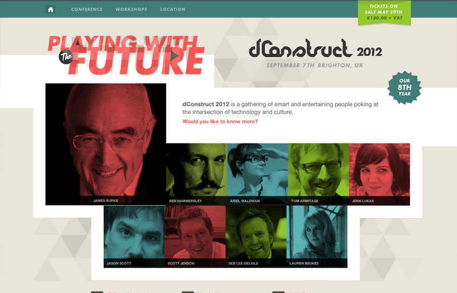
dconstruct.org 2012
We are proud to unveil this year's @dConstruct site: 2012.dconstruct.org See you in September!— Clearleft (@clearleft) April 23, 2012 The dConstruct conference is definitely a high-point on the web design community's conference calendar, and their new website is...
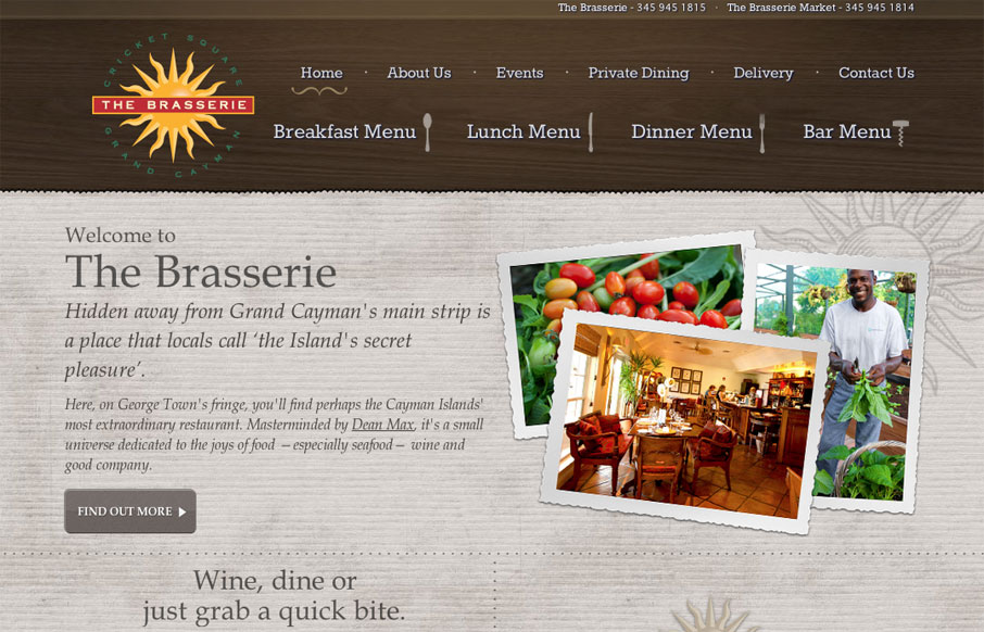
brasseriecayman.com
Visually, there is some good stuff going on here. The main texture is nice and color is used well to help frame out the site. The photos stand apart from the background and add a lot of vibrance to the page. Small touches of hand-drawn elements keep things feeling a...
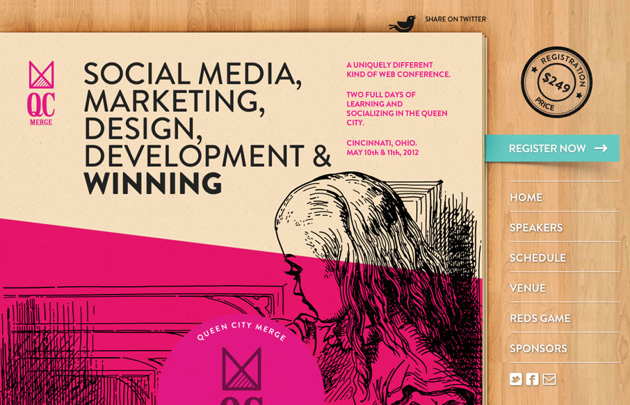
qcmerge.com
The Queen City Merge conference website is nicely designed for sure. I love the colors and the wood background. The fixed main nav is a nice touch to the single page(ness) of it. Storm Troopers and Alice in Wonderland, love it!
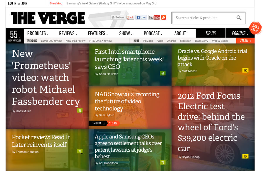
theverge.com
The Verge isn't exactly new news in the design world. It's been around a few months. I happen to feel like it's a great experience in terms of taking in news/stories, both on the old laptop and on my iPad too. What are your gripes or loves for it?
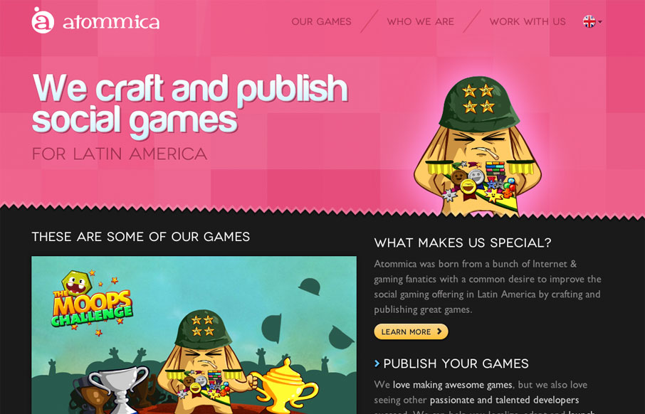
atommica.com
Pretty tight design that allows itself to feel lose at the same time. The illustrations are what helps it achieve that. Simple mouse over animations here and there keep it interesting. Follow all that up with a nice responsive layout and you have yourself a damn fine...
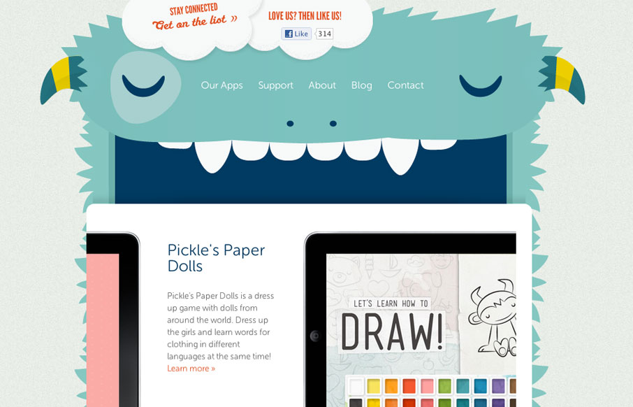
playtend.com
The Playtend website is just pain fun. I love the monster and how it all ties in with the name. Taking a look at it in our screen cast review Giovanni and I spell out how much we enjoy this website.
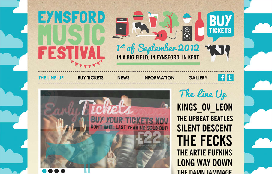
eynsfordmusicfestival.co.uk
Largely a simple execution technically speaking but visually it's super fun. I love the illustration style and the visual stories each little drawing tells to help further the overall story of location and experience. The type is also pretty much spot on with the...
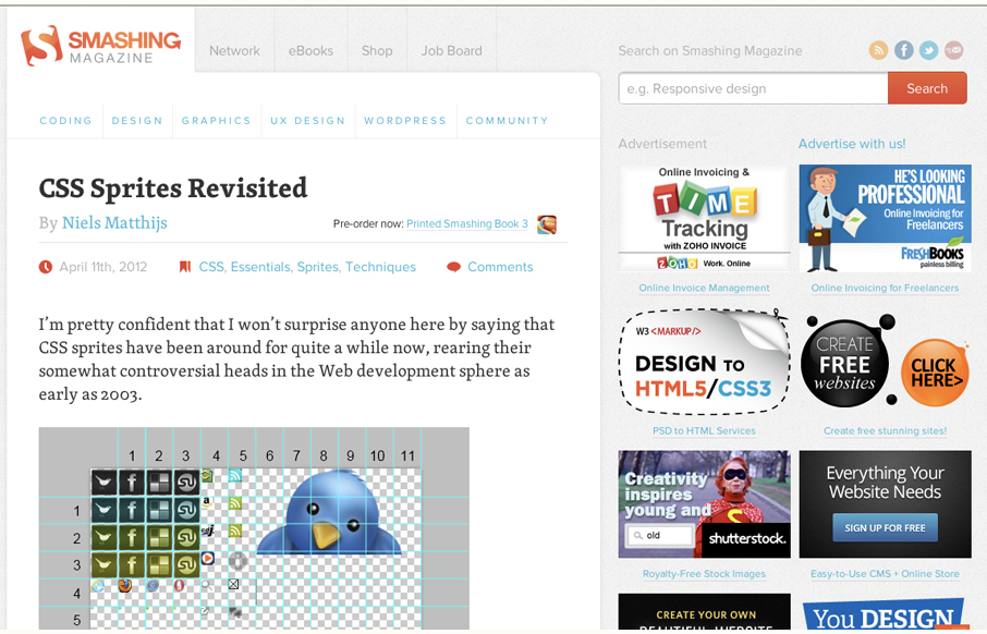
smashingmagazine.com
Smashing Magazine is one of those industry staple websites right? Like Facebook, you mess with it people either love it or hate it. Giovanni and I explore the responsive design decisions in some detail (kinda) in our screen cast review. Overall we do really dig the...
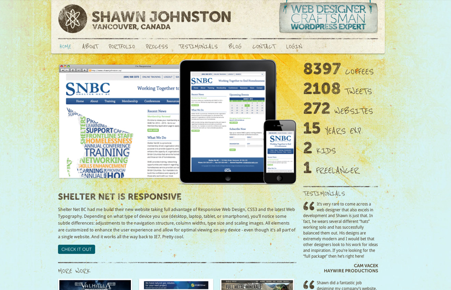
shawnjohnston.ca
We've written about Shawn Johnston's site design before here on UMS - we even did a screen cast of it. While this iteration isn't worlds different visually it totally is under the hood, it's a responsive implementation and a whole bevy of updated stuff. I really dig...
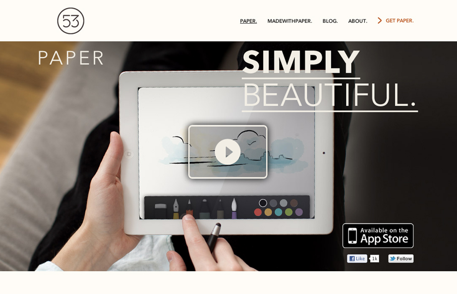
Paper
The Paper app home page is actually a sub page of the FiftyThree website. It's gorgeously clean and simple though. I absolutely love how the images and copy flow down the page being strongly gridded out but yet almost asymmetrical at the same time.
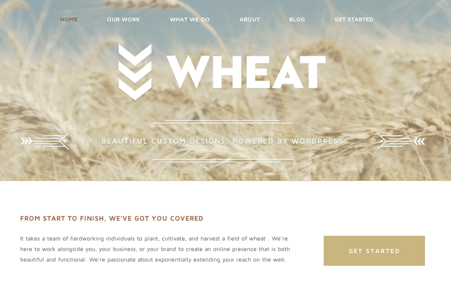
madebywheat.com
Just a beautiful design, simple as that. I love the big bold image of the wheat and the large WHEAT set on top of it. Subtle yet not at all. The rest of the site is a display of restraint by the designer, which shows maturity to me. Love it.
EMAIL NEWSLETTER
News & Articles
unmatchedstyle
http://pattern8.com - some great repeatable patterns for your designs, they're free too. #ums
unmatchedstyle
All you need to know to get started in information architecture. http://bit.ly/4oQOn #ums
unmatchedstyle
Great examples of different navigation designs using CSS. http://bit.ly/nq7ce #ums

HARD WORK. CLEAN FUEL. NO EXCUSES
Use “WARRIOR2023″ for 10% off.