Web Design Inspiration Curated
Elegant Seagulls
What a fun, well executed website. I say "executed" because it takes a high level of design skill and experience to pull off something that appears simply but yet has depth like this website does. Bravo Team!
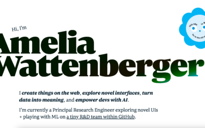
Amelia Wattenberger
I create things on the web, explore novel interfaces, turn data into meaning, and empower devs with AI. I'm currently a Principal Research Engineer exploring novel UIs + playing with ML on a tiny R&D team within GitHub.
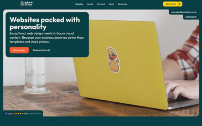
Rubber Duckers Ltd
Exceptional web design meets in-house visual content
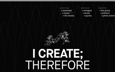
Tobias van Schneider
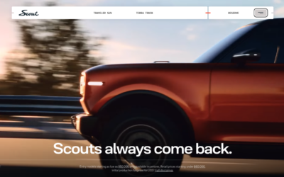
Scout
Pretty fun interplay between the video and scrolling the page. Solid design and page architecture.
Polecat Agency
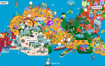
One of the most unique design approaches i've come across in a while. Bravo!
AHADI Foundation
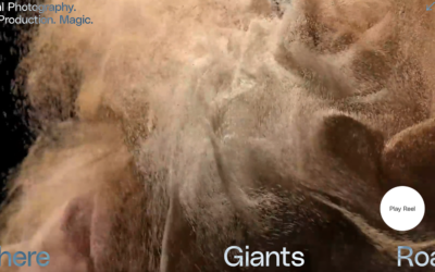
Where Giants Roam
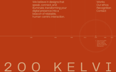
3200 Kelvin
I love this monochromatic color scheme and minimal yet detailed design. Super cool. As you scroll down the page, you'll see the form design approach, what do you think?
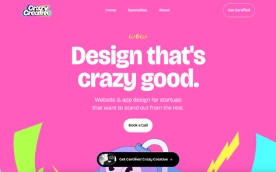
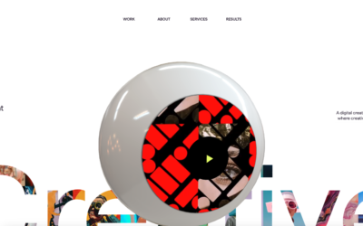
Crazy Creative
Website & app design for startups that want to stand out from the rest.
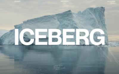
Iceburg
01. Iceberg is a transmedia documentary that uncovers humanity’s hidden capacity to tackle the climate crisis.
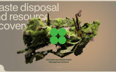
saapro
Confronted with the devastating impact of waste, we knew something had to change. That’s why we launched our mobile waste processing plants, delivering an innovative solution that can go wherever it's needed.
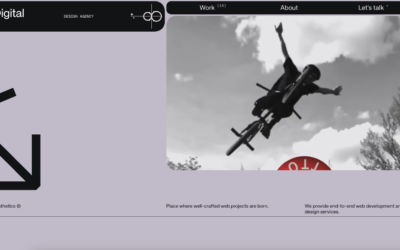
Fiddle.Digital
Some neat interactions and animations. Bordering on the "brutalist" design style but not quite crossing that line.
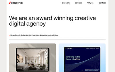
Web design London – Reactive
Website has a clean, modern look and is super easy to navigate. It clearly shows off their web design skills with a professional yet friendly vibe. Overall, it gives a great sense of their services and approach.
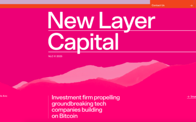
New Layer Capital
Super cool, corporate website design. I dig this, the way it looks initially on load and then the way thing move into place as you scroll. Very cool.
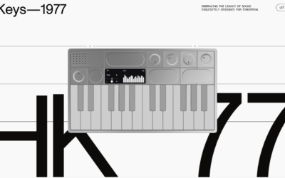
Hikeys–1977
Winner of the Framer Design of the Year Award for best storytelling: Great storytelling goes beyond function—it creates an immersive, memorable journey. The HiKeys site explores how compelling storytelling can bring a physical product to life on the web. ++hellohello...
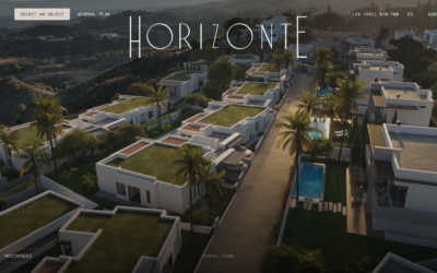
Horizonte
Pretty crazy scroll-based interactions here. Just check it out and let me know what you think...
Menuxl
Putting this website in the gallery because I do like the way it looks visually and the neat interactions. BUT and this is a big BUT, this website makes no sense as far as trying to figure out what they actually do and how to work with them. It could just be a...
Siena
Pretty crazy interactions. Reminds me a lot about Flash website design. But one thing that's cool with this re-birthed trend is that they still follow base web interaction expectations like scroll, click, etc...
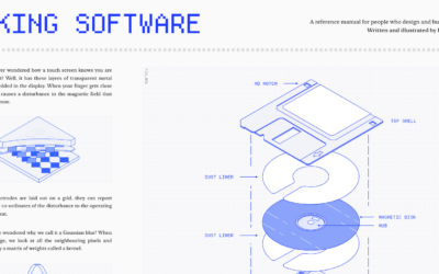
Making Software
Super simple, almost minimal approach, but the detail here goes deep. I love this website design.
EMAIL NEWSLETTER
News & Articles
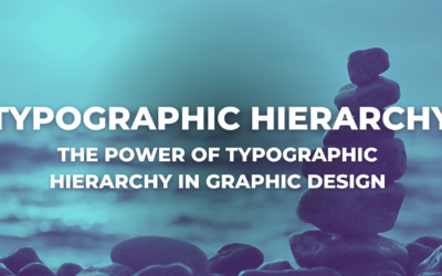
The Power of Typographic Hierarchy in Graphic Design
Unlock the power of typographic hierarchy in graphic design to communicate effectively with viewers. Craft attention-grabbing headlines, use subheadings, emphasize key points, and create a seamless reading experience for improved SEO rankings.
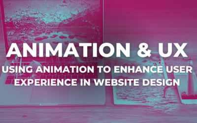
Using Animation to Enhance User Experience in Website Design
Learn how to use animations in website design to enhance user experience without overwhelming visitors. Follow SEO-friendly practices for better search engine rankings. Optimize load times and test across devices.
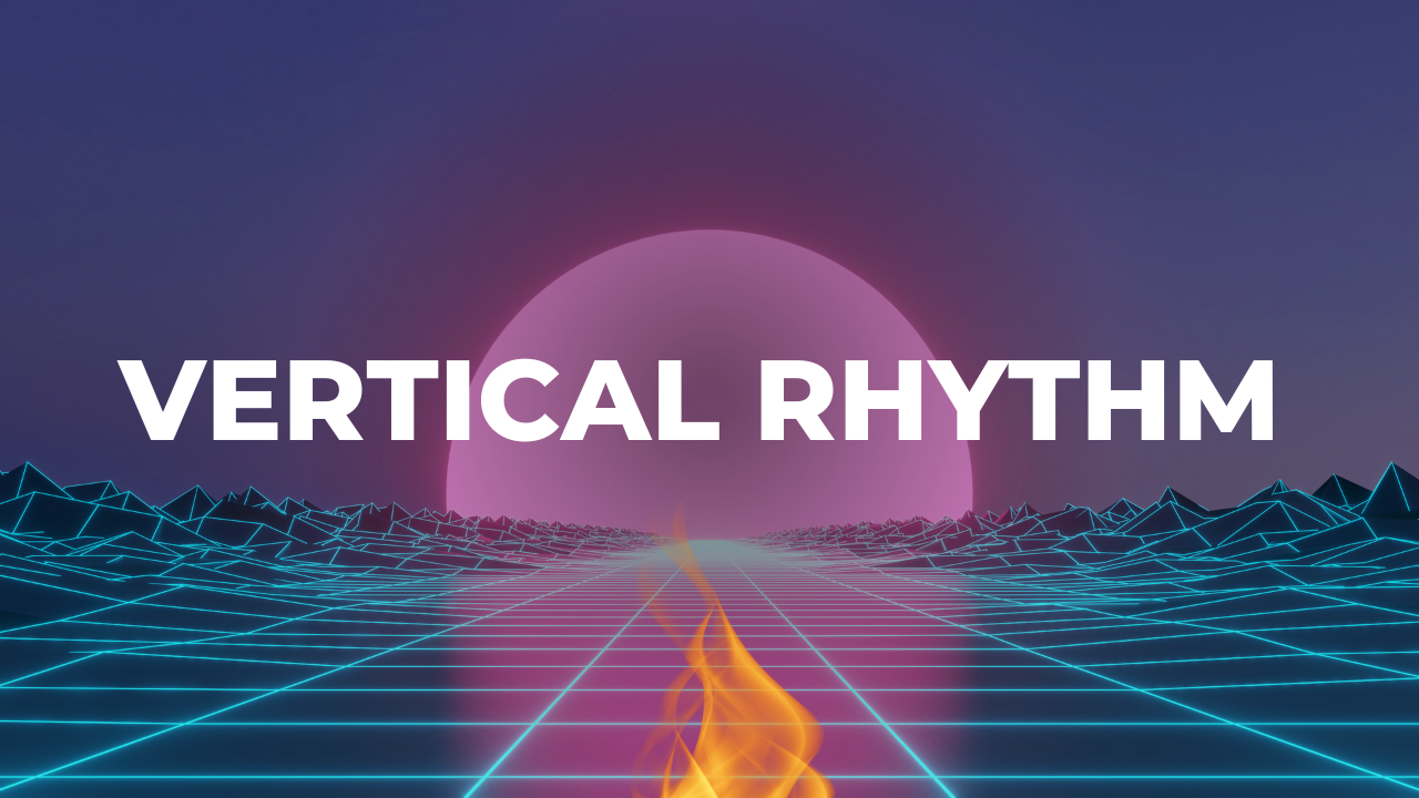
Vertical Rhythm: The Key to Exceptional Web Design
Discover the power of Vertical Rhythm in exceptional web design. Learn how it enhances readability, user engagement, and harmonizes page elements for a seamless user experience.

HARD WORK. CLEAN FUEL. NO EXCUSES
Use “WARRIOR2023″ for 10% off.