One of the most important aspects of visual layout is Vertical Rhythm, a concept that can significantly impact the readability and user experience of your website. In this article, we will explore the significance of Vertical Rhythm, its influence on user engagement, and how you can implement it to enhance your web design.
Understanding Vertical Rhythm
Vertical Rhythm refers to the visual pattern formed by the blocks of type or lines of type on a web page as users scan down its content. This rhythm can be influenced by various elements such as headings, list items, block quotes, images, and more. Achieving good Vertical Rhythm is crucial as it ensures that the elements on your page are in harmony, making the content more readable and scannable for your visitors.
The Importance of Proper Line-Height and Visual Hierarchy
Two fundamental aspects of Vertical Rhythm that require close attention are line-height between elements and overall visual hierarchy on the page. Appropriate line-height proportions contribute to an engaging design, though it may demand an involved design exercise. Similarly, visual hierarchy ensures that the most important elements, such as primary images and text, are visually prominent, while less important ones are smaller and placed lower down the page.
The Evolution of Vertical Rhythm in Web Design
Vertical Rhythm has long been a concern for print designers, but it’s come much later into the concerns of website or screen based visual design. With the increasing need to build responsive websites using grid layouts to accommodate various screen widths, mastering Vertical Rhythm is now more critical than ever. It has become a key aspect of both visual design and technical implementation, ensuring an optimal user experience across different devices.
Examples of Websites with Excellent Vertical Rhythm
To better understand the impact of Vertical Rhythm, let’s take a closer look at some websites that have excelled in its implementation:

1. Venture Labs (https://venturelabs.team/)
The Venture Labs website uses both visual rhythm via the font sizes and weights, but also extra-emphasizes it with scrolling based image loading and lazy animation to great effect.

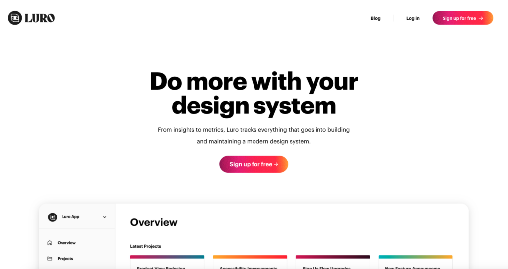
2. Luro (https://luroapp.com/)
The Luro website uses great type headline to body text weight differences to make it super scan-able. Then it balances the images very well as you scroll down the page to give you a nice sense of visual blocking to take the app in and understand what it’s all about.

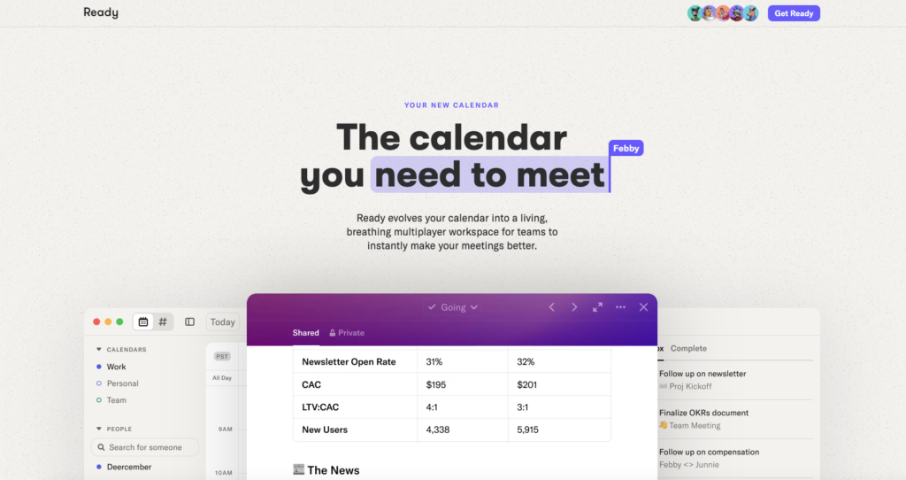
3. Ready (https://ready.so/)
The Ready website uses a nice contrast between headline and body copy, like in the Luro design. Then balances screenshots of the app and other details quite well.

4. Deathwish Coffee (https://www.deathwishcoffee.com/)
Aside from being the “strongest coffee” in the land, their website is equally strong visually. The visual beats of this design aren’t so much like the other examples in this post, this one is more like a Heavy Metal guitar solo – but still it’s a type of rhythm.
Implementing Vertical Rhythm on Your Website
To achieve exceptional Vertical Rhythm on your website, consider the following tips:
1. Choose an Appropriate Font and Font Size
Selecting a legible font and font size is crucial for maintaining a consistent rhythm. Avoid fonts that are too fancy or difficult to read. Remember, readability is paramount.
2. Set Consistent Line-Height and Spacing
Using ems or relative units for line-height can help you maintain consistent spacing between elements, enhancing the overall rhythm. Strike a balance between too much and too little spacing, aiming for a visually pleasing layout.
3. Utilize Grids and Columns
Grid layouts and columns can aid in creating a structured and rhythmic design. They provide a framework for placing elements in harmony with each other, enhancing the user experience.
4. Prioritize Visual Hierarchy
Identify the most critical elements on your page and ensure they receive appropriate emphasis through size, color, or positioning. Users should easily grasp the main message and navigate the content seamlessly.
5. Test for Responsiveness
Given the variety of screen sizes and devices, ensure your Vertical Rhythm adapts smoothly across different resolutions and orientations. Test your website on various devices to guarantee a consistent experience.
Resources & Articles
Here are some further articles and resources to help you on your journey to mastering Vertical Rhythm in Website Design:
8-Point Grid: Vertical Rhythm by Elliot Dahl
https://medium.com/built-to-adapt/8-point-grid-vertical-rhythm-90d05ad95032
ow to Easily Create a Responsive Vertical Rhythm with CSS
Designmodo https://designmodo.com/vertical-rhythm/
What the Font are Vertical Rhythm and Modular Scale?
https://www.bounteous.com/insights/2018/03/26/what-font-are-vertical-rhythm-and-modular-scale
Building a simple company website the Hard Way: Vertical rhythm
https://fragaria.cz/blog/2018/11/12/building-a-simple-company-website-the-hard-way-vertical-rhythm/
Why is Vertical Rhythm an Important Typography Practice?
https://zellwk.com/blog/why-vertical-rhythms/
RHYTHM IN WEB TYPOGRAPHY
https://betterwebtype.com/rhythm-in-web-typography/
Tools
Baseline
https://shalanah.github.io/baseline/
Gridlover
https://gridlover.net/
Syncope
https://nowodzinski.pl/syncope/
Vertical rhythm generator Packages
https://npm.io/search/keyword:vertical+rhythm+generator


0 Comments