Web Design Inspiration Curated
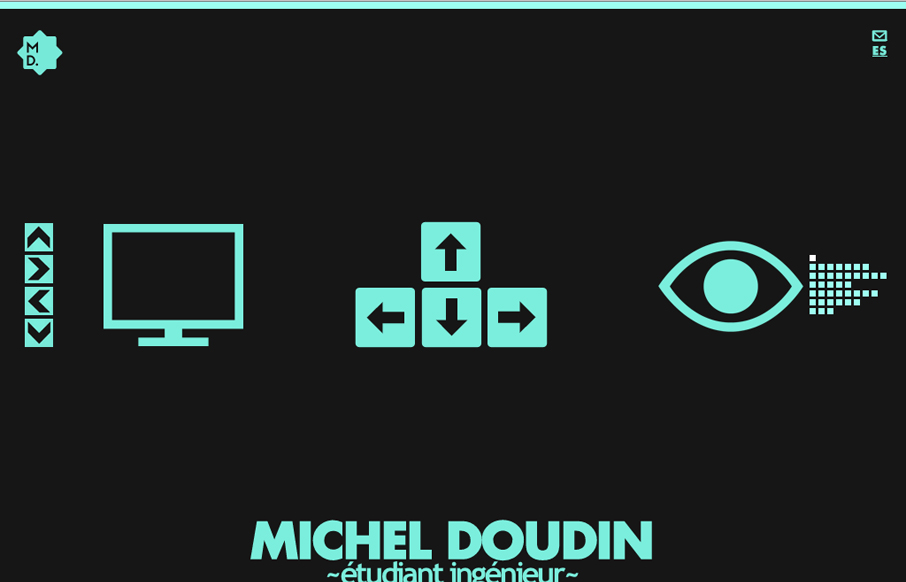
michel-doudin.com
Pretty crazy interaction here, I like the mix of arrow keys and the little navigation matrix to the right as well as the up and down arrow buttons. Covers all the bases to make it easy to understand what to do. Then the movement is so crazy and neat to watch as the...
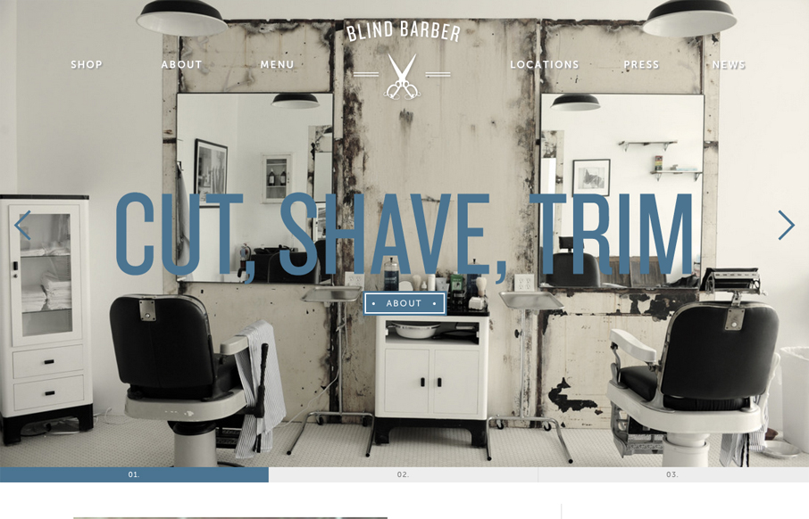
blindbarber.com
For once I almost like a loading screen, it doesn't take too long on this site which is good but it's entertaining too. I think the monochromatic color scheme pulled out of the main photos and just the single blue. I also dig how the slider is done with the...
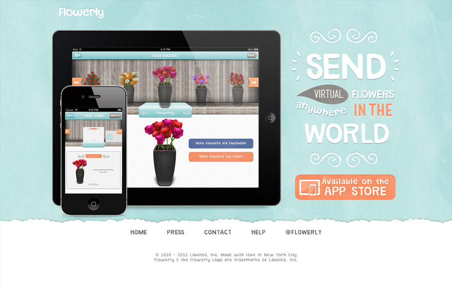
flowerlyapp.com
Great looking single page iPad/iPhone app site. Custom lettering FTW too! I love it, that block of text on the right side is immaculate. Down to the custom lettered "app store" button. I'm not entirely sure why there's a "home" button on a single page app, but maybe...
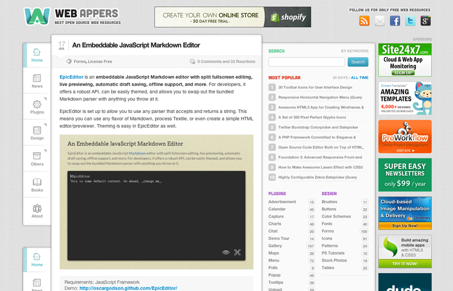
webappers.com
Aside from being a top-notch resource for web development stuff the design of webappers.com is well done. It's a nice study to compare how the different screen size designs are treated here vs. how Smashing Magazine has handled theirs. They've had to handle much of...
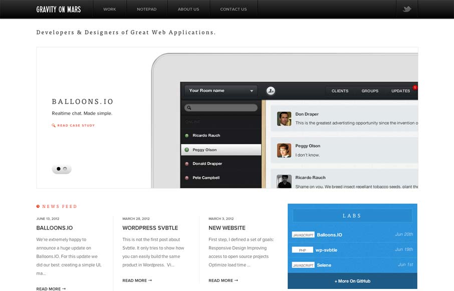
gravityonmars.com
Sharp looking minimal(ish) site design. I really like the cropping of the main image slideshow a lot. It gives a good sense of the apps and shows them in context on the iPad but it's not overpoweringly large. The delicate lines and typography are matched up together...
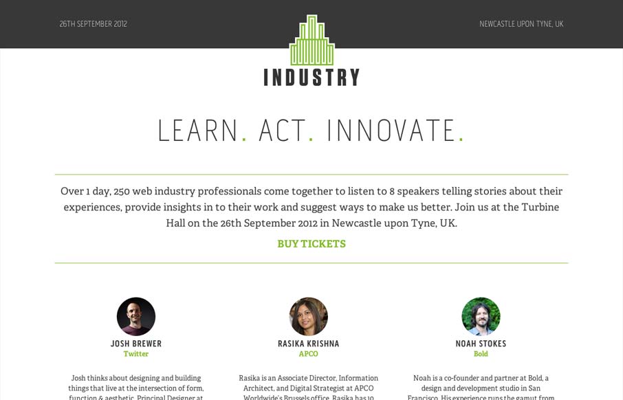
industryconf.com
Super simple yet clean and open looking conference website. I like the green & gray color palette too.
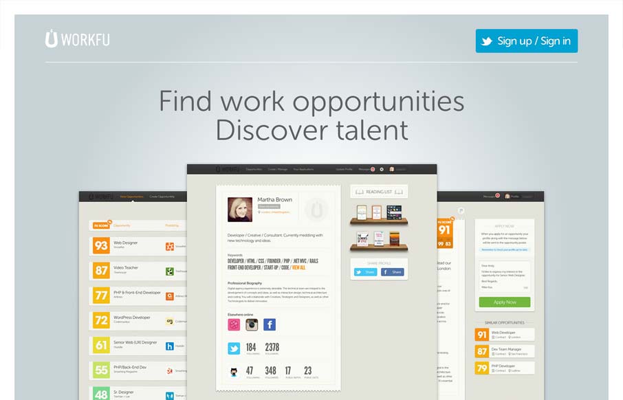
workfu.com
Really minimal product site design. I think the way they're showing the product screens off is superb like this. I also like the way they're treated as you size the screen down too. Super simple signup process too using twitter. I'd love to hear how that's helped...
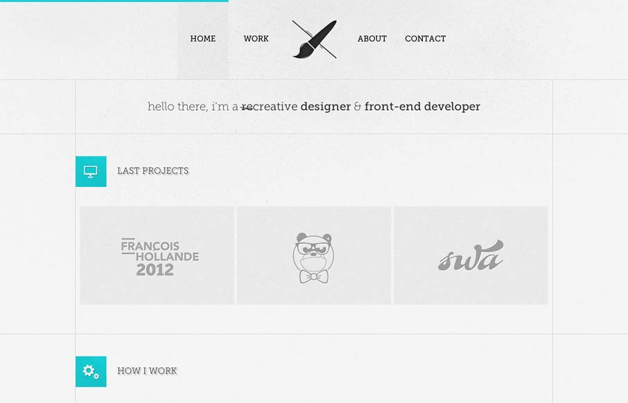
aleksfaure.com
I like the lines that the designer has used to support the grid in this layout. The flat/vector graphics also tie in very nicely with the overall vibe of the page. I really like that contact form design too, nice touch on the icon swapping out when I mouse over it.
patrickalgrim.me
What a beautifully designed experience here. I love the approach of something kind of unstructured yet totally integrated like this. The page jumps right into copy then plops you into some very swell looking info-graphic like sections. You gotta check 'em out as you...
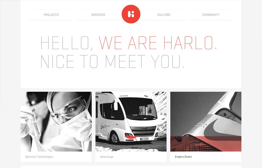
harlointeractive.com
Very thoroughly designed experience on this website design. I really dig how it's consistent and clean yet feels fresh on each page. The layout is just enough different on each page to keep you engaged with the content. Perhaps it's the header that animates slightly...
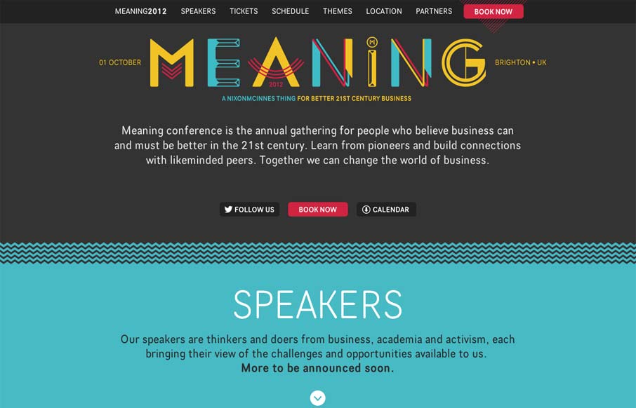
meaningconference.co.uk
Nice clean conference website design. I like the mix of the green and dark grey. The "book now" button is very clearly/obvious by being red and they also designed that little triangle pattern behind it. The sections are clearly marked with wavy lines and different...
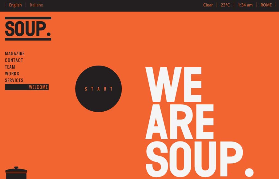
soupagency.it
Pretty cool work with such stark colors and imagery. I really like the heavy graphic feel to this layout, it's an underutilized style these days IMHO. It's bold and also slick with it's build out. I dig how when you initially load the site it scrolls you down really...
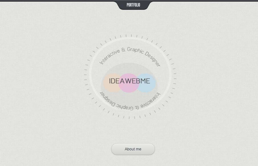
ideaweb.me
Submitted by: Vasudha Chandak @ideawebme Role: Designer & Developer Damn! This is just cool. I love the minimal design look but rich interaction model so much here. The way you go from section to section feels really seamless and is fun to experience the transition. I...
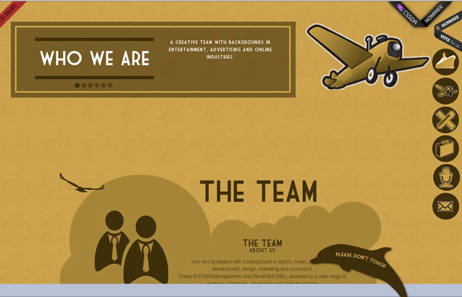
we-new.com
Submitted by: Tineke Timmerman @inTOWN_NL Role: Designer & Developer Pretty cool interaction on the footer. The "please do not touch" dolphin got me. I touched it... Overall I really like the type and the illustration fo the boat. It's like that nice 20's feel design...
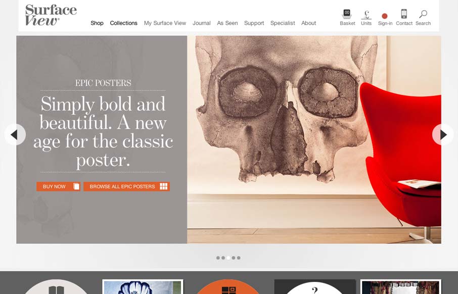
surfaceview.co.uk
I dig this mixture of fixed width elements then the jQuery Masonry section with all the products and content in it. It's not fluid or adaptive or anything 100% - probably not the target result with the design. I still like it's effect. Begs the question, do people...
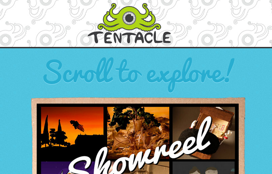
tentaclemedia.co.uk
Submitted by: James Wilkinson @tentaclemedia Role: Designer & Developer Tentacle is a small UK based animation company. We thought we'd take an experimental new approach to our website design. A mixture of hand drawing, hand built models and digital illustration. Just...
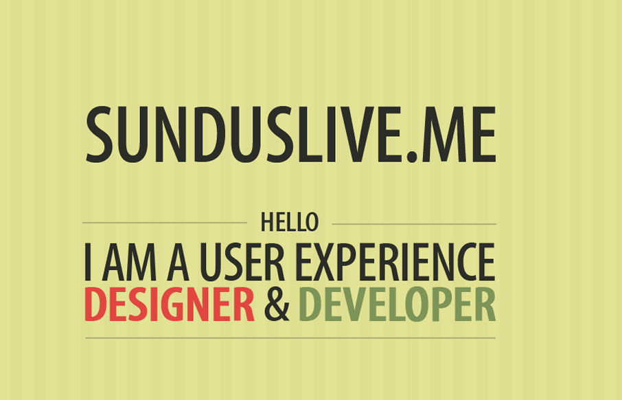
sunduslive.me
Very simple website as far as content, it's a single page, minimal copy. But a nice scrolling based interaction and reveal mixed with nice adaptive screen adjustments make this site a gem to me.
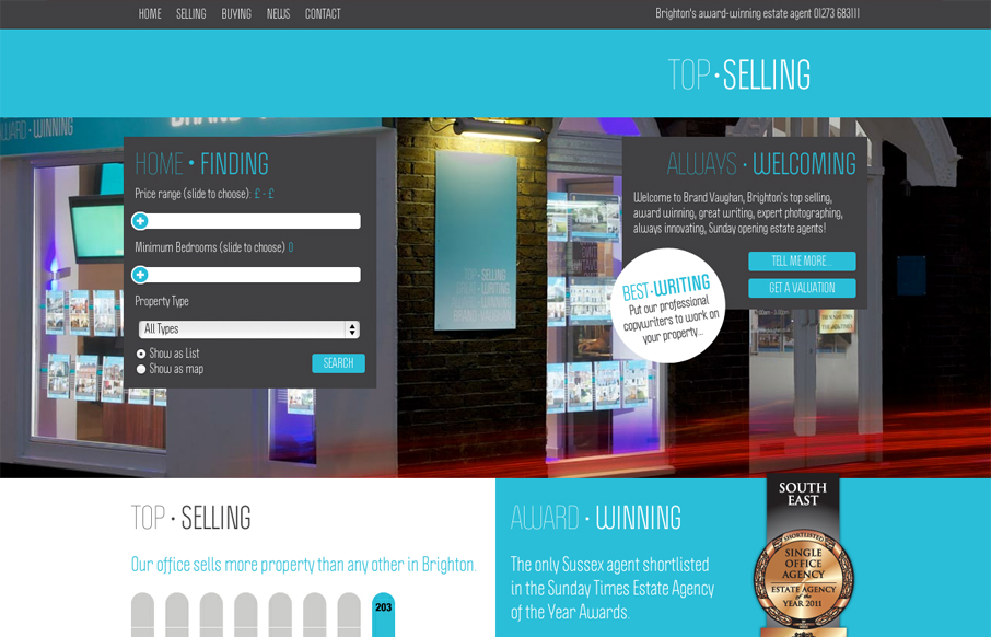
brandvaughan.co.uk
Submitted by: Luke Taylor @pixeldotco Role: Designer & Developer We were asked to rebrand the market leader in the estate agent industry in Brighton, UK. We wanted to work with them to change the way people view estate agents, to be more open and more honest....
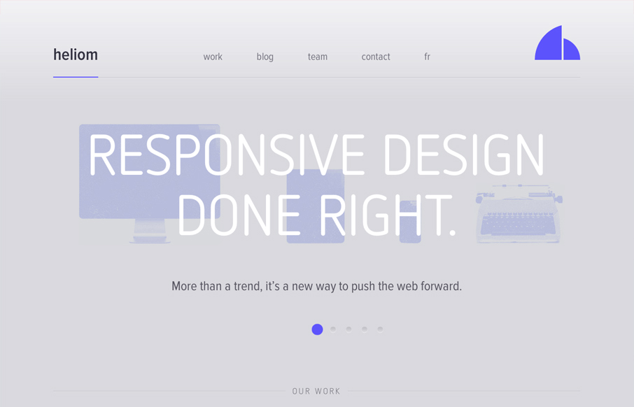
heliom.ca
Submitted by: Tristan L'Abbé @_Tristan Role: Designer A wonderful looking responsive website design. I love the monochromatic faded looking feel to it. The slideshow is so well done and engaging as well is the top horizontal navigation. Really nice detail work to go...
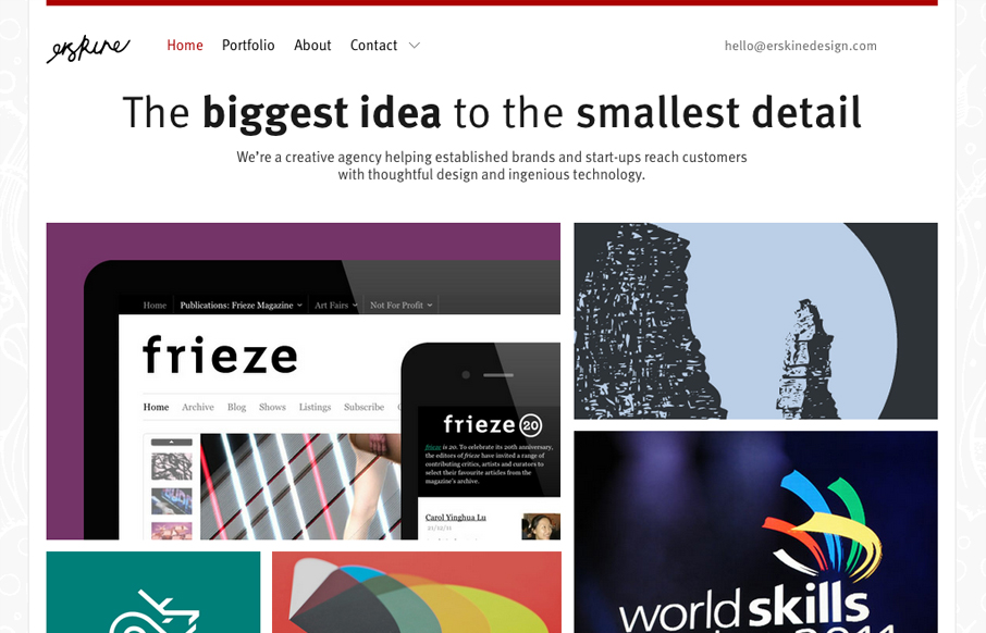
erskinedesign.com
Submitted by: Iain Harper @iainharper Role: Director Working on your own projects is often the hardest and this was no exception. After three long years we needed a new site to reflect the evolution of our agency. We took a fairly pragmatic approach, trying to...
EMAIL NEWSLETTER
News & Articles
4 Quick Tweaks For Your WordPress Homepage
![]() Here’s a quick tutorial covering four tweaks you can add to the front page of your Wordpress blog for a more dynamic and personal look.
Here’s a quick tutorial covering four tweaks you can add to the front page of your Wordpress blog for a more dynamic and personal look.
Web Standards: A Little Background
Writing a post about web standards on a design forum website, I run the risk of preaching to the choir. However, it's an important topic and I figure even the most ardent of web standards proponents could use a little affirmation, or just a chance to ring in with an...
unmatchedstyle
Great A List Apart article on burnout and what to do about it. We really don't want you guys burning out! http://bit.ly/kZjgI #ums

HARD WORK. CLEAN FUEL. NO EXCUSES
Use “WARRIOR2023″ for 10% off.