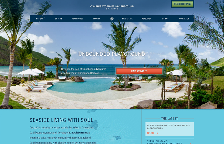
There’s truly a whole lotta sexy going on with this site. Aesthetically and developmentally it’s a site full of rich treasures. No exaggeration.
I almost don’t want to point anything out and just let you experience it on your own, but I suppose I wouldn’t be doing my job very well. So, here’s a few highlights to whet your appetite. Text masking in the hero image – yes. Slick gradients and a color palette that’s carefully calculated. Transparency, texture, animation, strong typography. A layout and overall presentation that makes me feel like I’m there rather than just looking at a brochure. There seems to be a ton of information on this site, and of varying context, but it’s all organized very well. The nav adapts visually and architecturally to the content and is an impressive consideration. This is a site that I’d love to see a case study of (and an island I’d love to be on).


Thanks for the flattering write-up, Maria. The site was a lot of fun to work on and the client is one of those dream clients that you don’t actually think exist until you get them. Even though they haven’t sent us on site, we still love them.
Sounds like somebody needs to revisit their contracts…