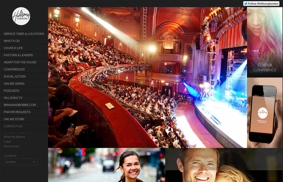
The thing I like most about this site is the extra wide screen size treatment, having the images fold out like one of those masonry type websites set’s this design off. I like how the images are also nav items and mostly mirror the navigation on the left. The sub sections feel like things jump around a good bit from page to page, that’s likely just part of the way it’s put together, the home page is very powerful visually though.


The Call to Action, Revisited
The Call to Action hasn’t changed in a decade, but the bar has. A fresh look at prominence, copy, mobile tap targets, and accessibility, with lessons from three major design systems.


0 Comments