Web Design Inspiration Curated
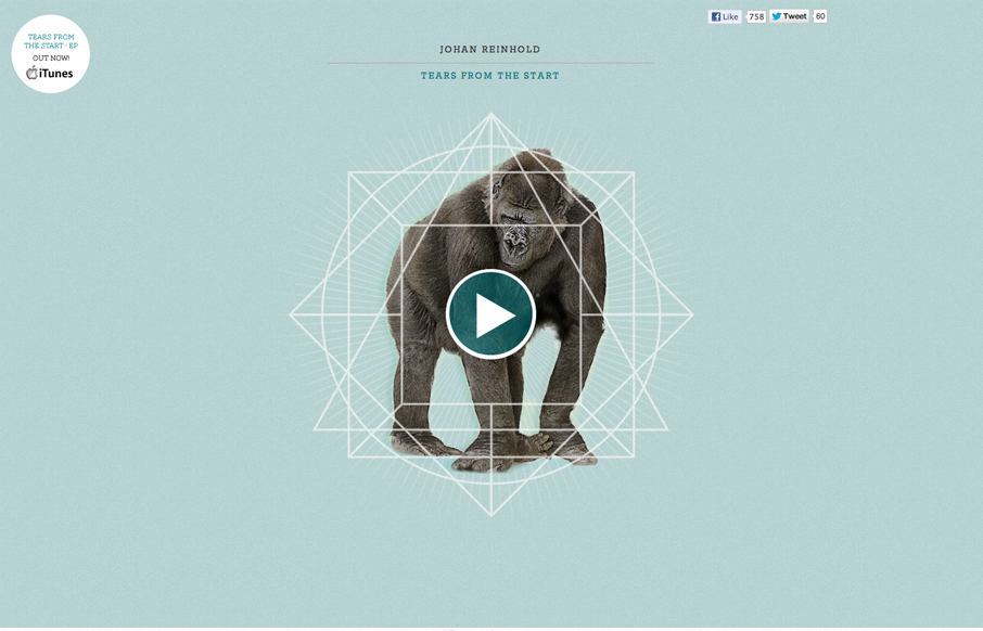
Johan Reinhold
Submitted by: Johan Reinhold Role: Designer & Developer Official website of Swedish electro-pop outfit, Johan Reinhold. I like the interaction animations worked into this site. Like the gorilla and the beating heart illustration. I think the way it's initially...
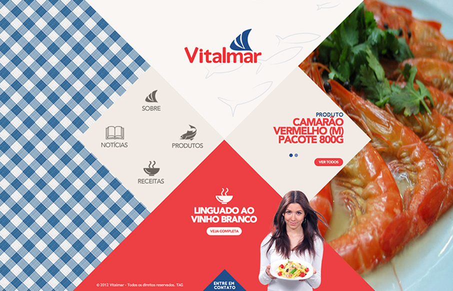
Vitalmar
Pretty nifty interactions and page load animation. Keeps the site very memorable visually.
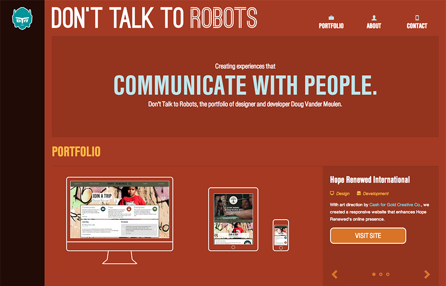
Don’t Talk to Robots
Submitted by: Doug Vander Meulen @dt2r Role: Designer & Devleoper Don't Talk to Robots is the portfolio of designer and developer Doug Vander Meulen. The responsive design highlights various web design and print projects via re-sizable slideshows. The site is built...
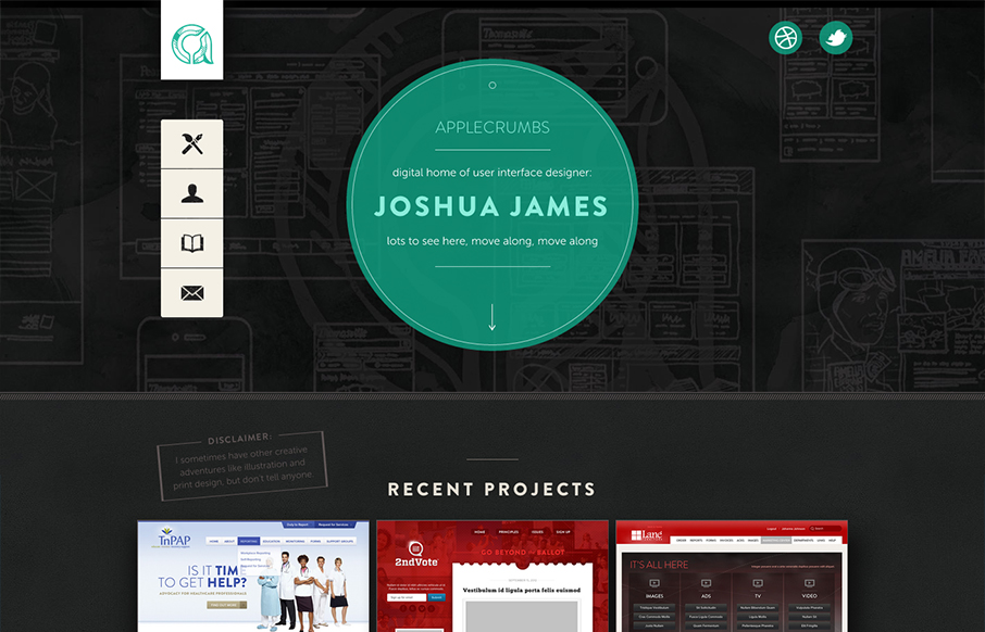
Apple Crumbs
The distinct navigation layout change going from the desktop to smaller screen widths is a very nice difference from most other responsive sites's i've been seeing. There's also a lot of interaction built in as you mouse over and click on the various elements and...
Michel Doudin
Marked by some really fun interactions with they keyboard, this portfolio site for Michel Doudin is well done. It's an interesting way for sure to serve up your work visually to others.
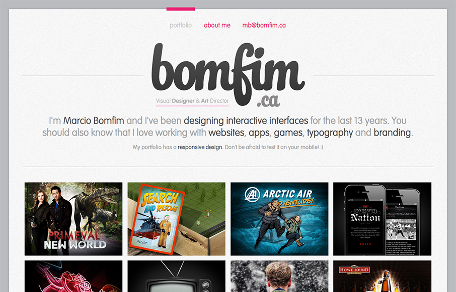
bomfim
Damn, I love websites that just embrace their purpose and put it front and center to the core of what it's all about. This website is a portfolio, so make that the home page. Brilliant! I also love the "A bit more about me..." part of the about page, one of the more...
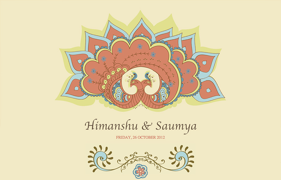
Himanshu & Saumya
Talk about a narrative driven website. This one is very nicely crafted with the animated illustrations and the timeline that slides in from the left and right telling the story of the wedding party. Lovely lovely website here.
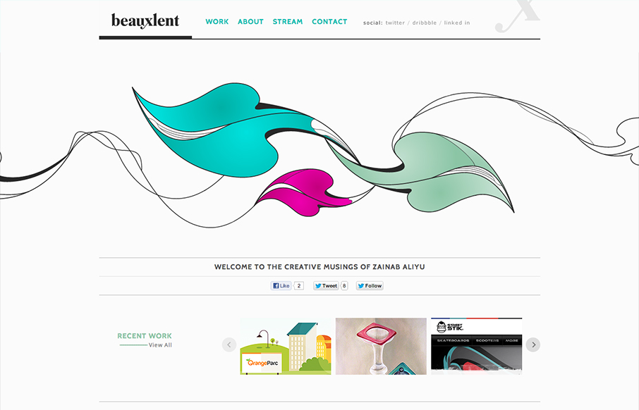
Beauxlent
It's a pretty standard and simple layout but accentuated by that nice leaf illustration. That illustration is the central focus of the design and makes you really start your visual journey around the page there in the center of the page almost.
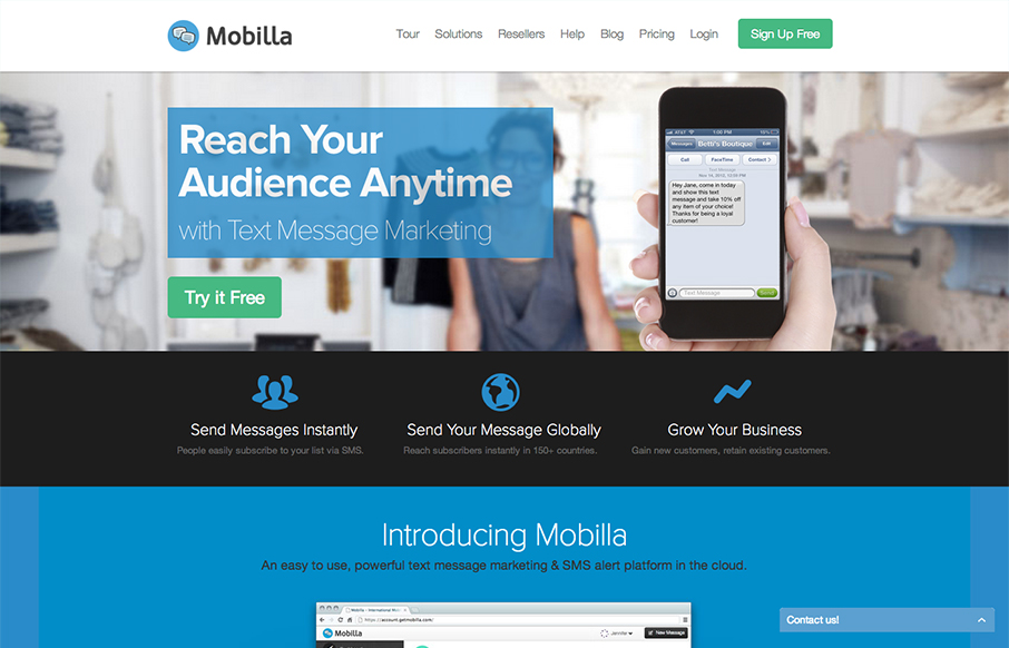
Mobilla
What a richly packed layout we have here. It's simple and open yet very dense visually at the same time. That's very hard to achieve and Mobilla does it very well. I especially like the main hero image that's responsive and static almost with the iPhone and hand that...
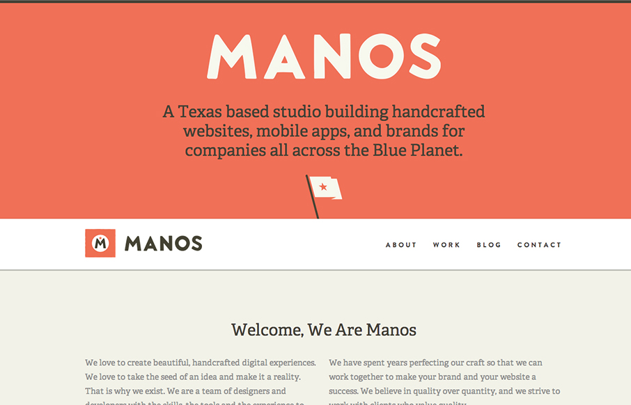
Manos
Super beautifully crafted website design. The colors, typography layout choices - it just sings! Just beautiful! I really love how the main nav slides up to be a fixed header from the home page on. Seamless and smart feeling.
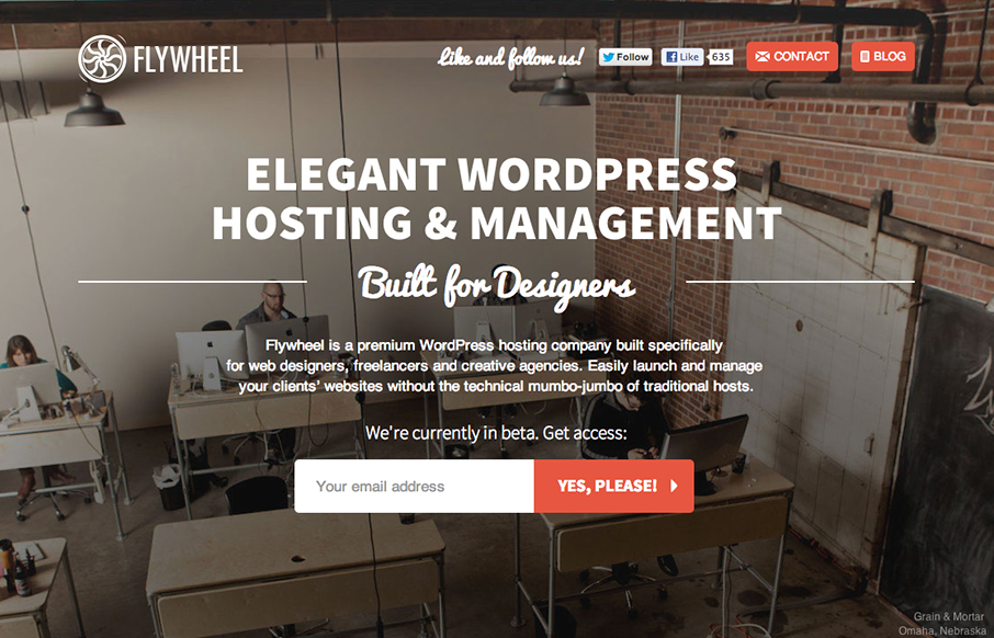
Flywheel
Nicely done coming soon page, it's almost a full site really. The single page actually does it justice since it's so concise. I like the way the email signup stays readily visible as you scroll down - almost becoming more so because of the animation.
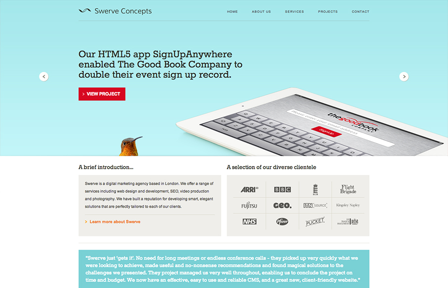
Swerve Concepts
I like the clear blocky grid for this design. Right angles and squared off images, then the big oversized slideshow at the top. Pretty common layout formula but it's pretty groovy here to me. Pretty funny use of the animal heads throughout the site. Humor is funny.

poweredByCoffee
I like the left to right changing layout. Very asymmetrical and open vibe. I also dig the mobile nav design, feels really app like. Clever stuff.
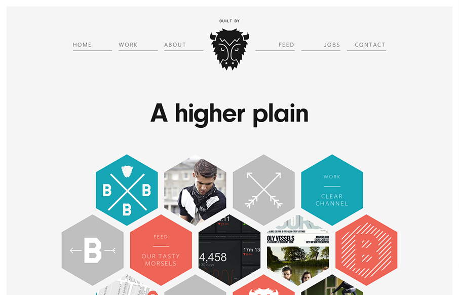
Built By Buffalo
I LOVE the new Built By Buffalo design. So clean and sharp. The hexagon shapes feel very new compared to other sites too. Slick responsive design solution that's just as clean and concise as other screen width versions of it. Beautiful! Ascii buffalo head FTW!
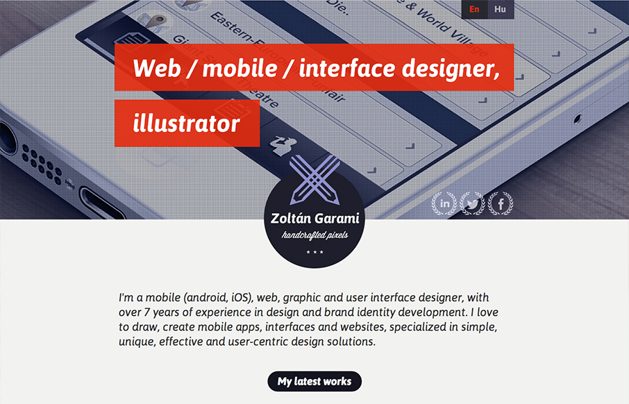
Zoltan Garami
Submitted by: Zoltan Garami @garamiz Role: Designer I like the placement of the red behind the white text that's over the monochromatic image. I know it's simple and been done before but it's nicely done here and I just like it. The logo is nicely placed in the center...
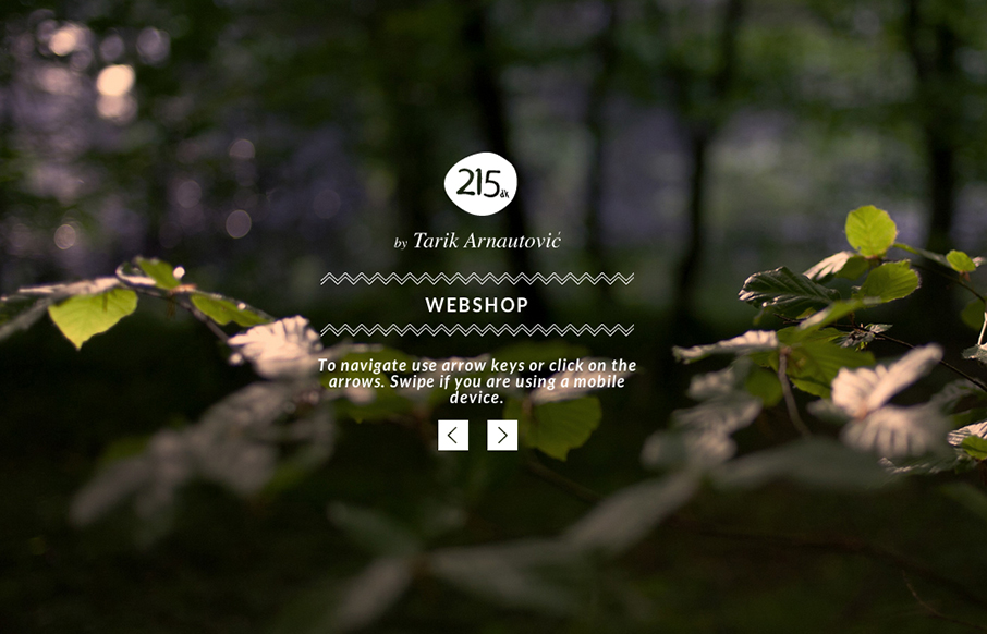
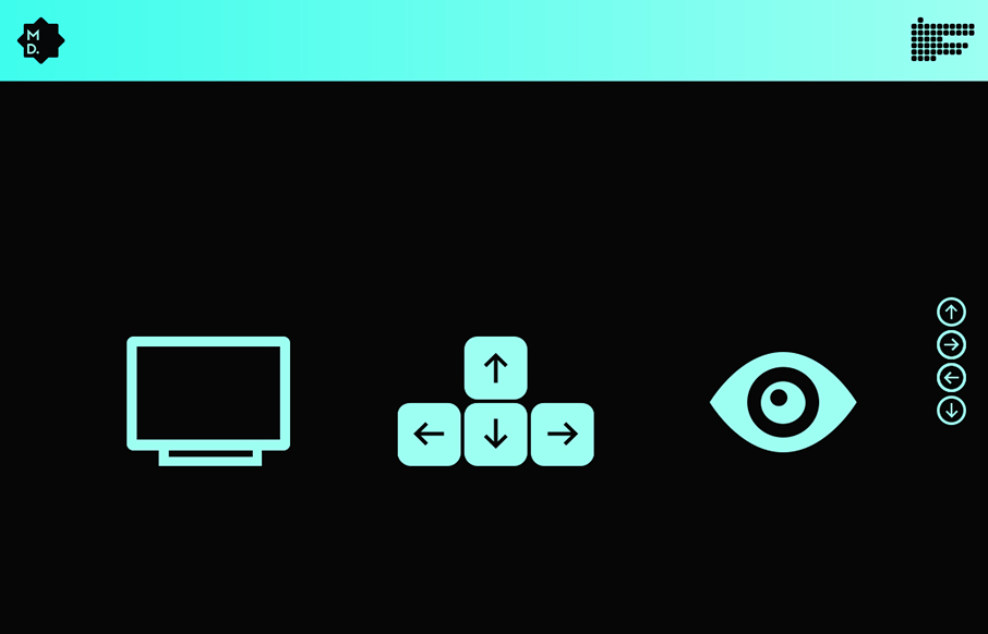
215.dk
I love subtle design and this site is a perfect example of that. The left right arrows that match up with the keypad, then the simple placement of interactions/controls. Like when you click on menu and the big X is over the content of the previous page/view. Love it....
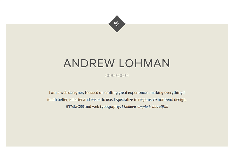
Andrew Lohman
Submitted by: Andrew Lohman @ajlohman Role: Designer & Developer A simple responsive personal site with some nice little details. Really brilliantly simple design. I love how the logo stays put as you scroll down the page, disappears behind the portfolio section then...
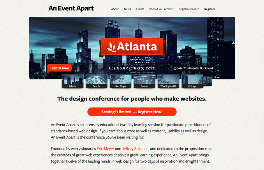
An Event Apart
The new An Event Apart site had landed. It's a well done example of clean design and responsive/mobile-first implementation. I think we'd all except no less from the masters themselves. They've given us a nice writeup on the site re-launch on their new blog too. I...
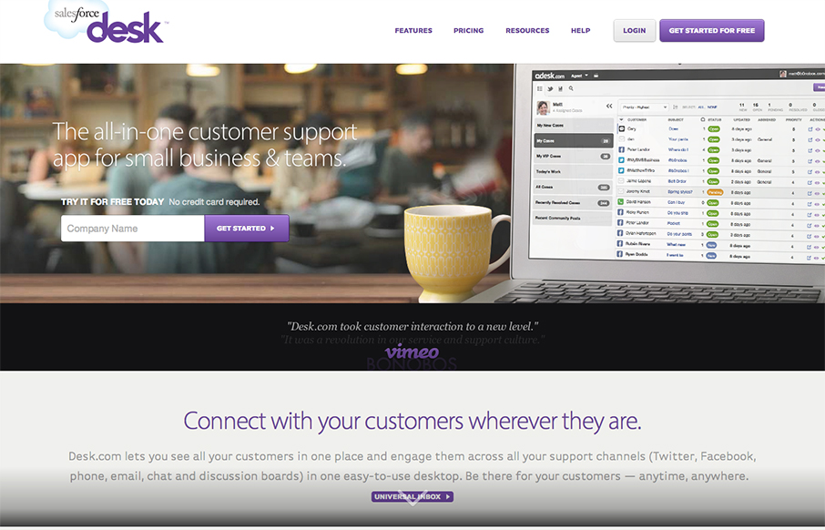
Desk
Submitted by: John Ashenden @ashenden Role: Designer & Developer The all-in-one customer support app for small business & teams. Desk approached The BKRY to help lead the redesign and development of both their identity and web site. The project spanned ~3 months. The...
Osvaldas
I just love this site design. The minimal color palette and the simple yet deep approach to the layout. The single list of posts on the home page just sings to me for some reason. I think it's the balance the designer has struck vertically with the layout. I'm also a...
EMAIL NEWSLETTER
News & Articles
A Designer’s Article Marketing Menu
How to Cook up Blog Posts That Help You Get More Business Now more than ever, I hear designers talking about fresh content as an important ingredient in web marketing. Like Internet nutritionists, they remind their clients, week in and week out, to post new,...
Icon Lab Giveaway – 50 Icons
 50 Free icons for you from Icon Lab’s Unity Icon set.
Google Buzz Icons
 Custom Google buzz icons by unmatchedstyle, use them however you want.

HARD WORK. CLEAN FUEL. NO EXCUSES
Use “WARRIOR2023″ for 10% off.