Submitted by: Matt Brothers @grooveshark
Role: Designer & Developer
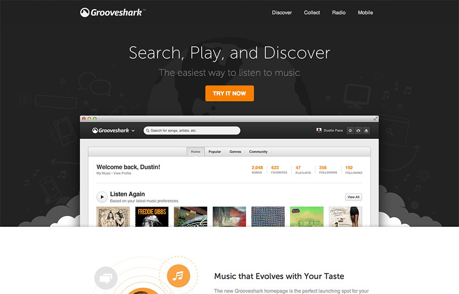
Landing page for early access to the new Grooveshark redesign.
Nice new design update for the Grooveshark experience. I understand this to be a gateway to get to the updated Grooveshark. It’s nice and visually deep and gives you a reason to check it out with all the nice visual trickery. I really love sites like this that give the scrolling narrative priority over other ways of telling the story.
My favorite little detail is how the “try it now” button disappears and then fades in on top of the fixed header. It almost looks like it’s animated to do that. That’s a nice use of the fade man.


Thanks for the love guys! Hope you guys are enjoying the redesign too 🙂
Edit: Dev was by Matt but Design was by the wonderful James Barnes