Web Design Inspiration Curated
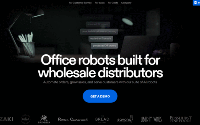
Rekki
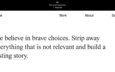
Neue
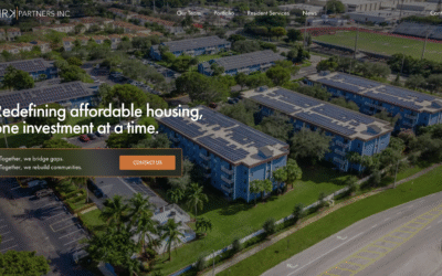
MRK Partners
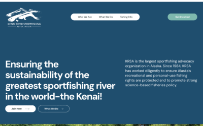
KRSA
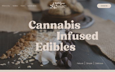
Lady Gray
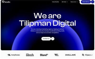
Tilipman Digital
Tilipman Digital’s website was designed to showcase the agency’s Webflow expertise, B2B marketing focus, and results-driven approach. The clean, minimal design highlights services, case studies, and growth strategies while driving conversions through clear structure and messaging.
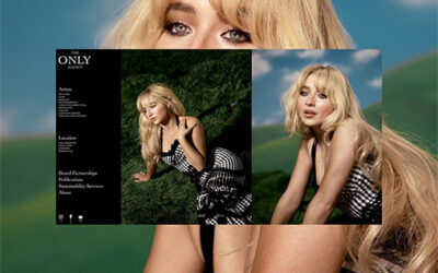
The Only Agency
TheOnly.Agency – Fashion, Beauty, Branding and Talent Management.
Floema
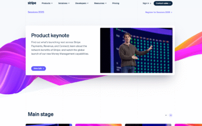
Stripe
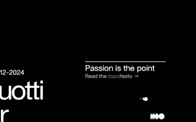
Silvias Guotti
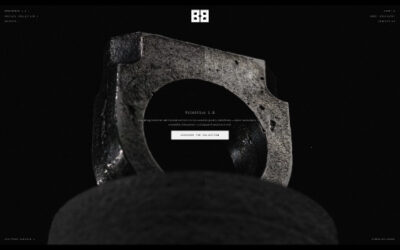
BRUTBEAST
Brutbeast is a multidisciplinary avantgarde jewelry and industrial design brand founded early 2020 by Kristina Koshechkina and Evgeny Demchenko.
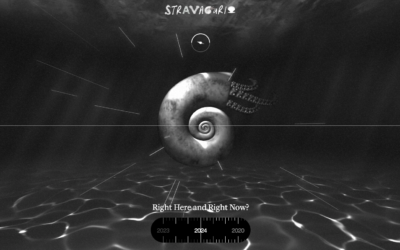
Stravagar
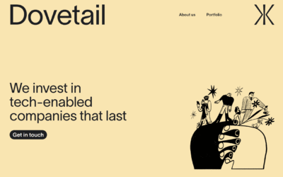
Dovetail
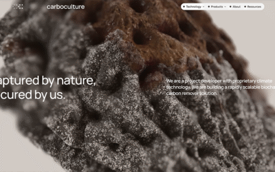
Carbo Culture
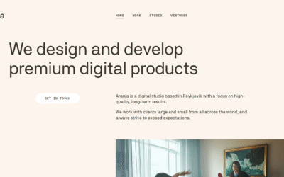
Aranja
Anna Jóna
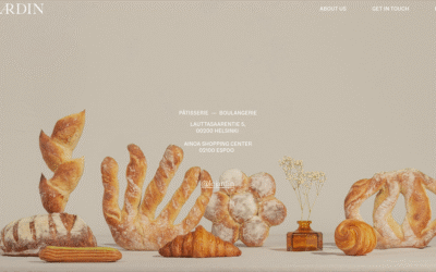
Le Jardin
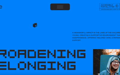
Striive
Striive
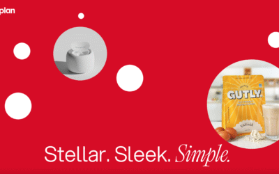
SimplePlan Media | Award-Winning Branding & Design Agency
SimplePlan is a creative agency that turns ideas into impactful brands, websites, and campaigns. Focused on quality, relationships, and outcomes, we make design, development, and marketing approachable for startups and growing businesses. Great work, done better.
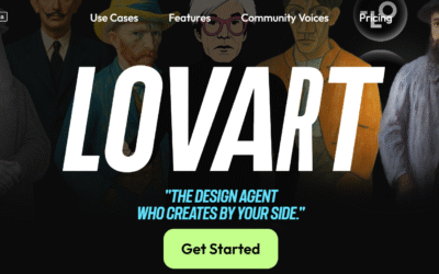
Lovart-AI Design Agent
Lovart AI – Revolutionary AI Design Agent that transforms text prompts into stunning visuals instantly. Automate your design workflow with our intelligent auto-design agent.
EMAIL NEWSLETTER
News & Articles
SQL vs. No-SQL Database: Choosing the Right Database for Your Project
Explore the SQL vs. No-SQL database dilemma in this informative article. Learn the strengths, use cases, and factors to consider, aiding your choice for optimal data management.
Creating Delight in Website Design and Development
Delight in web design transforms usability into memorable experiences, fostering user connections and brand loyalty. Balancing delight and functionality is key to crafting exceptional digital interactions.
The Five-Second Test: A Crucial Technique for UX Success
Discover the power of the Five-Second Test in UX design. Learn how it captures users’ attention, conveys brand messages, and enhances user engagement for lasting digital success.

HARD WORK. CLEAN FUEL. NO EXCUSES
Use “WARRIOR2023″ for 10% off.