In the realm of web and mobile app development, there exists a critical differentiator that sets outstanding creations apart from the mundane – the art of creating something truly memorable and delightful to use. This elusive quality might manifest as a touch of humor, a visually striking interface design, or an interaction that brings a smile to the user’s face. It’s important to note that achieving this delightful user experience is both subjective and challenging to define, and that’s precisely the point.
Before we delve deeper into the concept of delight, it’s imperative to establish two foundational pillars: usability and accessibility. These two benchmarks must be met before the pursuit of delight can begin. Furthermore, any delightful element introduced must seamlessly integrate into the overarching design framework. For instance, if you’re crafting a high-end banking application, humor may not be the most appropriate choice. Similarly, if the interaction in question will be used repeatedly, adding an overly complex set of interface elements solely for aesthetic purposes would hinder usability. The key lies in harmonizing delight with usability, ensuring that it enhances the user experience without sacrificing functionality.
The Essence of Delight
The true magic of creating delight in website design and development unfolds when the targeted element aligns with the website or app’s overall objectives. If your goal is to infuse fun into an application, it should also reinforce the brand’s identity. If your brand exudes a sense of fun and cleverness, integrating humor becomes a winning strategy. Another fertile ground for delight is when an element communicates data, such as a chart or graph. Animations, too, play a pivotal role as they can inform users on how to interact with the interface effectively. They load, educate, and gracefully recede into the background, facilitating a seamless user experience.
The Impact of Delight
Introducing moments of delight into your website or app can yield remarkable results. It not only makes your creation more memorable but also fosters a deeper connection between users and your platform. This, in turn, cultivates goodwill and may even serve as a buffer, mitigating any concerns users may have or seeking forgiveness if other aspects of the design fall short of expectations.
When users encounter a delightful surprise within your website or app, it creates a lasting impression. It transforms a mere interaction into a memorable experience, leaving a positive mark on the user’s perception of your brand. Over time, this can translate into increased customer loyalty and brand advocacy.
The Art of Delightful Design
To harness the power of delight in design effectively, it’s crucial to understand your target audience. What brings them joy, amusement, or satisfaction? Tailoring the delightful elements to resonate with your user base ensures a more impactful response.
Additionally, constant testing and user feedback are invaluable. These iterative processes help refine the delightful elements, ensuring they continue to meet user expectations and preferences. What delights users today may evolve over time, so staying attuned to these shifts is essential.
Some Examples
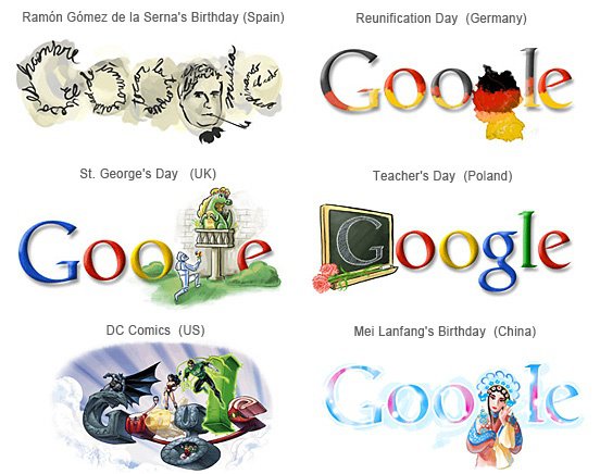
Google Doodles:
Google frequently replaces its logo with creative and interactive animations or illustrations to celebrate holidays, historical events, and famous figures. These delightful doodles often surprise and engage users when they visit the Google homepage.

Duolingo’s Language Learning Gamification:
Duolingo, a language-learning platform, incorporates gamification elements into its interface. Users earn points, unlock achievements, and compete with friends, adding an element of fun and delight to the otherwise challenging task of language learning.
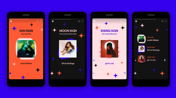
Spotify’s Personalized Playlists:
Spotify’s algorithms generate personalized playlists for users based on their listening habits. Discovering new music that aligns with your tastes can be a delightful experience and keeps users engaged with the platform.
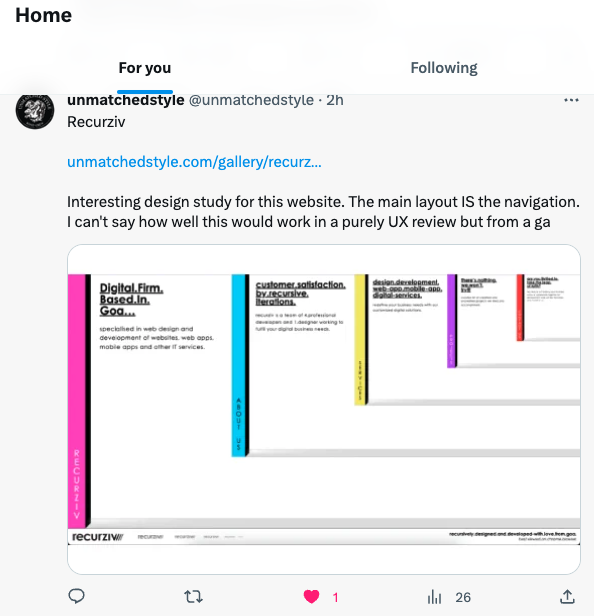
Twitter’s Like Animation:
When users ‘like’ a tweet on Twitter, a heart icon pops up and explodes into a burst of tiny hearts. This small animation adds a touch of delight to the act of liking a post and provides instant feedback to the user.
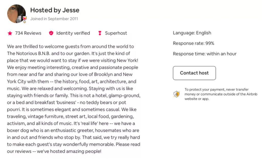
Airbnb’s Host Bios:
Airbnb allows hosts to create personalized bios for their listings. Some hosts go the extra mile by including humorous anecdotes, local recommendations, or interesting stories about their properties. These personal touches can delight potential guests and make the accommodation stand out.
These examples demonstrate how delight can be strategically integrated into website design and functionality, enhancing the overall user experience and making interactions more enjoyable.
The Masters
Paying homage and researching Don Norman’s groundbreaking work on emotional design and Aaron Walter’s insights on designing for emotion is essential in today’s digital landscape. Norman’s emphasis on creating products that evoke positive emotions aligns with Walter’s focus on crafting user experiences that resonate emotionally. By combining their principles, designers can create websites and apps that not only function well but also leave a lasting and delightful impact on users’ hearts and minds.
Make ’em Smile
The ability to create moments of delight is a game-changer. It transforms your creation from a mere tool into a memorable experience that resonates with users on a profound level. By aligning these delightful elements with your brand and user expectations, you can forge stronger connections and leave a lasting imprint in the digital realm.
While creating moments of delight is a powerful strategy, it must be approached with balance and sensitivity. Overindulgence in whimsy or extravagance can overwhelm users and detract from the core functionality. Therefore, it’s essential to strike the right equilibrium between delight and usability.
So, when embarking on your next web or mobile app project, remember that usability and accessibility are the foundation, but it’s the touch of delight that can truly set you apart.


0 Comments