Web Design Inspiration Curated
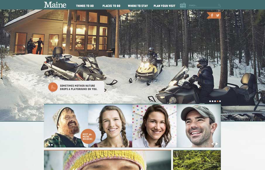
Visit Maine
So i'm planning a trip to Maine this summer, I came across this website for Visit Maine and it's a nice one. Good responsive approach and beautiful design. I love the navigation design a great deal on this site.
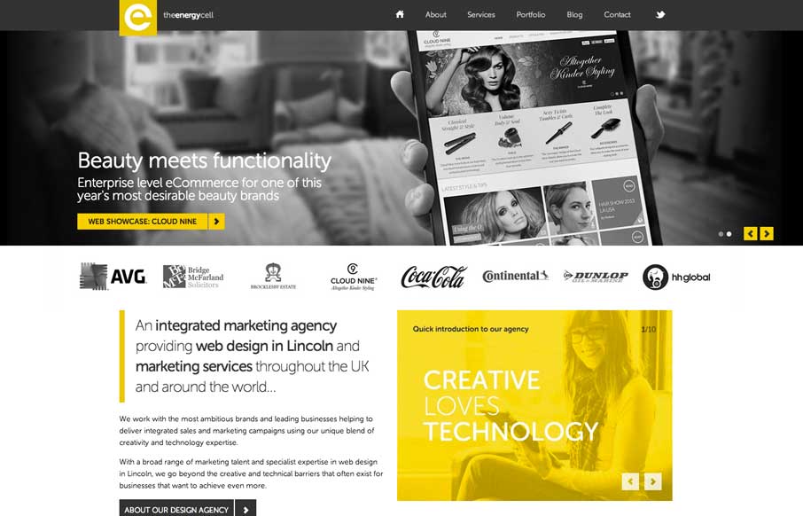
The Energy Cell
Nice looking adaptive site. I like the yellow and black palette. My favorite part is the lower 3rd of the page, the grid and blockiness of the layout works really well there.
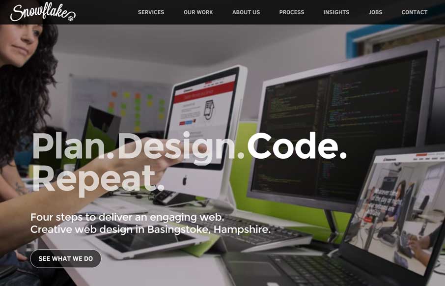
Snowflake
Oooh! I love the way the background images in the hero area(s) of this page get some faux 3d movement. That's very smart and I don't think i've seen that before. What a way to make the site different than the rest. Bravo.
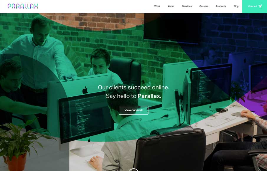
Parallax
Little details make the site. I like the little movement the down arrow has, just to let you know it's there. Then the little paper airplane on the contact button is nice.
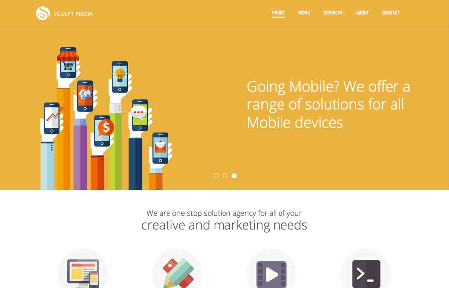
Sculpt Media
Similar design patter at work, with the big hero area and the sliding into place main navigation. I like the slight transparency to that main nav on this site and the icon work is beautiful.
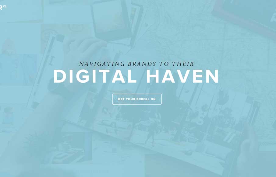
HARBR Co
Nice minimal approach to the HARBR Co site design. I like the "menu" link and how that interaction works. It helps to keep the site clean and focused.
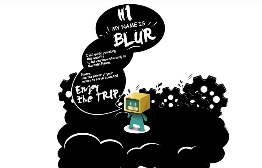
Marcello Pisano
Nifty portfolio site for the illustrator Marcello Pisano. The illustrations are cute and the site is designed to show off the guy's skill like it's supposed to. The timed faded in pieces are a nice touch as well.
2che
Sometimes you're presented with something completely different, like in the case of the 2che website. When you start to scroll you go right to left and there's a sort of horizontal parallax (which is the original direction right?) going on. It's not terribly practical...
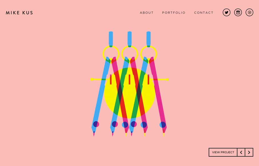
Mike Kus
There's nothing quite like a simple beautifully designed website. Mike Kus nailed it.
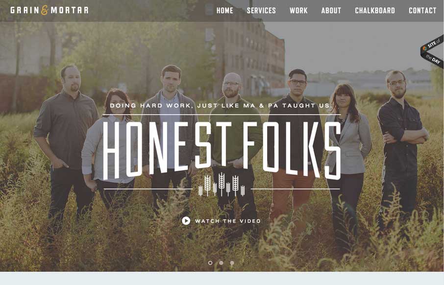
Grain and Mortar
Beautifully designed website here for Grain and Mortar. I love the dark overtone to the design and love the typography. There are some really wonderful illustrations throughout the website too - if you're into that sort of thing 🙂
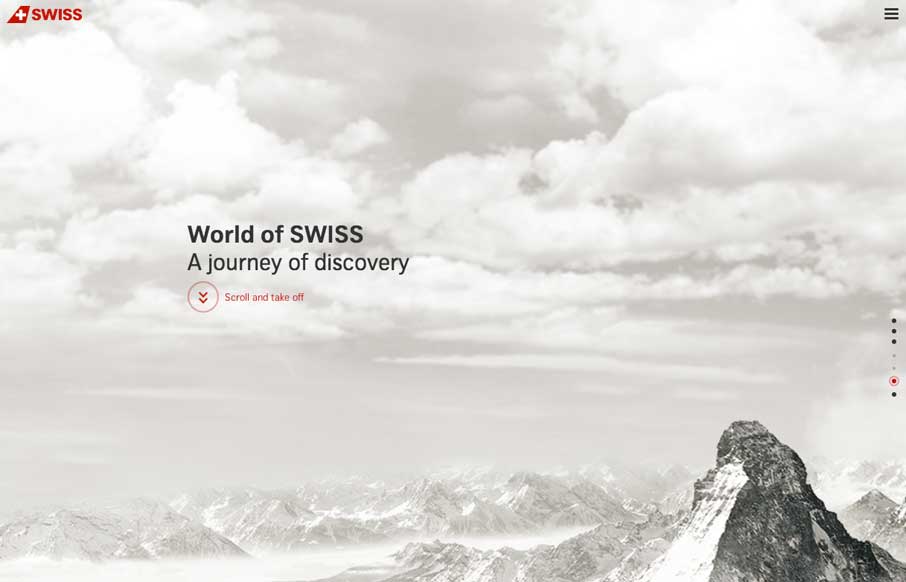
World of Swiss
Very interesting experience traversing this website. I love the scroll and fly feeling. Very slick execution.
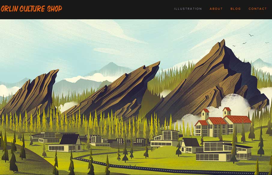
Orlin Culture Shop
Super simple and elegant way to show off your work for an illustrator. I get to just sit here and scroll down the page and take in all this succulent work. Mmmm.
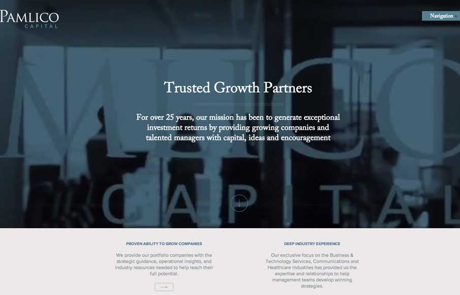
Pamlico Capital
I like the use of the video in the header on the Pamlico Capital site. All of the slider interactions across the home page are nicely done too, they're subtle enough and effective at the same time. I don't think i've seen a site's navigation labeled "Navigation" yet,...
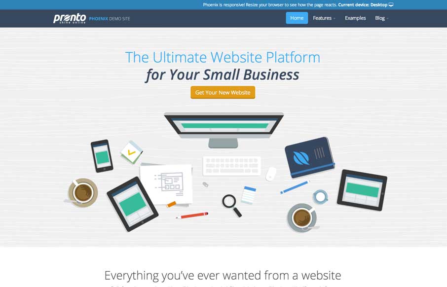
Pronto
Beautiful icons across this site. Really elegant layout and type work too. I sense some technical issues every now and then on images loading but overall it's a gorgeous site design.
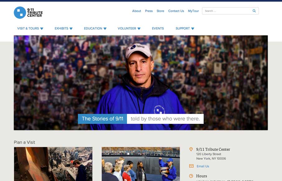
9/11 Tribute Center
Great new site for the 9/11 Tribute Center by the Bearded Studios gents. My favorite part is the navigation design. I really like how most of the site's nav is represented in the drop down and keeps it easily accessible on the desktop. While it's more inline on the...
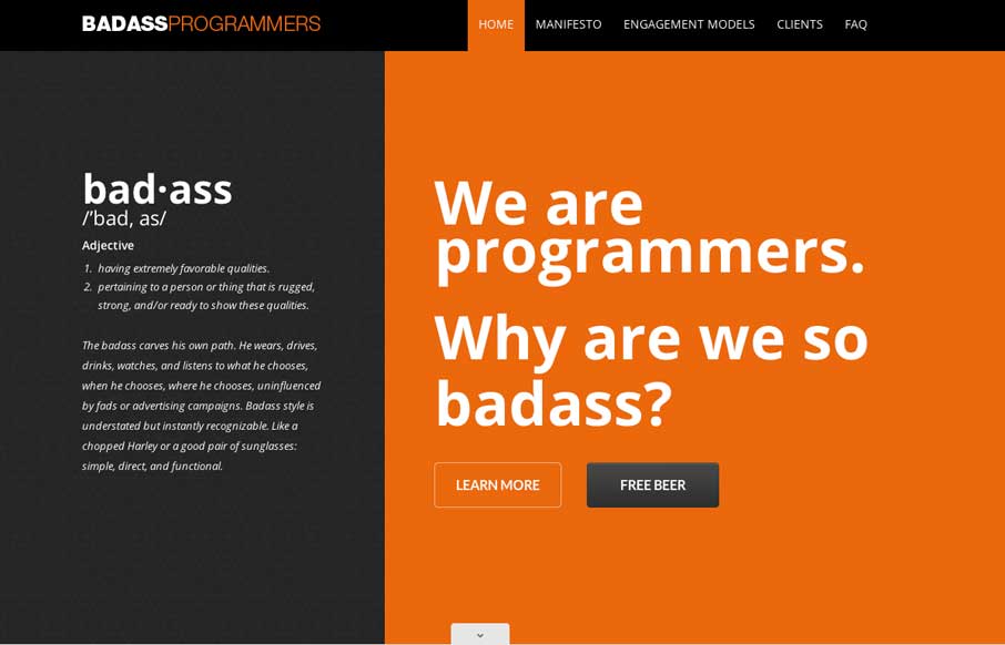
Badass Programmers
Nice scroll down/in movement on the main graphics. That kind of thing can hit home right away when you first visit a website. Claws, Jimi Hendrix... dern fellas.
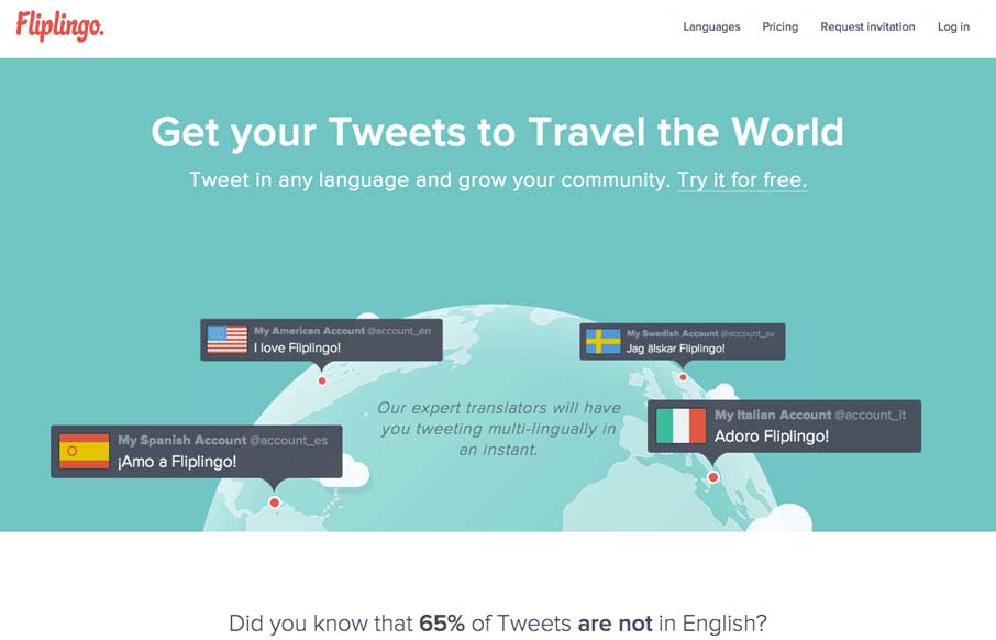
Fliplingo
Pretty cool interactions to review on this site. First I like how the nav goes transparent when you scroll and reappears when you start to scroll back up. Then there are little movements on important buttons to show you where your attention to should be placed next....
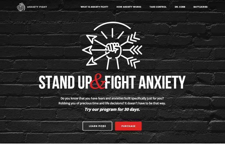
Anxiety Fight
Strong visual language backs up a nice solid design and layout. Sometimes you can see there's good content that the designer has to work on, this site is a good example of that. Good content backed up with good design.
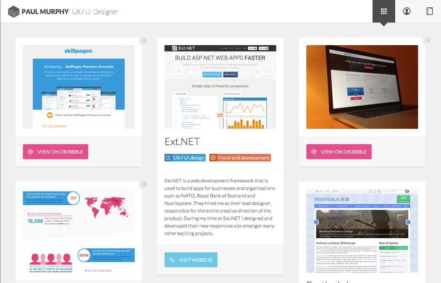
Paul Murphy
Really dig the masonry like layout utilized here. It's well done. I also like the light touch to the design so that the site itself doesn't overpower the work displayed. That's a hard line to walk.
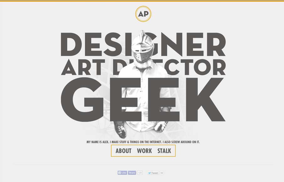
The Geek Designer
I love it when a person's personality comes through in their design. Now this is a personal portfolio site for Alex Pierce and yeah, his personality should show through. Boy does it. In the specific words and phrases and most of all there's a shot on the main page of...
EMAIL NEWSLETTER
News & Articles
UMS Email Newsletter
Check out our email newsletter, we’ve been publishing it for the past year or so and we’d love for you to sign up so we can inspire you next!
Danny Halarewich: LemonStand, Limewheel Creative
Finding out a bit about what makes LemonStand a successful product and some backstory on how it came to be.
Interlink Conference: With Shawn Johnston
 Getting some background info on the Interlink Conference in Vancouver from Shawn Johnston the conference’s founder.

HARD WORK. CLEAN FUEL. NO EXCUSES
Use “WARRIOR2023″ for 10% off.