Web Design Inspiration Curated

thesnippetapp.com
Lots of good design queues in this site. Narrative and good visuals to support it. When that's done well that's all you need folks. 🙂 Submitted by: Ben De Rienzo @derienzo777 Role: Designer
UIX.me
Pretty clean and simple layout. Lots of popular design patterns here but they're all done well and executed precisely.
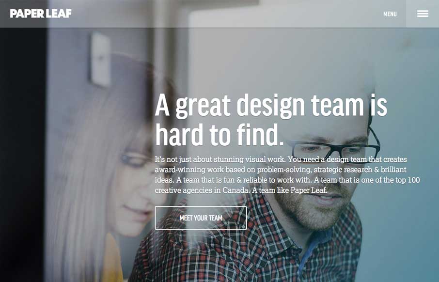
Paper Leaf
Really nice clean design for Paper Leaf. I like the side menu design as well as the overall type treatment - slightly drop outlined or something. Quite nice. Highly detailed, responsive website built on Bootstrap and powered by Wordpress. Key elements: CSS transforms,...
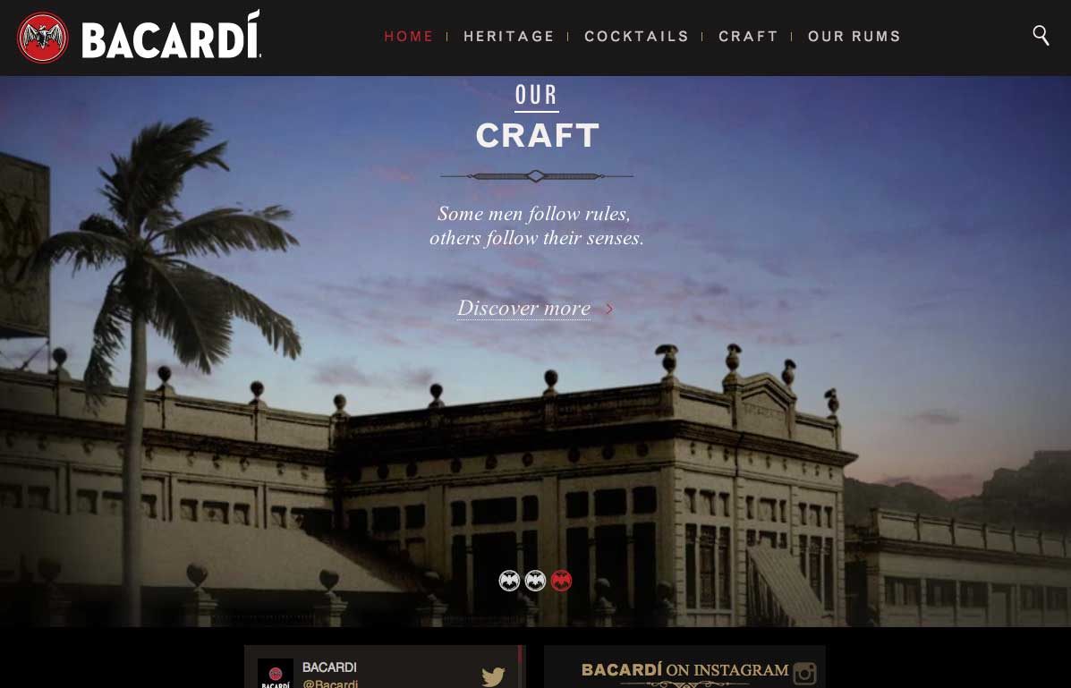
Bacardi Rum
So.. I've been watching and listening to a lot of World Cup Soccer, and Bacardi is a sponsor. I guess advertising works, because after about the seventh time of hearing the ads, I ended up on the site. The opening video background is kind of awesome, especially when...
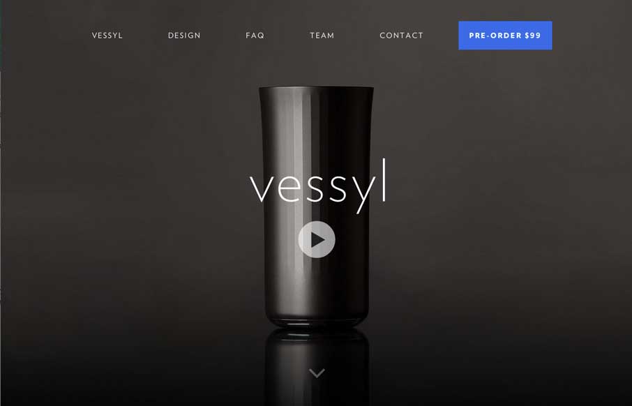
Vessyl
We're kind of fitness and gadget junkies here at UMS. So when the site was submitted, it was cool to imagine what the possibilities were for Vessyl as a device and company. Design-wise, the site itself is slick and sharp, which seems to be very much in-line with the...
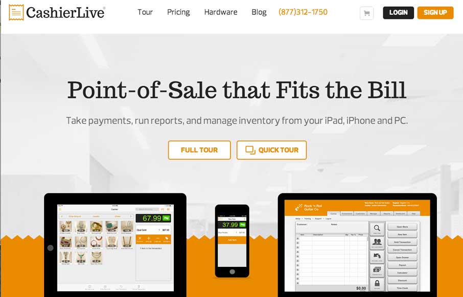
CashierLive
Really nice clean product site. I like the little illustration details scattered down the page. The little grid of posts is nice too. Submitted by: Joe Clay @joeclayallday Role: Designer & Developer
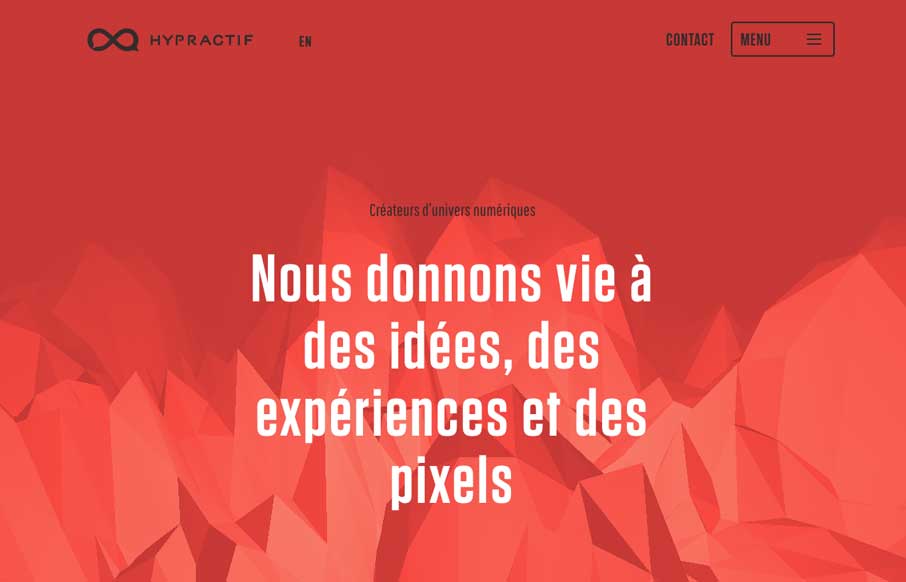
Hypractif
I luuurve the scrolling interaction with the background image on the Hyperactif site. It's pretty badass looking and i'll remember it for a while for sure. Submitted by: L Edouard Reinach @hypractif Role: Designer & Developer This website makes a very interesting...
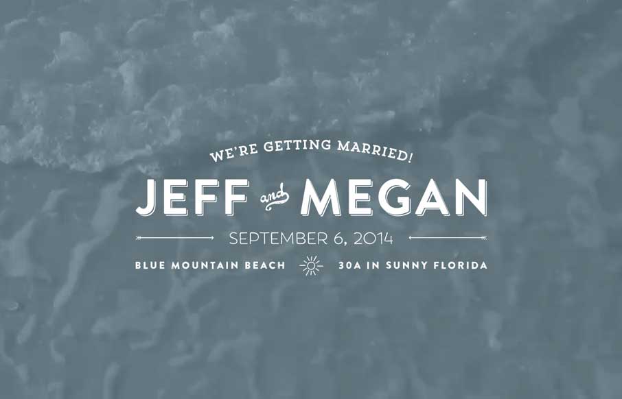
Jeff and Megan
Jeff and Megan are getting married at the Beach. 🙂 It's a wedding site, but it's a nifty one. I like the use of the video and the slow fades between the proposal pictures to sort of be animated(ish). Dig it. Submitted by: Jeff Glenn Role: Designer & Developer
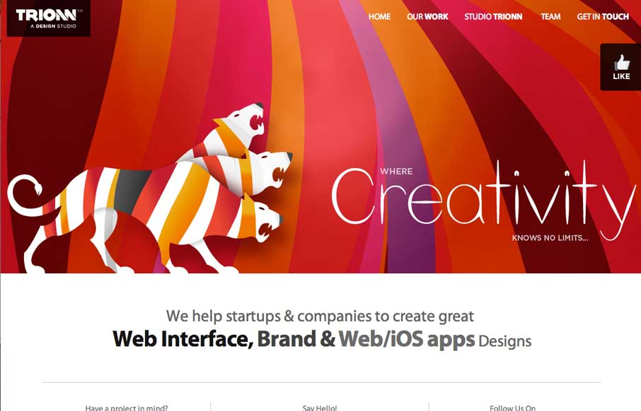
Trionn Design
Some neat graphics here. The three headed lion monster is pretty badass. I like the bold colors, but some of it is over the top. That said however, why not? Submitted by Sunny Rathod @trionn_design
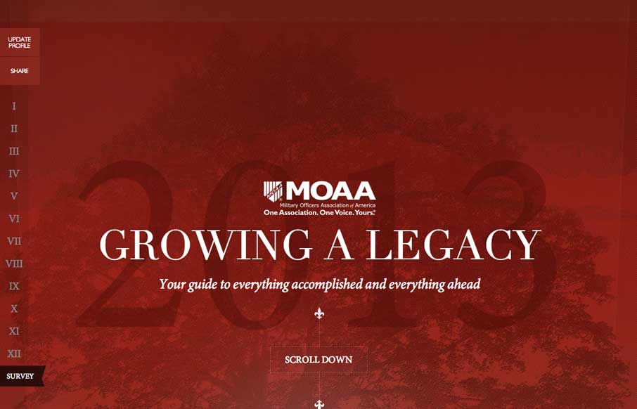
MOAA Annual Letter
Beautifully designed page. I love these type of websites, annual reports or whatever. They are a chance to stretch a website design's limits sometimes. Submitted by LMO Advertising @lmoadv
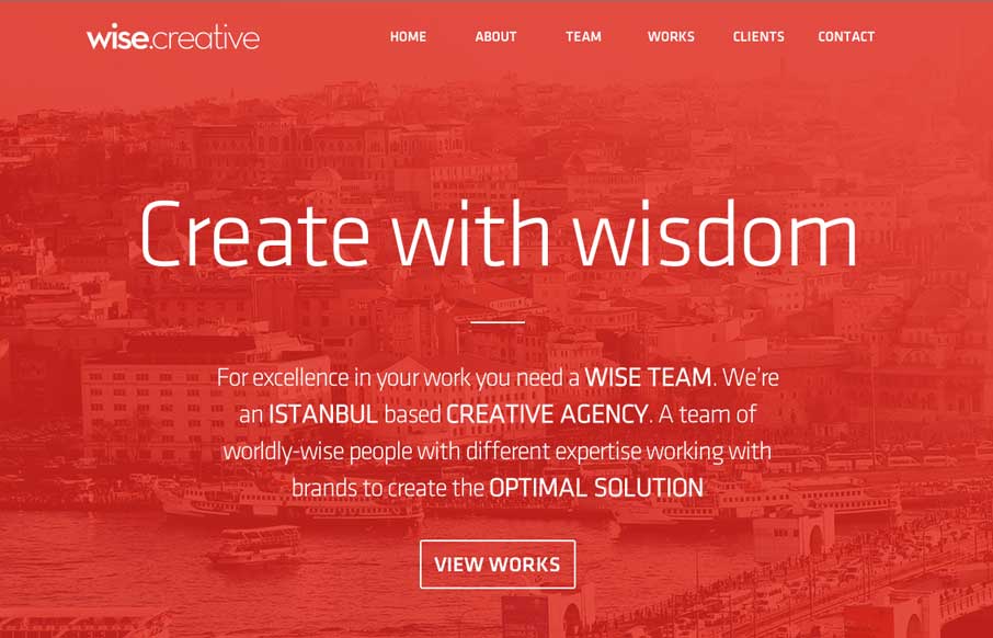
Wise Creative
I always like to see how people handle the fixed nav animation as you scroll design piece. Wise Creative is one of my favs too. I like the overall clean layout of the site as well. Classic color combo red, black and white too.
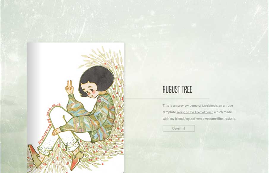
August Tree’s Portfolio
This is a theme you can buy - in fact it's a site that is meant to show off the theme. It's pretty nifty. I've actually had clients in the past ask for this specifically and we've never built one out, too bad this wasn't out then, i'd have just pinched it and made...
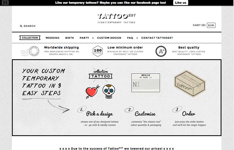
Tatto EST
Nice pure simple black and white site. Clean layout and some nifty illustrations make this site one that I like.
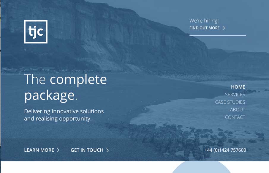
The Jamieson Consultancy
I dig the clean layout and nice use of negative space between text/design elements on this page. The minimal color palette is very business too, with the blues.
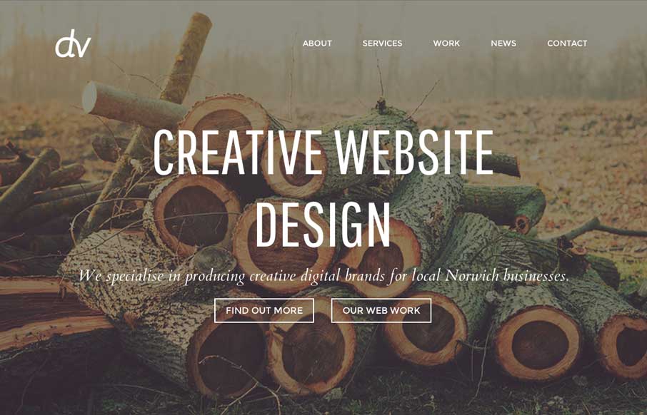
Design Vibe Creative
I like the soft colors and imagery they've baked into the design for this site. It's a theme it looks like, but still I like what they've done with it. Submitted by Adam Engledow @design_vibe Simple design with a nice rustic and vintage feel which is nice. The images...
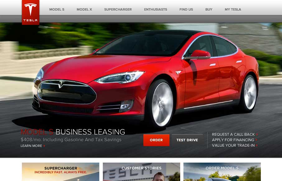
Tesla Motors
This site does well to reflect the product that they have, with quality interactions and with a smooth ride. The site seems cookie cutter at first but reveals some pieces that really draw you in when scrolling through the Top 5 Questions...
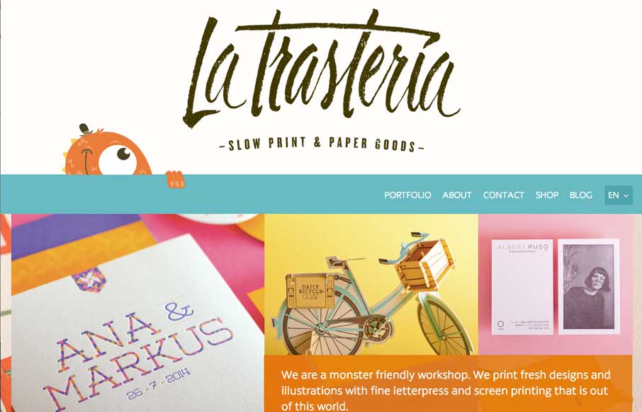
latrasteria.com
I love the overall feel of this site. It's crisp yet feels warm and tactile through the use of illustrations, overlays, and pattern. The style of the site matches that of the work which gives a nice cohesion to the brand.
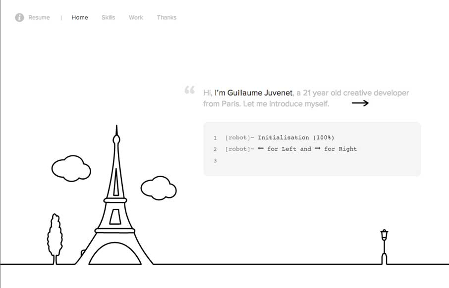
Guillaume Juvenet
This site is fun, hands down. I like driving the little robot instead of using the links. Clever and very memorable.
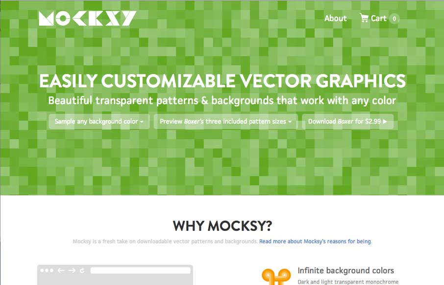
mocksy.com
Easily customizable vector graphics – a smart idea as smart ideas go. The home page makes a compelling case about why to use the product and there are more than a few ways to immediately start playing around with different colors and sizes. These quick demos really...
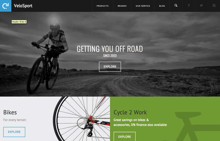
VeloSport
http://velosportonline.com/ Pretty sick bike site. I like the bold blocky layout and the info is organized in a clear and easy to consume way.
EMAIL NEWSLETTER
News & Articles
CSSOff Update #3
 Third update on the status of judging and an overall CSSOff related update.
CSSOff Update #2
 Update on the status of judging and an overall CSSOff related update.
Why I make Glyphicons
![]() Quick post from Jan Kovarik. Why and how he makes Glyphicons.
Quick post from Jan Kovarik. Why and how he makes Glyphicons.

HARD WORK. CLEAN FUEL. NO EXCUSES
Use “WARRIOR2023″ for 10% off.