Web Design Inspiration Curated
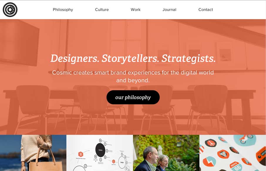
Cosmic
Great site at any screen size. Like their infographic on their work process too. Looks like a cool place to work - 2 minutes from the ocean, 10 from the mountains.
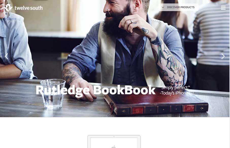
Twelve South
This was a fully responsive redesign of the Twelve South eCommerce website. Twelve South creates beautifully designed accessories exclusively for Apple computers. We love their BookBook for iPhones and iPads - and the site reflects the beautiful design of their...
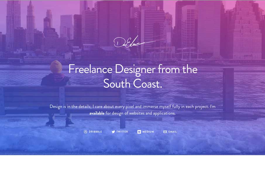
Dan Edwards
I love the big screenshots, they keep going forever. Pretty cool vibe color wise too, nice stuff. Simple and effective. Submitted by: Dan Edwards @de Role: Designer & Developer I've not touched code in years, so to try something new I set myself the challenge of...
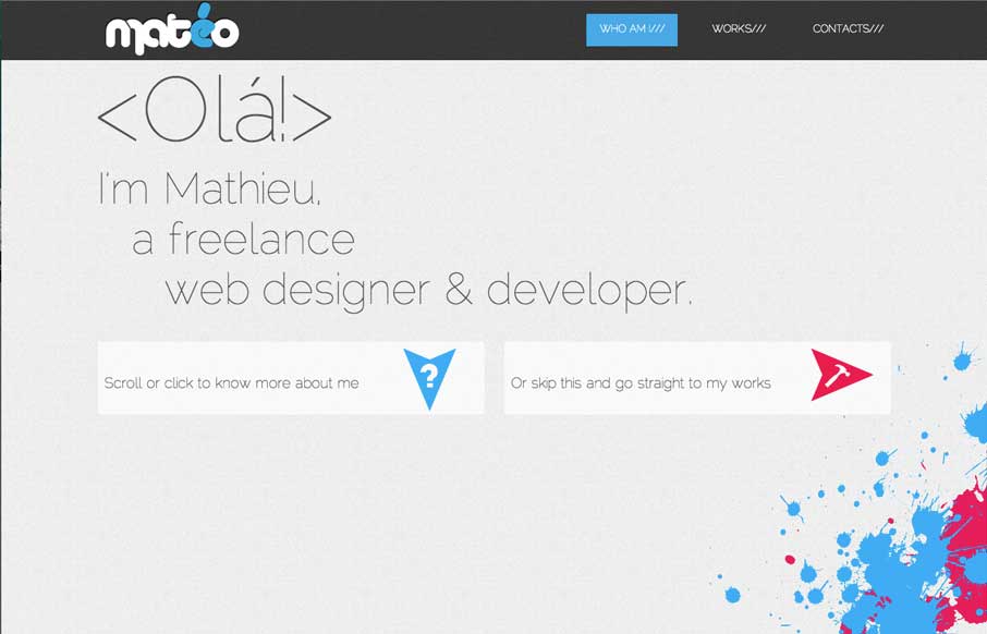
Mathieu Bocher
I dig the feel of this site, the two big calls to action "more about me" and "check out my work" that's pretty much what the site is for and he goes for it in an interesting way with those CTA's. Other little cool details make the site shine too. Good work. Submitted...
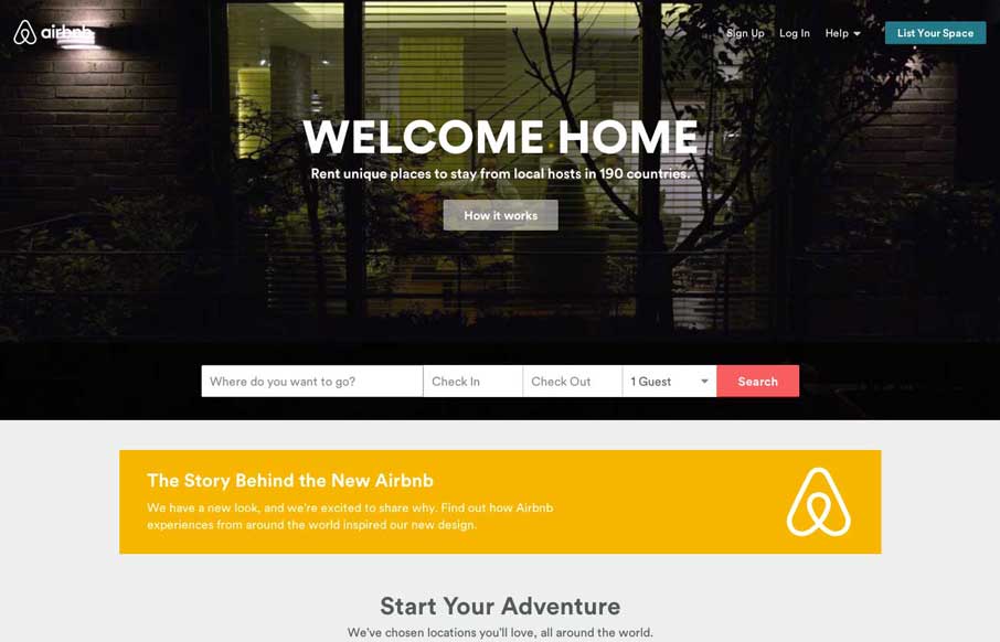
airbnb
New airbnb website update. Plenty to gawk at, most noticeable is the new branding. Go consume folks!
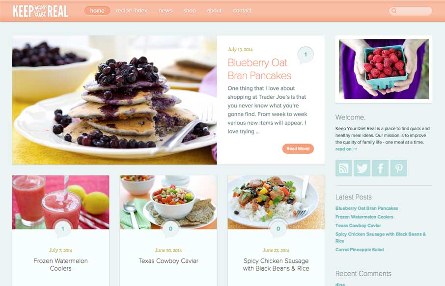
Keep Your Diet Real
I like the colors and soft visual feel to the elements on the site. Nice responsive changes as you scale down the page width too. Submitted by: Matt Rossi @matthewjross Role: Designer
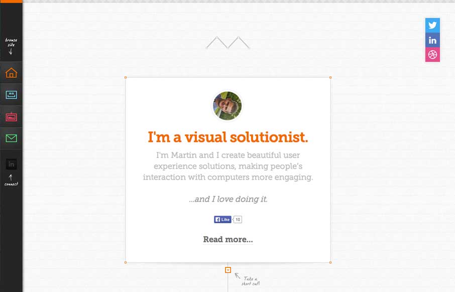
Martin Fletcher
Pretty cool side bar nav design. I also really dig the way the main page is put together with the lines/graph paper feel and the trail connecting things. It's intriguing enough to make me scroll it and check it all out.
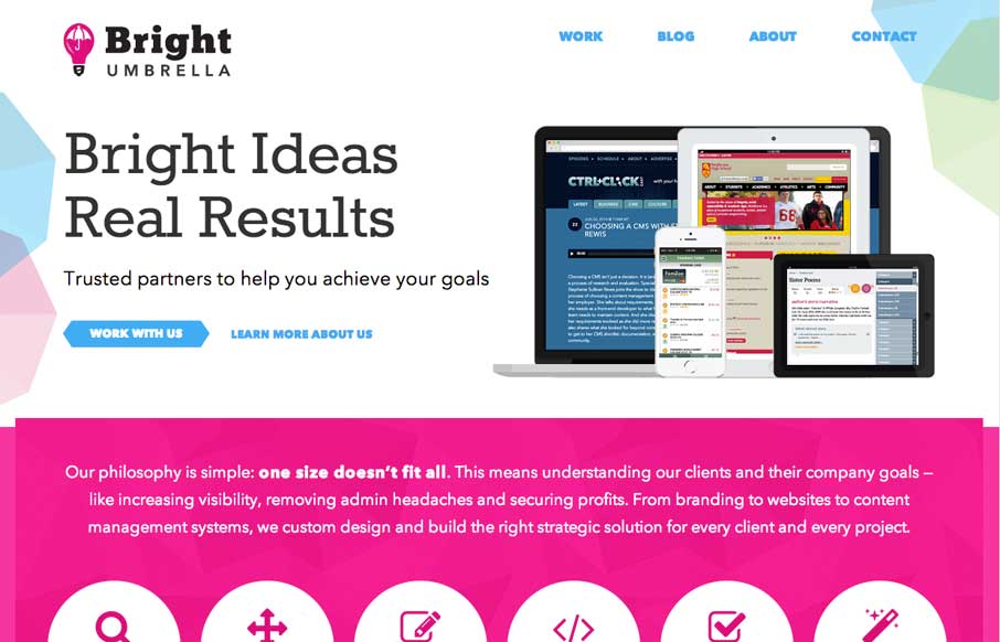
Bright Umbrella
It's just simply a well done site. These two have been kicking ass for a long time IMHO and it's really nice to see them rebrand and launch this company and website like they have. There is plenty to admire about the site design, plenty of detail work, so defineately...
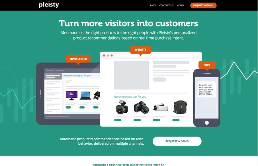
pleisty
I love narrative when it's used in a site design, this one for pleisty is very well done. It's intriguing and cool looking at the same time. Pretty badass actually.
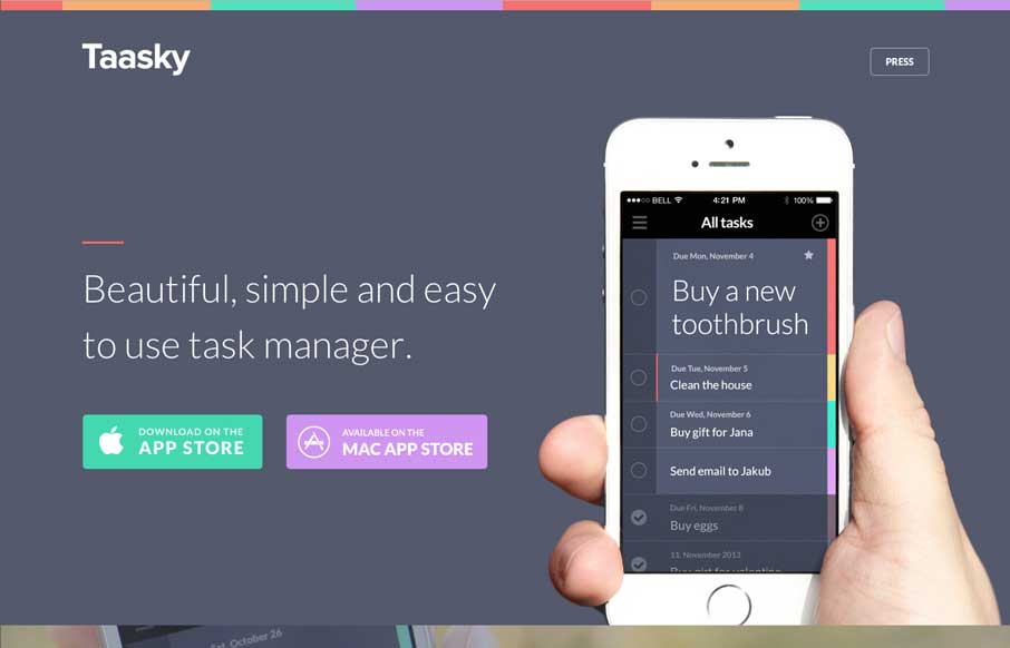
Taasky
Really nifty looking design. I like the soft but crisp look to the site, beautiful work. The very bottom/footer of the site is the bestest part though. I can drop them check marks like a pro.
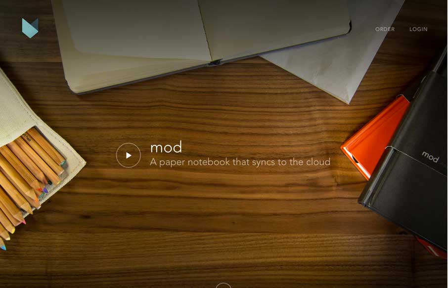
Mod Notebooks
Aside from the fact that I JUST WANT ONE OF THESE, the site is beautiful. I love the flow of the home page as I scroll and the cart process for ordering is simple and smartly put together. Love the notebook and love the site guys!
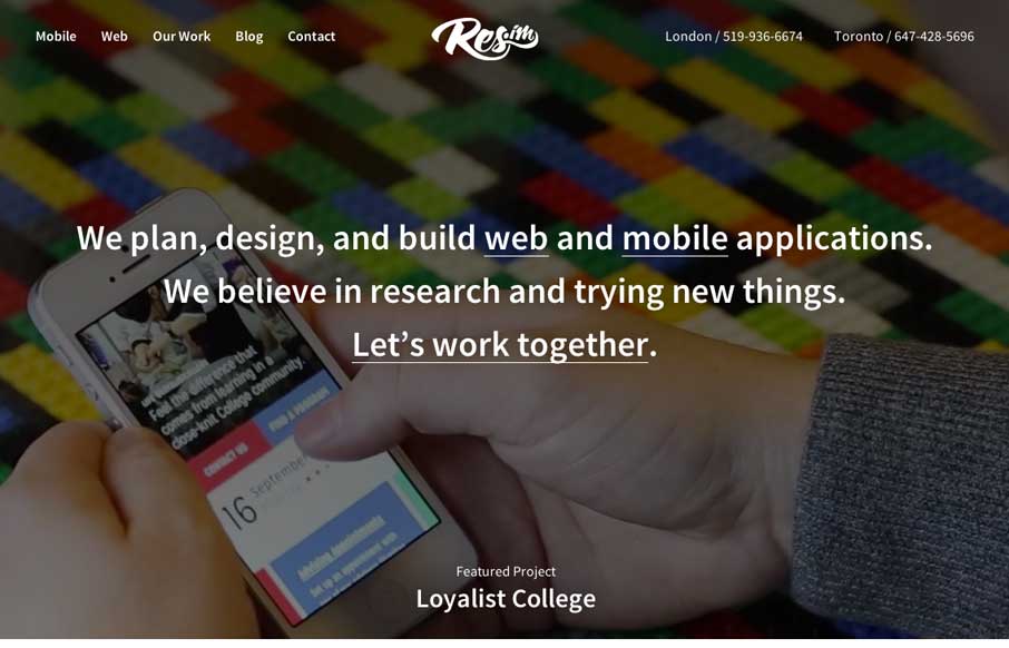
Res.im
There are a lot of familiar patterns at work on the Res.im site, but they are just simply done well. Then there are some new things that i've not seen done before, like the timeline of projects with the team profile pics - that's just smartly done. I also love the...
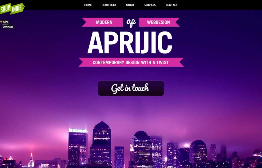
Aprijic web design
Nifty little design details and movement on this site. I like the super bold coloring and the photography elements.
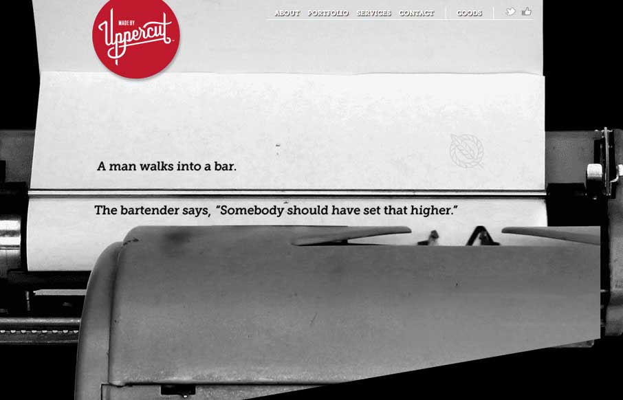
Upper Cut
Really like the animated scrolling on the home page - want that Field Notes book for my personal collection. Great use of fonts, both on the page, and in the modals (which make the modals actually work well - like a placard o' info). And someone needs to get a hold...
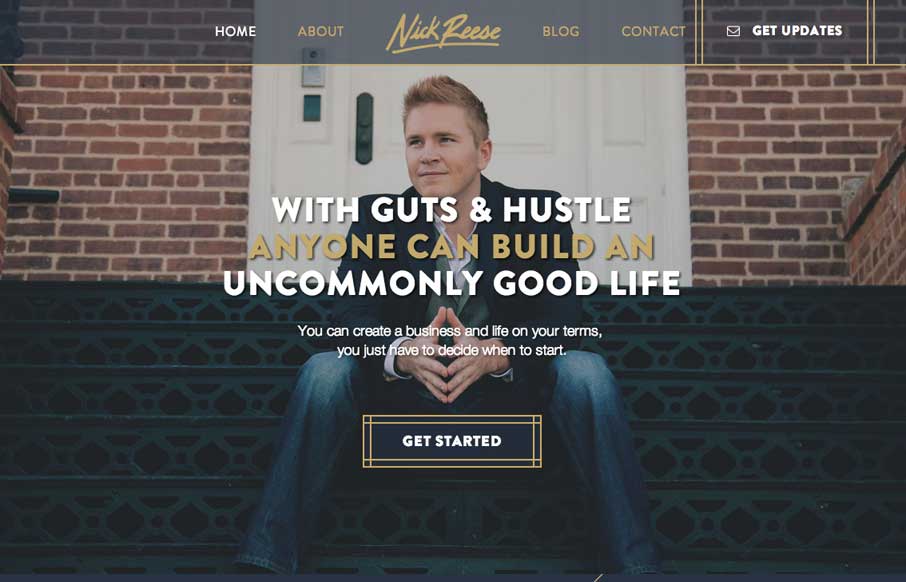
Nick Reese
Nicely focused well branded site for Nick Reese here. I like how the main image stays centered when the screen size is reduced. Very highly produced site here, quite good.
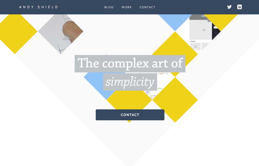
Andy Shield
If you are going to make a portfolio site for yourself, please make it different from all the other designer portfolio sites out there - and Andy Shield did. Besides not being magenta, he's made good work of still using trends, but in more subtle ways - that make the...
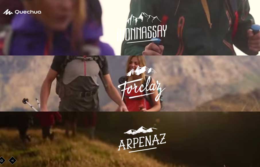
Quechua
Awesome page interactions at work on this site for sure. I dig the line based design then the sharp, quick and smooth movements are nice. I luuurve the way they use the hamburger icon and how when you simply mouse over it you get navigation choices, brilliant.
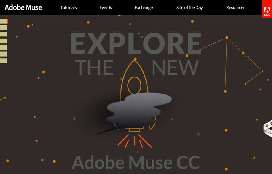
Adobe Muse
Pretty dang nice long form scrolling page design for Adobe Muse. I like the side navigation that drives the page too, tab like design but with the fly out labels.
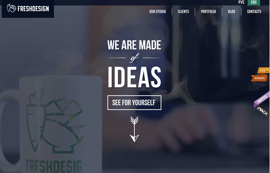
Fresh Design Studio
There is so much going on in this site (which is a good thing in this case) - from video background, to animated infographics, to maps with carrots growing out of them - you get the idea that this agency has enough skill to make your website pretty darn awesome with...
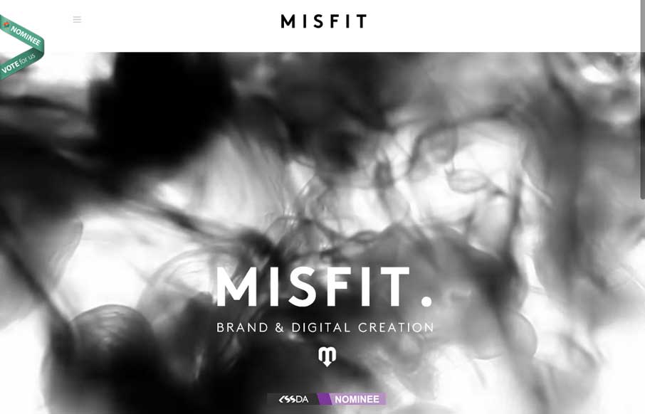
Misfit Creative
I almost don't have to write a review on this one - Pete Brady (below) really captures the site - black and white with the color coming from the work Misfit does. He forgot to mention the thing that draws you to the site in the first place - the cool "smoke.." in "the...
EMAIL NEWSLETTER
News & Articles
10 Tips For Conference Goers
Going to a conference? Here are some friendly reminders about how to prepare and make the most out of your conference experience. Plus a Moo business card giveaway!
Chat Session: Jonathan Snook
 Discussing SMACSS, Scalable and Modular Architecture for CSS – his flexible guide to developing sites small and large. Also, leave a comment to win a copy!
Chat Session: David DeSandro
 Discussing his various contributions to the web dev community and how he approaches his work.

HARD WORK. CLEAN FUEL. NO EXCUSES
Use “WARRIOR2023″ for 10% off.