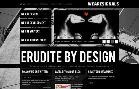
Cool black and white design. Largely black and white anyways. I like the off kilter imagery used on the site, like the buildings set sideways, etc… It’s a very stark and fun design.
Cool black and white design. Largely black and white anyways. I like the off kilter imagery used on the site, like the buildings set sideways, etc… It’s a very stark and fun design.


The Call to Action hasn’t changed in a decade, but the bar has. A fresh look at prominence, copy, mobile tap targets, and accessibility, with lessons from three major design systems.

Glassmorphism brings transparency, depth, and light back into modern UI. Learn how this “frosted glass” design trend enhances hierarchy, focus, and atmosphere, plus how to implement it in CSS responsibly.

Brutalism in web design rejects perfection for authenticity. Stark grids, raw type, and honest structure create interfaces that feel human, intentional, and impossible to ignore. Break the rules, on purpose.
0 Comments