
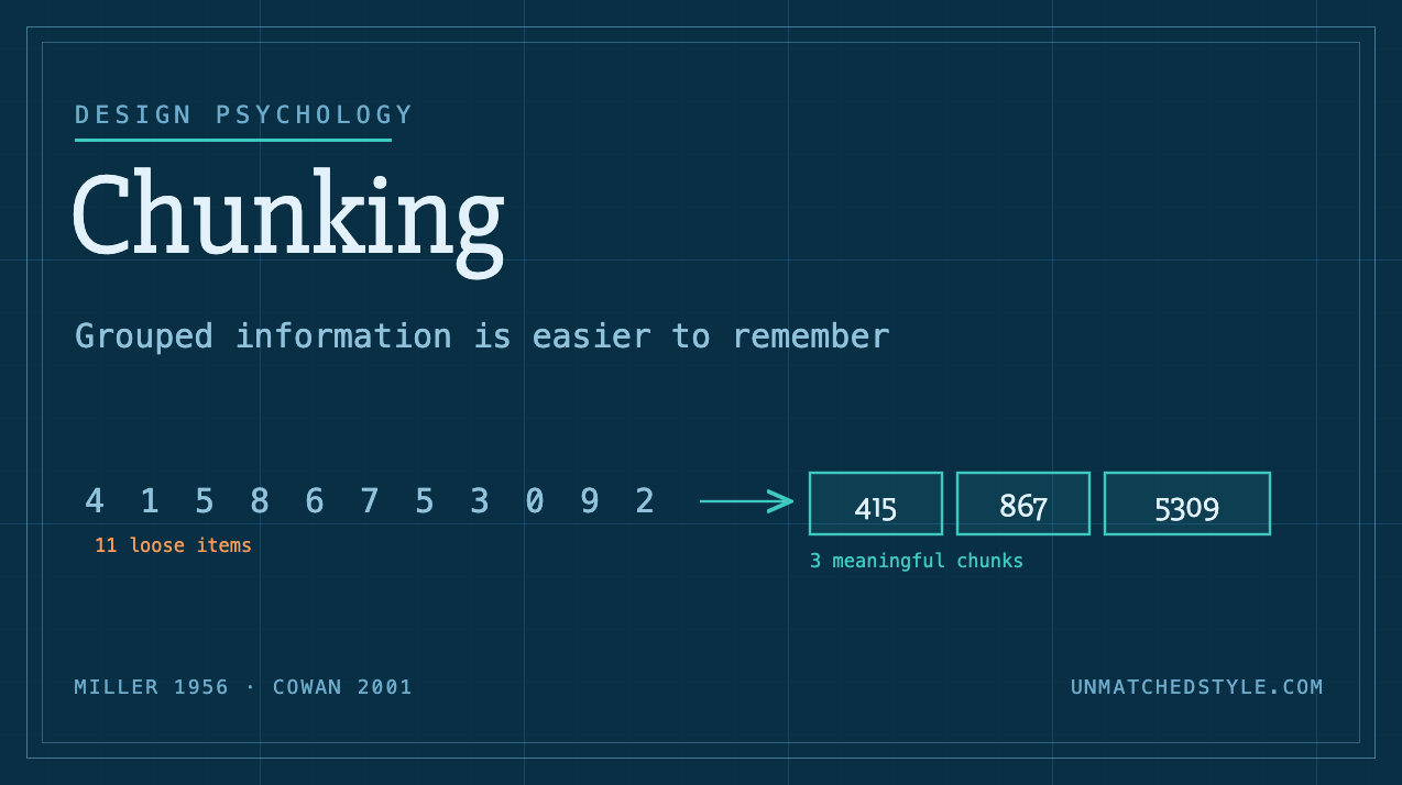
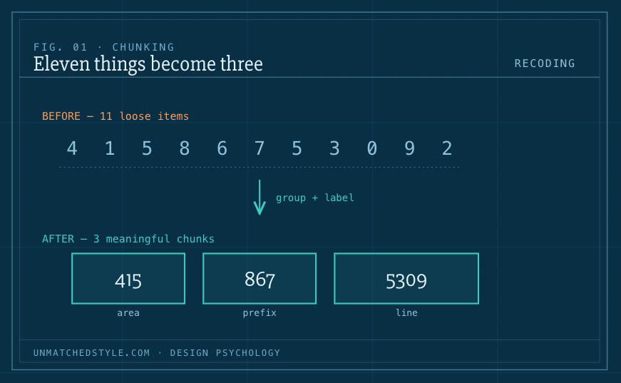
Ask someone to memorize this: 4 1 5 8 6 7 5 3 0 9 2. Eleven digits, gone almost as fast as you read them. Now read it back as a phone number: (415) 867-5309 and suddenly it sticks, maybe even sings, because a generation knows the tune. Nothing about the digits changed. What changed is that eleven separate things became three things: an area code, a prefix, a line number. That collapse from eleven to three is chunking, and it is one of the most useful ideas a designer can steal from cognitive psychology.
The bottleneck chunking sneaks around
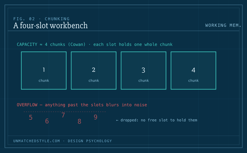
To understand why chunking works, you have to meet the constraint it defeats: working memory, the small mental workbench where you hold whatever you’re actively thinking about right now. It is astonishingly cramped.
The number most people have heard is seven, from George Miller’s famous 1956 paper, “The Magical Number Seven, Plus or Minus Two.” Miller measured how much people could hold in immediate memory across several kinds of tasks and kept landing near seven items. But here’s the twist that gets lost in the retelling: Miller himself was ambivalent about that number,he opened the paper by joking that he’d been “persecuted by an integer” and the finding he actually cared about wasn’t the seven. It was that the size of a chunk barely mattered. People could hold about seven random letters, or seven four-letter words, roughly 28 letters, because each word counted as a single chunk. The capacity is measured in chunks, not in raw information. That’s the whole trick.
And the modern number is smaller than seven. Later research, most influentially Nelson Cowan’s 2001 work, argues that when you strip away rehearsal and other tricks, true working-memory capacity is closer to four chunks, plus or minus one. Four. That’s the real size of the workbench. Everything past those few slots either gets pushed off the edge or blurs together into noise.
So chunking is the maneuver that beats the bottleneck. It doesn’t widen the workbench; it makes each thing on the workbench carry more. Group eleven digits into three labeled units and you’ve spent three of your four slots instead of eleven-that-you-never-had. Your brain files each chunk as a single higher-order unit and can pull it back whole.
Chunking is recoding, not just spacing
It’s tempting to think chunking is “adding gaps,” but the deeper mechanism Miller named is recoding, translating information from one form into a denser one. Splitting 19195552743 into 1-919-555-2743 helps a little just from the visual grouping. But it helps far more once you know that 919 is an area code and 555 is a prefix, because now the groups carry meaning, and meaningful chunks are the ones your brain files efficiently.
This is why a chess master can glance at a mid-game board and reproduce it perfectly while a novice can’t. The master isn’t seeing 25 pieces; they’re seeing five or six familiar configurations, a castled king, a pawn chain, each a single chunk built from years of pattern exposure. Expertise, in large part, is better chunking. The design lesson hiding in that: a chunk only works if the grouping is meaningful to your user, not just tidy to you. Arbitrary groups don’t recode into anything, so they don’t buy you memory.
Where it shows up in an interface
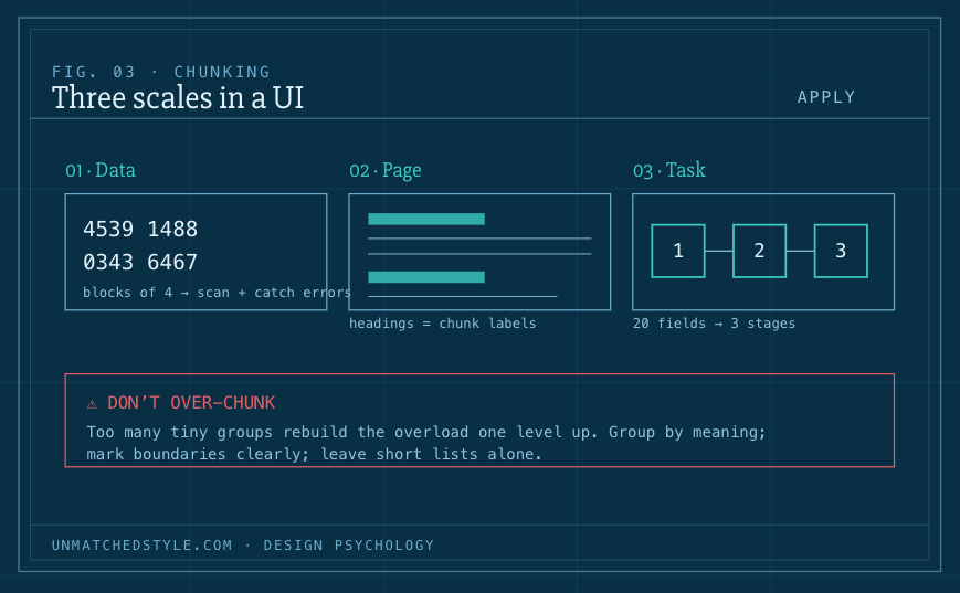
Once you have the concept, you start seeing chunking everywhere good design lives, at three different scales.
At the scale of data. Phone numbers, credit-card fields shown in blocks of four, IBANs, software license keys, verification codes, any long string a person has to read, hold, or type gets broken into groups. It reduces memory load and, just as importantly, makes errors visible: it’s far easier to spot a wrong digit in 4539 1488 0343 6467 than in the same sixteen digits run together. (One caveat the UX literature is firm about: for very long strings, don’t make people transcribe at all, give them a copy button. Chunking helps reading and recall; it isn’t a substitute for removing the work.)
At the scale of a page. A wall of text is a single undifferentiated blob that working memory can’t get a grip on. Break it into short paragraphs, add descriptive headings and subheadings, use lists where the content is genuinely a list, and hold line length in a readable band. Each heading becomes a handle, a chunk label, that lets a scanning reader decide what to hold and what to skip. This is chunking as content design, and it’s most of what makes a page feel “scannable.”
At the scale of a task. A checkout or signup that dumps twenty fields on one screen reads as twenty things. Split it into labeled stages, Shipping, Payment, Review, and it becomes three things, each holding a comfortable handful of fields. The total work is identical; the perceived load drops sharply, and completion rates tend to follow. The same instinct organizes a sprawling navigation menu into a few thematic groups instead of a flat list of fifty links, and organizes a long settings screen into sections.
The number you should actually design to
Here’s where a lot of well-meaning design advice goes wrong, and where the research is worth taking seriously.
Because “seven” is the famous number, designers sometimes invoke it as a hard rule, no more than seven menu items, seven tabs, seven anything, and treat it as a law of nature. The Nielsen Norman Group is blunt that this is a misreading: Miller’s seven was about items held in memory over a short interval, not a cap on how many options may appear on a screen at once. When all the choices are visible and stay put, the user isn’t holding them in working memory, they can just look. Truncating a useful navigation menu to seven links “because Miller” makes the product worse in the name of a principle that doesn’t apply.
So the honest guidance is a pair of rules:
When a person must hold information in their head between two moments, remember a code from one screen to the next, keep a set of options in mind while deciding, respect the small capacity. Aim to keep what they carry down toward a handful, and chunk aggressively to get there. When the information is present and persistent on screen, you have far more room, and your job is grouping for comprehension and scanning, not for memory. The count matters much less than whether the groups are meaningful and clearly bounded.
How to over-do it
Chunking has a failure mode, and it’s the mirror image of the wall of text: fragmentation. Slice content into too many tiny groups and you’ve just rebuilt the overload problem one level up, now the user has to juggle a large number of chunks, and the boundaries between them stop meaning anything. A form broken into eleven single-field “steps” is worse than one sensible page. A menu subdivided into a dozen near-identical categories forces people to guess which bucket holds the thing they want.
The guardrails are simple. Groups should be genuinely meaningful, drawn from how your users think about the domain rather than how your database is structured. Boundaries should be obvious, marked with real visual separation, whitespace, headings, cards, dividers, so the eye can tell where one chunk ends and the next begins. And you should resist chunking things that don’t need it: very short lists and short numbers are already a single easy unit, and grouping them just adds ceremony. Chunk to reduce genuine cognitive load, never merely to look organized.
The takeaway
Working memory is a four-slot workbench, and most interfaces hand people far more than four loose things to hold. Chunking is how you show respect for that limit: gather the loose pieces into meaningful, clearly bounded groups so each one lands in a single slot and stays retrievable. Do it at the level of digits, of paragraphs, and of whole workflows. But do it in service of the user’s understanding, grouped around what things mean to them, and stop before tidiness curdles into fragmentation. Get it right and people won’t notice a thing, which is the point. They’ll just find your product unusually easy to remember.




0 Comments