
“Call to Action” still conjures up e-commerce and donation forms, but the term has always been about something simpler: convincing someone to take an action on your site. If we want a visitor to contact us, buy something, subscribe, or even just read the next thing, we have to ask. How we ask still matters enormously. The call to action is the specific button, link, or block we want a visitor drawn toward so they’ll actually do the thing.
The fundamentals haven’t changed in a decade. What’s changed is the bar. A big orange button on a dark background was a strong move ten years ago, and it still works, but today that button also has to be thumb-sized, accessible, honest about what happens next, and the only loud thing on the screen. Here’s how to think about it now.
Prominence is still king, but contrast beats size
The first question is the same one we’ve always asked: does the action stand out from everything around it? Your CTA button should be the most visually distinct element on the page. The classic high-saturation button still tests best, and the reason is contrast, not any magic color. Orange and green buttons tend to test well across industries, but the real winner is whatever color contrasts most with your specific page design. Pastels and muted hues lose to high-saturation accents almost every time.
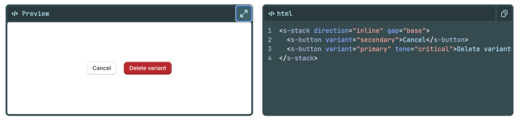
The bigger shift is that prominence is now also a function of restraint. When everything shouts, nothing stands out. The strongest pattern today is one dominant action per screen — if you need a secondary option, demote it to a quieter text link so the primary button clearly wins. Contrast and white space, the same tools we leaned on a decade ago, are doing more of the heavy lifting than size ever did.
The copy: verb plus outcome
“Download this” and “read this article” were good advice then and they’re good advice now, but we can be sharper. The modern rule is verb + object, and ideally a benefit baked in. “Start my free trial” beats “Submit.” “Get 10 free meals” beats “Learn more.” A small but real wrinkle: first-person phrasing (“Start my” instead of “Start your”) often outperforms. The label should answer exactly one question, what do I get when I click this? and one more rule that didn’t matter much a decade ago: your button copy needs to match the headline on the page it leads to, or trust evaporates instantly.
Design for thumbs, not cursors
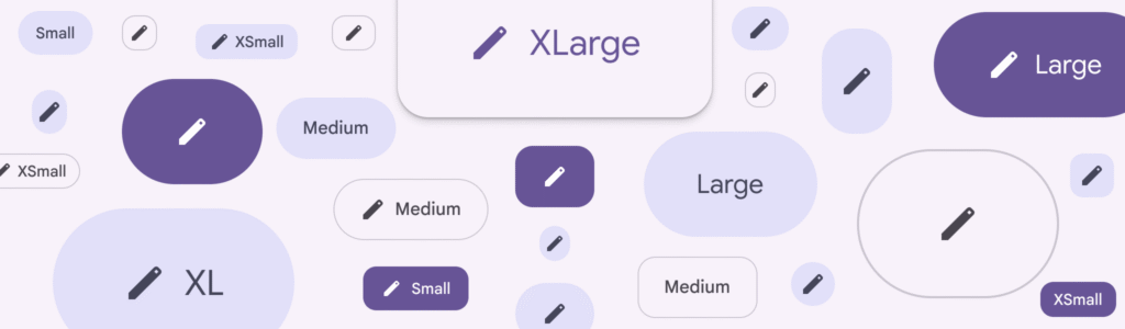
Most of your visitors are on a phone, tapping with an imprecise finger pad. Apple recommends a minimum tap target of 44×44 pixels, with 48px or taller and near-full-width preferred on mobile. Adjacent targets should be separated by at least 8px of inactive space so people don’t tap the wrong one. Where it fits the experience, a sticky CTA that follows the scroll means the action is always one tap away.
Accessibility isn’t optional anymore
A button only “stands out” if everyone can perceive it. The working checkpoints are 4.5:1 contrast for text, 3:1 for the button’s edges and focus state, and a WCAG 2.2 minimum target size. Descriptive labels aren’t just good copy, screen readers often read links out of context, so “Get the report” works where “Click here” leaves the user stranded. Run your colors through a contrast checker before you ship; “looks fine on my monitor” is not a test.
A little motion, used with intent
The newest layer is feedback. Fast, unambiguous press and success states reassure users and prevent double-clicks, and the current taste runs toward subtlety, thoughtful micro-interactions that guide and confirm rather than flashy animation everywhere. A gentle hover state or a 150–200ms transition on tap tells the visitor their action registered. That’s the goal: confirmation, not decoration.
The takeaway
It’s the same as it ever was, with sharper edges. Ask your visitors to do what you want them to do. If you don’t ask, they won’t know, and they’ll be left to figure out what matters most on their own, which usually means doing nothing. The difference today is that asking well now means asking clearly, accessibly, and on a screen that fits in one hand.
Go Study
A durable way to study good CTA use is to look at how major design systems document their button rules, these are maintained, current, and they happen to all preach the same gospel.
Google’s Material 3 ranks buttons by “emphasis,” and the filled button sits at the top. Filled buttons have high visual impact for important actions, and because their emphasis is so strong, the style should be used sparingly, ideally for only one action on a page. Material frames the whole page as a hierarchy: a layout should contain a single prominent, high-emphasis button that commands the most attention and makes it clear the other buttons matter less. That’s the modern restatement of “prominence” from the original article, except now it’s codified, with quieter outlined and text buttons explicitly reserved for the secondary stuff. Material DesignMaterial Design
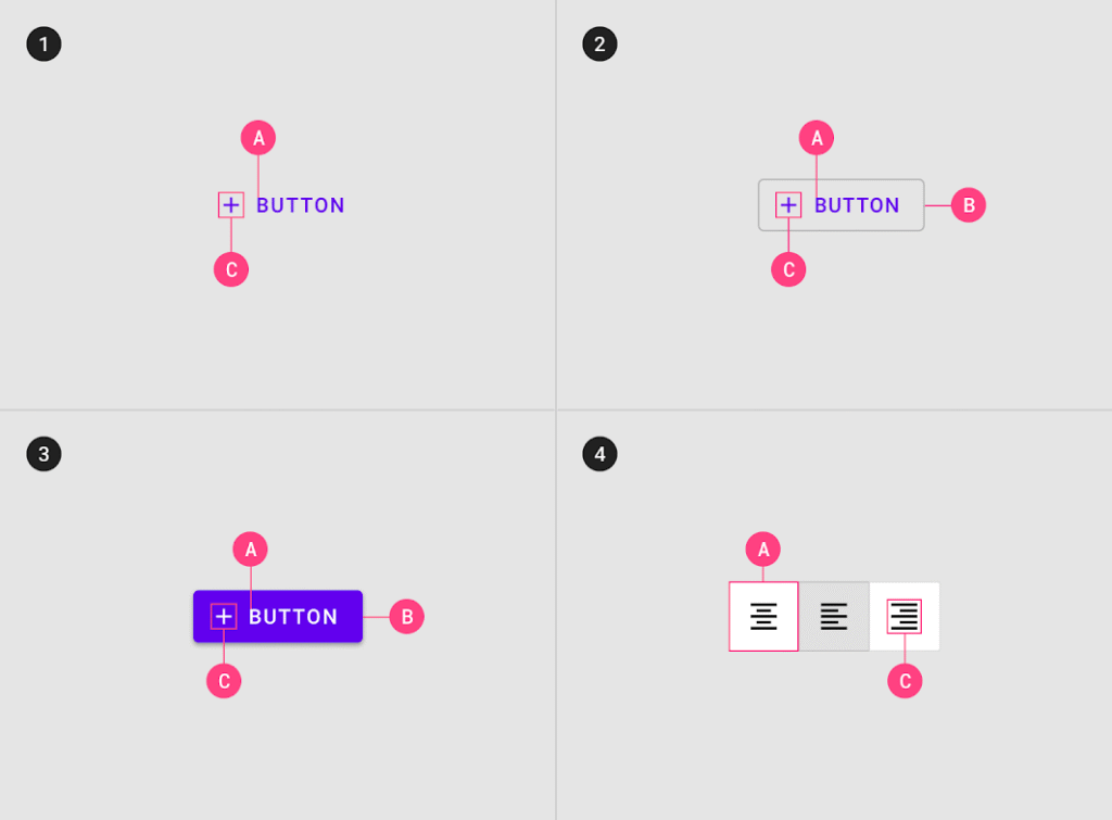
Atlassian’s Design System says the same thing in plainer words. Use a primary button to highlight the single most important call to action on a page, and primary buttons should only appear once per area, though not every screen needs one at all. The second half of that rule is the part people forget: if nothing on the screen is truly the primary action, you don’t owe the page a bright button. Atlassian also reserves its brand blue for exactly that one action, which is what keeps an otherwise dense product UI calm, one color means “do this,” and everything else stays neutral. Atlassian
Shopify’s Polaris rounds it out on the copy and accessibility side. Polaris treats its content guidelines as a first-class part of the system, used to help write CTAs in the proper tone and to keep labels and descriptions consistent. And like the others, it bakes in WCAG-level contrast and screen-reader support at the component level rather than leaving it to each designer, the accessibility floor we covered earlier, enforced by the system itself. Shopify
The throughline across all three: a call to action earns its prominence by being the only thing asking loudly. The systems differ in vocabulary “filled,” “primary,” “high-emphasis” but they converge on one rule. Decide the single most important action on the page, make it unmistakable, and let everything else step back.


0 Comments