Stephane.ly

Stephane.ly

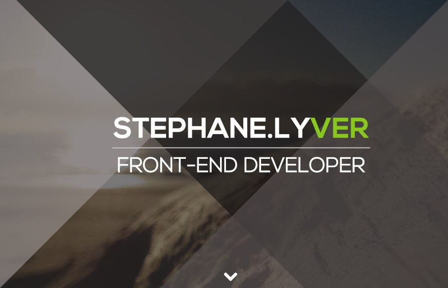
I love this simple and colorful site for Stephane Lyver. It seems to have minimal design, but the colorful sections draw my attention. I love his black and white ending portrait shot, and I really dig the simple effects of the angled :before and :after css elements. This creates a grand affect on the header image which shows just simple design really works. I had way to much fun resizing my browser window trying to get his angled overlays to line up just right on the image.

Lots you can learn from someone that can make simple design look grand.

I love this simple and colorful site for Stephane Lyver. It seems to have minimal design, but the colorful sections draw my attention. I love his black and white ending portrait shot, and I really dig the simple effects of the angled :before and :after css elements. This creates a grand affect on the header image which shows just simple design really works. I had way to much fun resizing my browser window trying to get his angled overlays to line up just right on the image.

Lots you can learn from someone that can make simple design look grand.

Kinsta

0 Comments

Submit a Comment

Your email address will not be published. Required fields are marked *

Time limit exceeded. Please complete the captcha once again.

News & Articles

Fitts’s Law: Why the Easy Button Wins

Fitts’s Law: Why the Easy Button Wins

Large, close targets are faster to hit than small, distant ones, that’s Fitts’s Law. A look at the 1954 rule behind buttons, prime and magic pixels, thumb zones, and dark patterns.

The Call to Action, Revisited

The Call to Action, Revisited

The Call to Action hasn’t changed in a decade, but the bar has. A fresh look at prominence, copy, mobile tap targets, and accessibility, with lessons from three major design systems.

