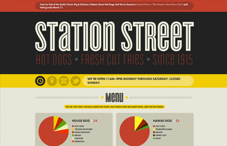
The color scheme screams hot dog. And I immediately became hungry. Interesting use of infographic-style for the menu item descriptions. Hot dogs are generally a pretty simple thing to order, but this puts some love and fun into it. The color for hot dog and Heinz ketchup seem a little too close, but overall well done. Sexy font choices and good use of space round out the cool factor of this page. Good work, now when’s lunch?

Looking Fast: The Art of Website Speed Perception
In the web world, technical speed and user perception matter. By improving design for a faster appearance, you boost conversions and stand out online. Speed isn’t just loading time; it’s perception.


i love the flat shapes in that color palette.
at first i was skeptical about “making everything an infographic,” but after actually looking at the diagrams, there is something conveyed…
menus often show WHAT ingredients are in a dish, but i don’t think i’ve ever seen a menu that actually shows HOW MUCH or at least in what ratios they/there are. that can actually be valuable.
i think that’s actually cool and novel (and least in my experience).
on the other hand, the breakdown of ingredients with a scientific reference like this really reminds me that hot dogs are made up of lots of things… er… crap.
dissecting it pretty heavily, but i gotta say, i still like it:)
out
jonah