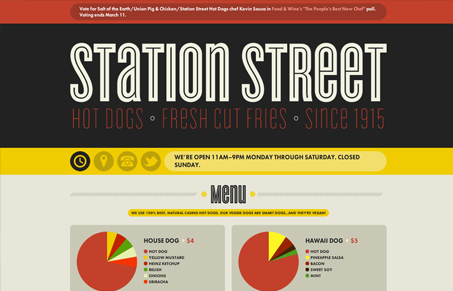
The color scheme screams hot dog. And I immediately became hungry. Interesting use of infographic-style for the menu item descriptions. Hot dogs are generally a pretty simple thing to order, but this puts some love and fun into it. The color for hot dog and Heinz ketchup seem a little too close, but overall well done. Sexy font choices and good use of space round out the cool factor of this page. Good work, now when’s lunch?

Microinteractions
Microinteractions are subtle site animations enhancing engagement. They include triggers, rules, feedback, and sometimes loops/modes. Practical uses: improving engagement, guiding user behavior. Well-designed microinteractions boost user engagement and your online presence.


i love the flat shapes in that color palette.
at first i was skeptical about “making everything an infographic,” but after actually looking at the diagrams, there is something conveyed…
menus often show WHAT ingredients are in a dish, but i don’t think i’ve ever seen a menu that actually shows HOW MUCH or at least in what ratios they/there are. that can actually be valuable.
i think that’s actually cool and novel (and least in my experience).
on the other hand, the breakdown of ingredients with a scientific reference like this really reminds me that hot dogs are made up of lots of things… er… crap.
dissecting it pretty heavily, but i gotta say, i still like it:)
out
jonah