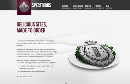
I like a lot of aspects to this design. The colors are dark and crisp feeling, as well as are the graphic elements. There are some content holes it looks like and the contact form is a little uninspiring. I include it here because I just like the overall vibe of the site.
Glassmorphism: The Transparent Design Trend That Refuses to Fade
Glassmorphism brings transparency, depth, and light back into modern UI. Learn how this “frosted glass” design trend enhances hierarchy, focus, and atmosphere, plus how to implement it in CSS responsibly.


0 Comments