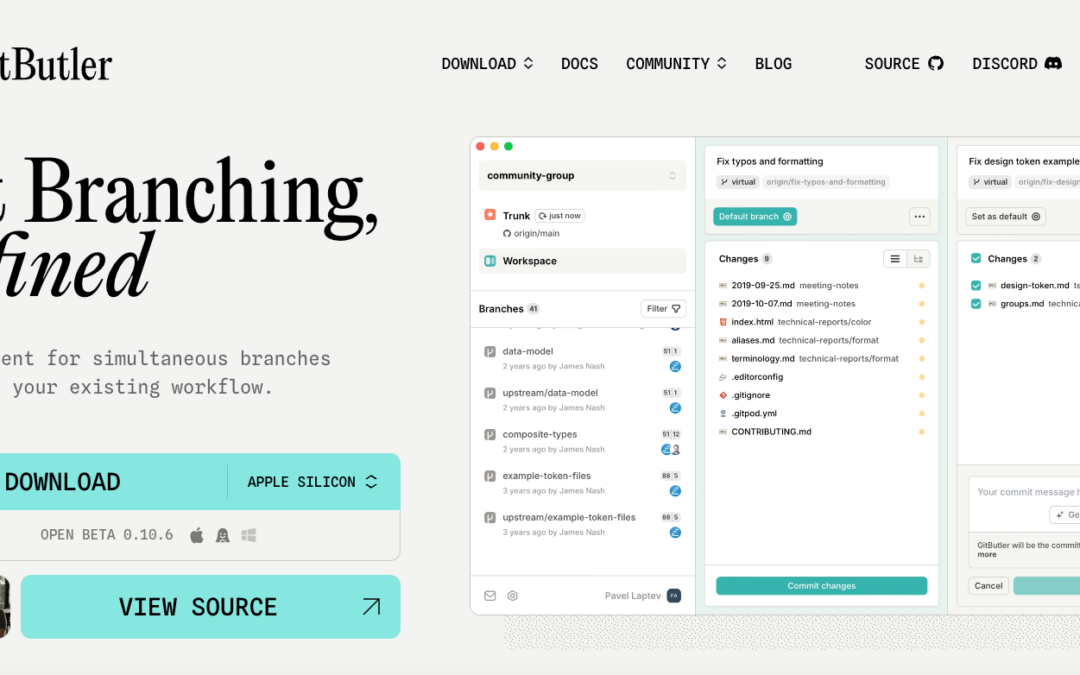
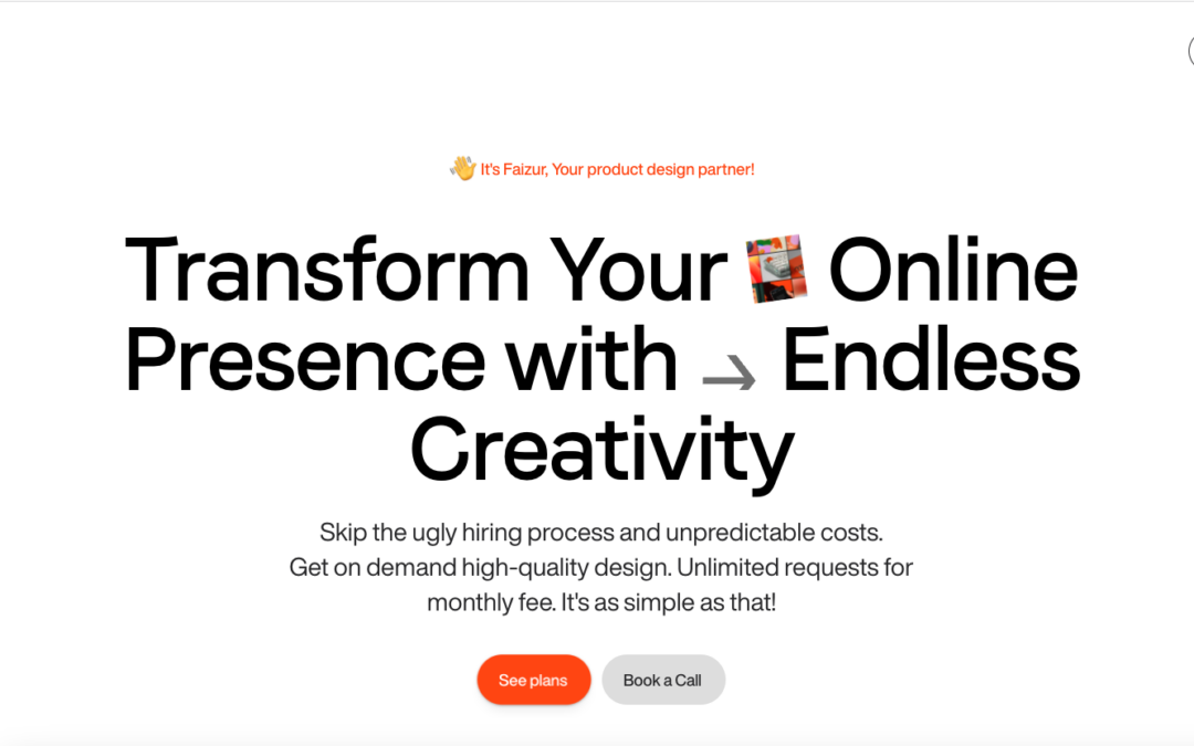
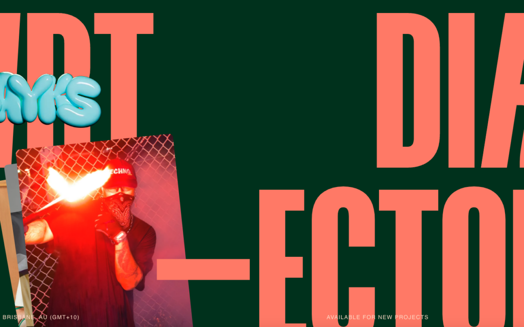
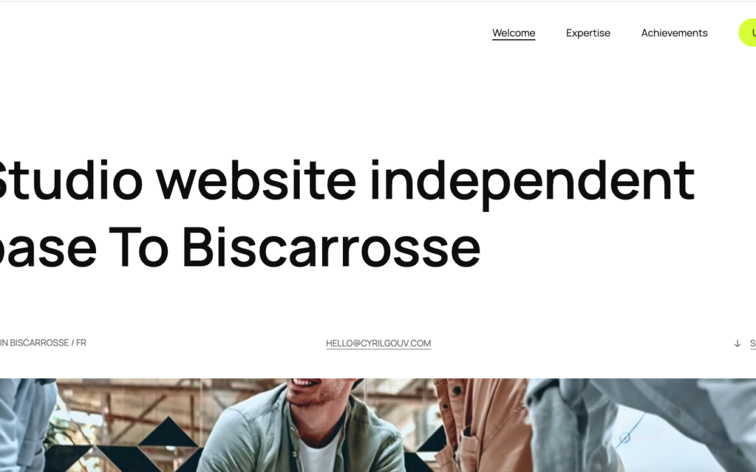
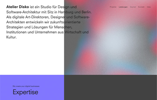
Website for branding and animation agency.
Black Fountain Capital
Superbly done grid and overall layout. I love the monochromatic approach the colors too. Very classy and 'high-end' vibe.
Buonq
I really dig the super clean grid. Juxtaposing the text/copy and the images in such a clean way makes the vibe very professional. Museum level almost.
COB
Really visually fun design. Much like the subject matter, popcorn, the designers could really go for it. I love the branding here, even the pop-up keeps with it.
CIELIA
Nice clean grid based design with minimalist color palette. There are some nifty visual surprises as you scroll the page(s). Well done.
Z2A Digital
I like the background, it 'feels' fuzzy and clean at the same time. I really dig the grid as well, feels swiss in it's approach.
UnD NY
Pretty radical looking design for something pretty straight forward as pastries. I kinda love it.
Train Hard
I like the stark black and white approach to this website design. It keeps it classy and focused. The strong typography matches well with the subject matter.
GoodBytes
Explore this maximalist site at with interactive shaders, poppable balloons, GSAP animations, a 3D character, and a showreel of Three.js class demos and student projects.
UX & PRODUCT DESIGN WEEK
To celebrate the upcoming UX & Product Design Week Future London Academy’s design team created a fun and engaging landing page.
5forests
5forests is globally-recognized for our award-winning wine, beer, and spirits marketing.
Alchemy Digital
Nice grid layout very dutch feeling to me. I like the presentation you get as you scroll down the page.
Life at Spotify
Nice scroll effects. This seams to be a trend for big brands in the audio/visual industry, not to mention the tech industry. This is done well in this example and still keeps the Spotify vibe going.
Ang Studio®
Cool home page presentation of work. I dig it, it is a bit disorienting if I look at this through a pure UX lens, but man it's fun and I think that may trump worrying too much about UX here.
DES
Cool presentation delivered as you experience scrolling down on this website. Targeted animations used strategically always make me smile.
The Weather
Design that turns heads. Digital advisory that wins hearts. No-nonsense web development.
Violet’s Code
Website to promote a new graphic novel, Violet’s Code, by J.D. Paulsen
Patch
I like the simple approach to color here. Not black and white but not too much color, keeping it surface level and focused on the content and story it's working to communicate. Smartly done website.
Workshop
Really SWISS design vibe here. I dig how the layout feels like their furniture designs too. Minimal and solid. Great work.
Pony Studio
Designers. Dreamers. Doers. Our branding stands for: Love the creative loop process | Our studio is our people | Love diversity and colours.
Konpo
Website Design for ourself, Konpo studio, A software design team specialized in branding, websites, products and systems from 0 → 1
G R Ö N
Experimental feeling design. Very stark and wild, reminds me of the old days of design with people like David Carson leading the trends.
Shannon Lim
Pretty cool approach with the grid and timeline of work. I dig this.
Cola Town Bike Collective
The Cola Town Bike Collective is a non-profit full-service bicycle shop dedicated to providing low and no-cost access to transportation to people in need across Columbia and the Midlands. We are a full service bike shop located at 711 Elmwood Avenue, where we provide...
Old Riga Kvest
I love the boxed in feel with the fixed nav style they're using here. Solid photography and a cool concept make this a very fun website to study.
Pinch
This website design just radiates it's boldness with the bubblegum pink coloring. This audacious choice of color scheme not only catches the eye but also injects a sense of vibrancy and creativity into the digital space. Furthermore, the multicolored screen...
Noshly
Noshly's website for their new app looks cool! It has round boxes and bright, colorful colors like candy. But the best part is the video with their logo on it. It's like magic! Even though it seems simple, it makes the website look awesome and fun. It shows that even...
few
Few is a company that makes websites for important clients. Their website is cool and colorful with bright colors that change. They talk about how they work as a team. Everything on their website is important and isn't there unless it's necessary. It tells you what...
Huge
Huge has been around a long time, there's probably at least 5 or more other submissions for this one in the gallery here. Never disappoints.
Knith
Knith is a store that sells beautiful things for your home, like cozy blankets and wooden spoons. You can buy these things on their fun online shop. The website has a lot of personality, and the typeface they use looks strong and unique.