Submitted by Cory James @coryska
Role: Designer & Developer
In a world of ever increasing complexity, sometimes It’s nice to have less to analyze and worry about. ‘Simple’ is calming, relaxing … for a change.
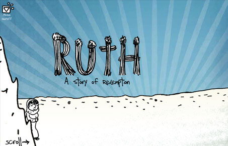
Pretty crazy website but I really dig it. I love the utilization of the side-scroller approach here tied together with the story and visual storytelling it’s pretty awesome. The illustrations are crude almost, but that’s a stylistic choice for sure, it works really well too. The animations are pretty good and the parallax really helps sell the animation/atmosphere. Really great stuff and super smart way to tell a story. It’s not at all appropriate for many scenarios but every once in a while it’s nice to find something like this that works really well.


Wonderful visual storytelling. They really nailed it. The walking animation, the touches like the animated fire, and of course the aesthetic of the illustration in general… all pretty amazing.
the optional menu that comes down has a very incongruous style IMO, and i’m really glad they left it off by default.
overall, all my thumbs way up
The separation from the illustrations and that optional nav is pretty different. I like how it’s out of the way and sort of secondary too.