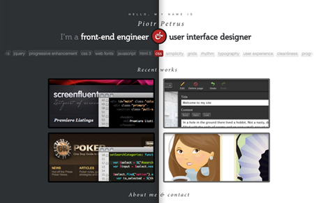
Nice concept, splitting the page in half, playing up the left vs. right brain idea. It’s been done before so you have to commit to it to really make it work and I think Piotr Petrus really does just that. The thing that really sells it is the interaction that happens when you click on one of the portfolio samples, that’s just cool.


0 Comments