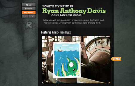
I really like the background design for this site. There are also some details that I especially like, the “buy print” call to action is really smart looking. I also like the compact navigation “box” a great deal. I do think the “back to top” link is a little hard to recognize at first, it should perhaps be played up a little more. I also really like the idea of the loop/magnifying glass over the artwork too, that’s also a smart idea.


0 Comments