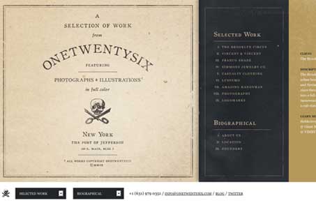
Oh man, this site is just chock full of awesome work! As a portfolio website design it’s tops in my book. One of the cooler blocks of work i’ve seen in some time. I love the intro slides/pages and the branding of this company is so cool.
The site does what it needs to do, showcase the work. I like that about it, it doesn’t try to be something it’s not. My only small criticism would be in the use of the simple form elements and also having them and the back and next buttons in the footer like they are, if your browser is slightly smaller than it needs to be, you lose them, since the design doesn’t really invite you to scroll visually. Basically resizing your browser window is the only solution. Outside of that quandary this portfolio site rocks. I think just exploring some more modes of moving from image to image would really take this site into the super-great arena.


I Absolutely Agree
Wow, came to the site for inspiration and found my own site! Awesome, thanks!
You can use the left and right arrow keys to scroll through the work as well, but we never wrote it specifically anywhere on the site. We probably should!
Right now, it’s more of an easter egg I suppose.
Thanks again!
Great site Jon. Totally missed using the arrow keys that’s nice. You should show that off man!