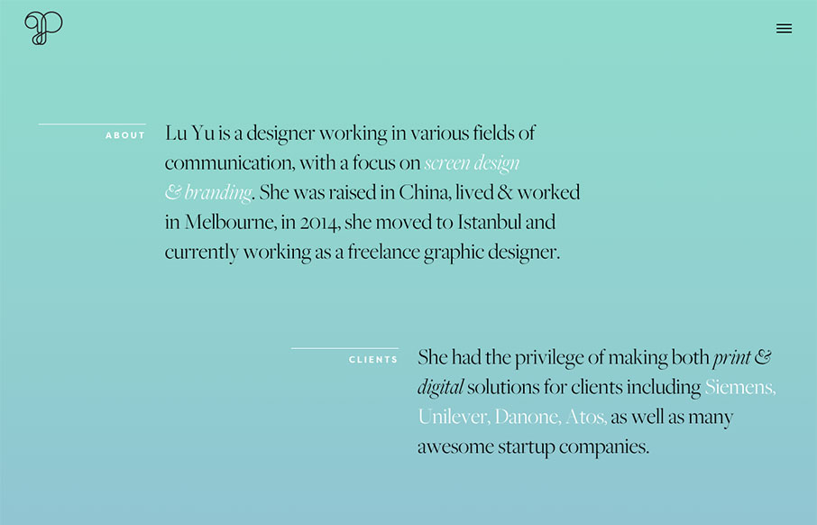
This is a good, quick portfolio for graphic designer, Lu Yu, out of Istanbul. It looks like it was built on Semplice – but it also looks like Yu works with Semplice. I like the off-set sections of the home page, and how the project names are attached to the images, but not fully on or off of them. Also like the white space for the home page – or rather the teal and blue gradient space – but it works to highlight the content sections.
Glassmorphism: The Transparent Design Trend That Refuses to Fade
Glassmorphism brings transparency, depth, and light back into modern UI. Learn how this “frosted glass” design trend enhances hierarchy, focus, and atmosphere, plus how to implement it in CSS responsibly.


0 Comments